

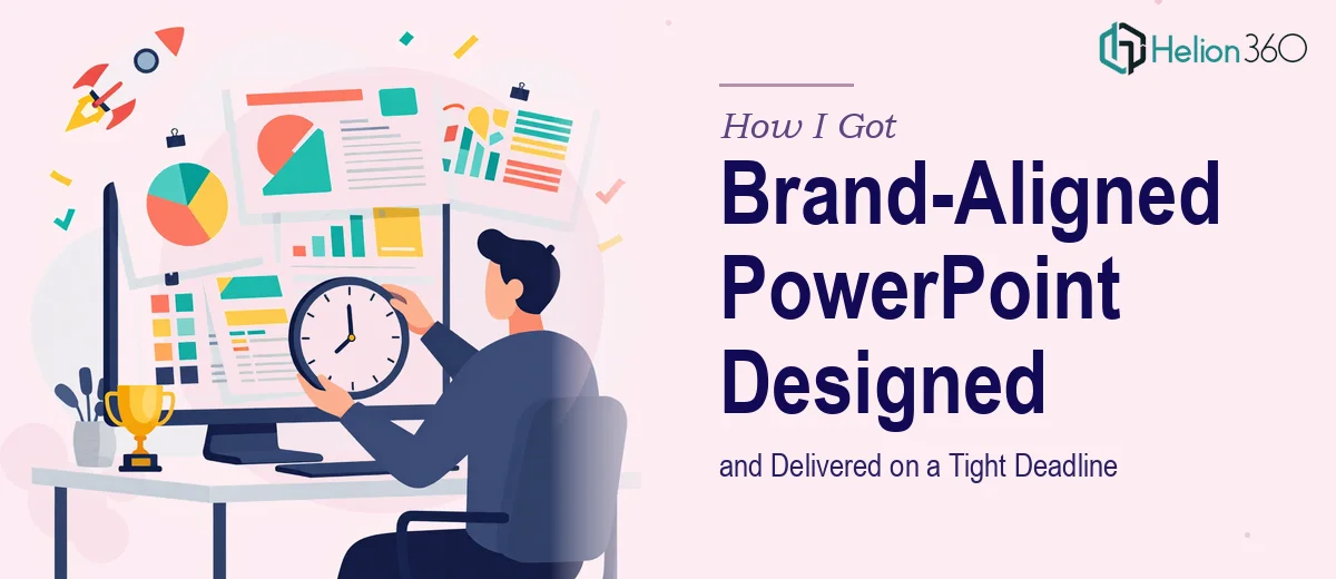
A Product Launch Event, a Hard Deadline, and No Room for a Rough Deck
We had a product launch event locked in. The date wasn't moving, the audience was real — partners, press, prospective customers — and the presentation was the centerpiece of the whole thing. Not a warm-up act. The main event.
What I quickly realized was that we didn't just need a deck that looked decent. We needed a brand-aligned PowerPoint presentation that could carry the room: clear narrative, polished visuals, every slide consistent with how we show up everywhere else. The kind of quality that signals you've done the work and you take this seriously.
The deadline gave us days, not weeks. And that changed everything about how I thought about getting this done.
What I Found Out a Polished Launch Deck Actually Requires
Before I made any decisions about how to approach this, I spent some time understanding what doing this well actually involves. What I found made it clear this wasn't something to improvise.
A professional product launch presentation isn't just filling in slide templates. The content structure has to follow a deliberate arc — problem, solution, product proof, call to action — and every slide has to earn its place. Weak sequencing kills audience attention fast, and a launch deck can't afford that.
Beyond structure, brand alignment at this level goes deeper than dropping a logo on the title slide. It means the color palette, typography scale, iconography style, image treatment, and layout language all have to mirror the brand system consistently across every slide. The moment one slide looks off, the whole deck loses authority.
And then there's polish — the kind that only comes from someone who works in this medium every day. Animation timing, master slide discipline, proper font embedding for distribution. These aren't finishing touches; they're what separates a presentation that looks ready from one that looks like it was put together the night before.
What the Work Actually Involves at Every Layer
The right approach to a brand-aligned PowerPoint presentation starts with the narrative structure before a single design decision gets made. Doing this well means auditing every piece of source content — product features, key benefits, positioning language — and mapping it against a clear story arc. A launch deck typically runs 12 to 18 slides, and each one needs a single, focused message. The structural work involves deciding what gets said, what gets cut, and what order creates momentum. That editorial judgment is harder than it sounds, and getting it wrong means a visually polished deck that still loses the room.
Visual mechanics are where the execution complexity compounds. A properly constructed slide layout operates on a 12-column grid, with a type hierarchy running roughly 36pt for headlines, 24pt for subheads, and 16pt for body copy. Brand color application follows strict rules — typically a maximum of four palette values used with defined hierarchy, not interchangeably. Chart types, icon styles, and image treatments each need their own consistency rules applied slide by slide. Setting up master slides and slide layouts that enforce these rules correctly — so that every new slide inherits the right structure without manual correction — takes hours even for someone experienced with PowerPoint's master-slide architecture.
Polish and consistency across a full deck is where most self-managed projects fall apart under deadline pressure. Every graphic element needs to be pixel-aligned. Animations, if used, need to serve the content rather than distract from it — and animation timing sequences in PowerPoint require meticulous sequencing through the Animation Pane. Font embedding, image compression for file size, and final export settings all need deliberate handling before a deck is ready for distribution. Each of these steps is fast for someone who does it daily and genuinely time-consuming for someone who doesn't.
Why I Brought Helion360 In to Handle It End-to-End
Looking at what a polished PowerPoint presentation actually required, the decision to engage the right team was immediate. I wasn't going to spend two weeks climbing a learning curve on master slides and animation sequencing with a live event on the calendar.
Helion360 handled the full project from the start — narrative structure, visual design, brand application, and final delivery-ready file. They took our brand assets and product content and turned it into a complete, polished deck in a fraction of the time it would have taken me to work through the mechanics myself. The turnaround was fast. Done in days.
What made the difference was that this is the work they do every day. The grid systems, the master slide architecture, the brand consistency checks — all of it is built into how they execute, not something they have to figure out on each project. That existing depth is exactly what a tight deadline requires.
What Came Out the Other Side, and What I'd Tell Anyone in My Spot
The deck we walked into the launch event with was exactly what it needed to be. Every slide was on-brand, the narrative moved cleanly from problem to product to proof, and the file was ready for immediate distribution — no last-minute fixes, no placeholder elements, nothing that needed an apology in the room.
The event landed well. The presentation did its job: it held attention, communicated the product clearly, and reflected the quality of what we were launching. That outcome wasn't accidental — it came from the work being done properly, not rushed through.
If you're looking at a similar situation — a hard deadline, a high-stakes audience, and a presentation that needs to be genuinely polished — Helion360 is the team to engage. They handled the full scope fast, and the execution depth was exactly what the project needed.