

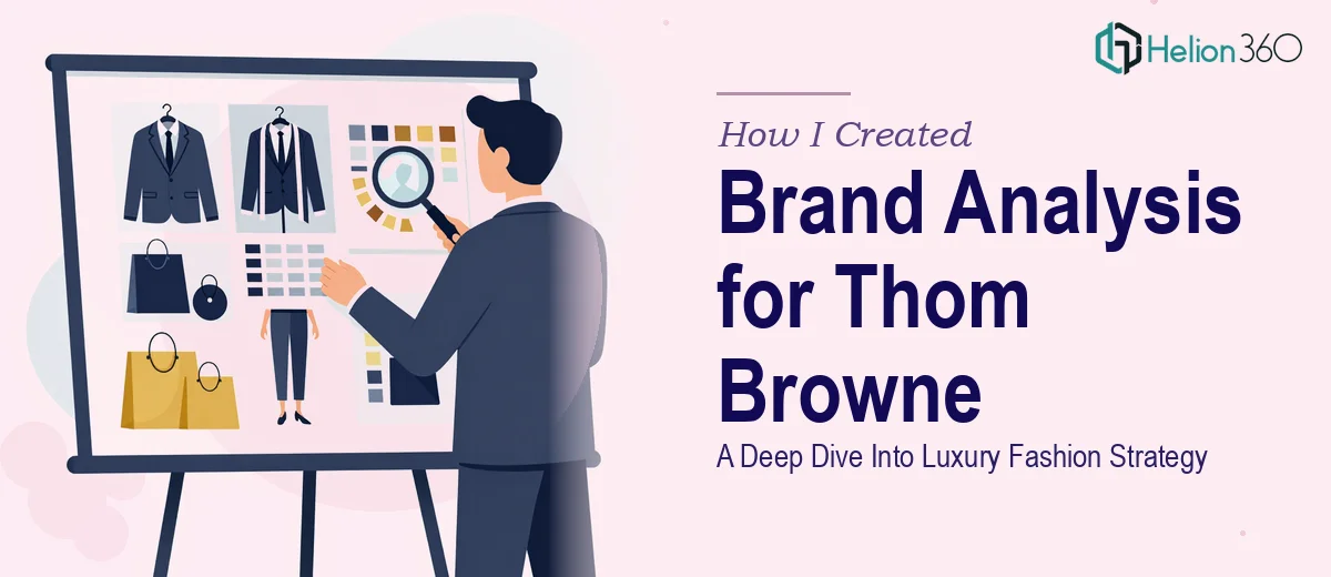
The Situation and What Was Actually at Stake
I was working on a strategic brand analysis for a luxury fashion label — the kind of deep-dive presentation that would need to hold up in front of senior stakeholders who know the category inside and out. The brief called for a structured look at brand positioning, competitive landscape, consumer perception, and strategic direction — all wrapped into a cohesive, visually compelling deck.
The stakes were real. This wasn't a casual internal update. The audience would be scrutinizing every claim, every chart, and every strategic inference drawn from the data. A sloppy structure or an inconsistent visual treatment would undermine the credibility of the analysis itself, no matter how solid the underlying research was.
I knew right away this needed to be done properly — not just researched well, but presented with the kind of design and narrative discipline that the subject demanded.
What I Found This Work Actually Required
Once I mapped out what a genuine brand analysis presentation involves, the scope became clear quickly. This isn't a matter of dropping research findings into a slide template. Done well, it requires a deliberate narrative architecture — one that moves the audience from context to insight to implication without losing them.
Three things signaled the real complexity almost immediately. First, the research itself needs to be structured before a single slide gets built — source materials audited, themes consolidated, and a logical argument mapped out that the visuals then serve. Second, the visual layer for a luxury brand carries its own rules: typography, whitespace, and color restraint that signals category fluency to a sophisticated audience. Third, brand analysis decks often blend qualitative positioning commentary with quantitative competitive data on the same slide, and making those two languages coexist cleanly takes real design judgment.
This wasn't a weekend project. It was a multi-layer execution problem.
What Doing This Well Actually Involves
The structural work is where a brand analysis presentation either earns credibility or loses it before the first chart appears. The right approach starts with a content audit — pulling together competitive research, brand positioning frameworks, and consumer insight data, then mapping a story arc that moves from market context through brand diagnosis to strategic implication. A well-structured deck typically runs through five to seven distinct narrative beats, each slide carrying a single clear point. Getting that architecture right before touching design is non-negotiable, and it takes longer than most people expect — drafting, stress-testing the logic, cutting what doesn't serve the argument.
The visual mechanics for a luxury brand analysis carry specific rules that are easy to get wrong. Typography hierarchies in this category typically run tight — something in the range of 32pt headline, 20pt subhead, 14pt body — with generous whitespace doing as much work as the type itself. Color palettes are deliberately constrained, usually no more than three brand-aligned colors plus a neutral, and the grid system holding every layout needs to stay consistent across every slide. Setting up a master slide system that propagates those rules correctly and doesn't break when content is swapped in is a technical task that takes hours for someone who doesn't work in slide design daily.
Blending qualitative and quantitative content on the same slide — which brand analysis decks do constantly — is where most attempts fall apart visually. A competitive positioning map sitting next to a paragraph of brand commentary needs a layout logic that makes both readable without either element dominating awkwardly. Chart types matter here too: a perceptual map communicates differently than a bar chart, and choosing the wrong one misrepresents the insight. Execution friction comes from the sheer number of judgment calls involved — each slide is essentially its own layout problem, and maintaining consistency across twenty or thirty of them requires both design skill and disciplined quality control.
Why I Brought in Helion360 to Handle It
I recognized quickly that attempting this myself wasn't a realistic use of time. The structural work alone — auditing source material, mapping the narrative, building the argument — would take days before design even started. Adding the visual execution on top of that, to the standard this kind of presentation demands, wasn't something I could pull off in the window I had.
Helion360 handled the full project end-to-end. They took the raw research inputs, built the narrative architecture, applied a visual system calibrated to the luxury brand context, and delivered a presentation that was ready for a senior audience. The work was turned around quickly — done in a fraction of the time it would have taken me to work through the learning curve on both the structural and design dimensions myself.
What made the difference was that this is the kind of work Helion360 does continuously. The tooling, the design judgment, and the strategic framing expertise are already built in. There was no ramp-up time, no trial and error on slide layouts, and no back-and-forth on what a brand analysis deck should actually say and show.
The Outcome and What I'd Tell Anyone in My Spot
What came back was a presentation that held together both analytically and visually — a clear narrative from market context through to strategic recommendation, with data visualizations and brand positioning frameworks that communicated precisely what the research supported. The deck performed in the room the way a well-built argument should: the audience followed the logic, engaged with the data, and trusted the conclusions.
The thing I'd tell anyone facing a similar project is this: the gap between a functional deck and a presentation that actually lands with a sophisticated audience is larger than it looks from the outside, and closing that gap yourself requires time and expertise that most people don't have sitting idle. If you're looking at a brand analysis, a competitive landscape deck, or any research-heavy presentation that needs to hold up in front of a critical audience, Helion360 is the team to engage — they delivered fast, handled the full execution, and brought the depth this kind of work requires.