

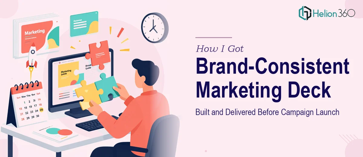
The Campaign Was Live in a Week and the Deck Wasn't Ready
We were a week out from launching a marketing campaign around our new eco-friendly product line. The problem was clear: the existing PowerPoint presentation hadn't been touched in months, the data was outdated, the branding was inconsistent, and we needed three brand-new slides built from scratch to communicate our sustainability positioning. The stakes were real — this deck was going into the hands of partners, stakeholders, and campaign contacts who would be forming their first impressions of the product line from it.
A presentation that looked patched together or off-brand wasn't an option. Neither was spending the next five days buried in PowerPoint trying to figure it out myself. I needed it done right, and I needed it done fast.
What I Found Out the Work Actually Required
Before deciding how to move forward, I spent some time understanding what a properly executed presentation update actually involves at this level. What I found was that this wasn't a quick cosmetic fix.
First, a brand consistency audit across every existing slide is a real undertaking. It means checking every font instance, every color value, every logo placement and margin against brand guidelines — and correcting them systematically, not slide by slide in an ad hoc way.
Second, integrating new environmental data and statistics isn't just a copy-paste job. The data needs to be visualized in a way that communicates clearly and matches the visual language of the rest of the deck. That means choosing the right chart types, maintaining axis consistency, and making sure the sourcing is handled appropriately.
Third, building three new slides that articulate unique selling propositions around sustainability and innovation requires narrative thinking before design thinking. The story arc of those slides has to flow from what came before them — they can't just be appended.
That combination of audit depth, data visualization work, and new slide construction told me this was a multi-day project requiring real expertise.
What Doing This Well Actually Looks Like
The work starts with a full structural and brand audit. The right approach here means going into the master slide setup — not just the individual slides — and ensuring the typography hierarchy is locked in at the source. A proper hierarchy uses something in the range of 36pt for headlines, 24pt for subheadings, and 16pt for body text, and it propagates from the master so changes don't have to be made manually on every slide. Doing this correctly also means enforcing a maximum of four brand colors across the entire deck, applied consistently to backgrounds, accents, text, and charts. Getting this wrong at the master level means every slide inherits the inconsistency, and fixing it after the fact is slow, painstaking work.
The data and statistics integration requires its own discipline. For a sustainability-focused product line, the visual approach to environmental data matters — bar charts work for comparisons across time periods, while progress indicators or icon-based infographics are better suited for showing milestone achievements. Each chart needs a consistent axis format, a label style that matches the deck's typography, and source attribution handled in a way that doesn't visually clutter the slide. A practitioner making these decisions is also thinking about whether the data supports the narrative or distracts from it — every data point has to earn its place on the slide.
The three new USP slides require narrative architecture before any design work begins. The approach involves mapping the logical flow: what claim does each slide make, what evidence supports it, and how does it connect to the slide before and after it. Done well, each new slide uses a consistent layout grid — typically a 12-column structure — so the visual weight of text, imagery, and data elements feels intentional rather than arbitrary. Getting the layout wrong, or building the slides without reference to the existing deck's grid, creates an immediate visual disconnect that's obvious to any attentive audience.
Why I Brought in Helion360 to Handle It
Once I understood the scope — the audit, the data visualization work, the master slide corrections, and three new slides built to match — it was immediately clear that attempting this myself over a few evenings wasn't realistic. The learning curve on master slide architecture alone would have eaten up days I didn't have.
I engaged Helion360 to handle the full project end-to-end. That meant the brand audit and master slide corrections, the integration and visualization of the new sustainability data, and the design and narrative construction of all three new USP slides — all of it, not just a polish pass on the existing content.
What made the decision straightforward was knowing that Helion360 does this work constantly. The tooling, the process, and the design expertise are already in place. The deck was turned around quickly — done in days, not the week-plus it would have taken me to work through it myself without that foundation already built.
What Came Back and What I'd Tell Anyone in My Spot
What came back was a deck that looked like it was built by one team with one brief, not assembled over time across multiple versions. The brand consistency held across every slide — fonts, colors, spacing, and logo treatment were all locked. The new sustainability data was visualized clearly and matched the visual language of the rest of the presentation. The three new slides had a narrative logic that fit naturally into the flow of the deck rather than feeling tacked on. The campaign launched on schedule with a presentation we were confident putting in front of any audience.
If you're looking at a similar situation — a tight deadline, a presentation that needs real work, and no realistic path to doing it yourself at the quality level it needs — Helion360 is the team to engage. They handled the full scope fast and brought the kind of execution depth this type of project actually requires.
For deeper perspective on what's involved in this type of work, consider reviewing how cohesive brand-consistent marketing slides come together, and what goes into marketing plan deck design when strategy and brand voice need to align.