

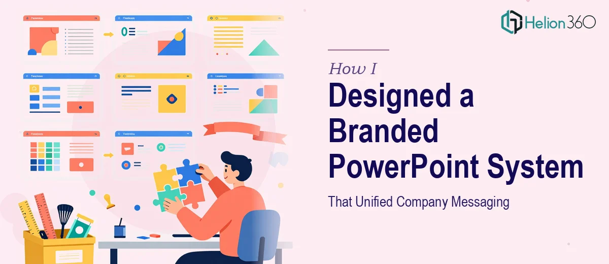
The Problem with Inconsistent Presentations Across the Company
Every time someone on our team sent a deck externally, I'd wince a little. One version had the old logo. Another used a font we'd quietly retired two rebrands ago. A third had slides that looked like they were built in a hurry — because they were. Individually, none of it was catastrophic. Collectively, it was a brand consistency problem that was starting to affect how we showed up to clients and partners.
The stakes weren't abstract. We had a series of client presentations, an internal all-hands, and a sales cycle where first impressions mattered. Every deck that went out looking slightly off was quietly undermining the credibility we'd spent time building. I knew what needed to happen: we needed a branded PowerPoint template system that anyone on the team could use and still produce something that looked intentional and on-brand. The question was what that actually took to build properly.
What I Found a Proper Branded Template System Actually Requires
I assumed building a template was a few hours of work — drop in the logo, set the colors, call it done. What I actually found was a different picture entirely.
A properly built branded PowerPoint template isn't a single file with a few branded slides. It's a system built at the master slide level, which means changes propagate across every layout in the deck. Getting that architecture right requires understanding how Slide Master, Layout Masters, and placeholders interact — and that's a layer of PowerPoint most people have never touched.
Beyond the architecture, there's the brand application itself. Typography hierarchies — title, subtitle, body, caption — need to be locked in at correct sizes (typically 36pt/28pt/18pt/12pt or a defined scale) and mapped to specific fonts. Color palettes need to be set in the theme color panel so they appear correctly in charts, shapes, and SmartArt — not just in manually applied formatting. Then there's the layout work: building enough slide varieties (title, section divider, two-column, full-bleed image, data slide, closing) that users aren't tempted to improvise their own layouts and break the system. Each of those variants needs to be purpose-built, not copied and nudged. That's when I realized this wasn't a weekend project.
What the Work Actually Involves at Execution Depth
The structural foundation of a branded template system lives in the Slide Master. Doing this correctly means building a master that defines fonts, colors, and background treatments at the top level, then creating individual Layout Masters beneath it — each purpose-built for a specific slide type. A well-built system typically includes 10 to 15 distinct layout variants. The challenge is that most users have never worked at this layer of PowerPoint, and errors made here — mislinked placeholders, overridden theme colors, broken font inheritance — cascade invisibly through every slide built from that template. Getting the master layer right before building layouts is the single most critical sequencing decision in the whole project.
Visual mechanics are the second major layer. Typography discipline means enforcing a defined scale — commonly 36pt for titles, 24pt for subheadings, 18pt for body, and 12pt for captions — applied through named text styles rather than manual formatting. Color discipline means loading the exact brand hex values into the PowerPoint theme panel (not just applying them via the color picker) so that charts, diagrams, and shapes all pull from the same source. A 12-column alignment grid set at the slide level ensures that content boxes, images, and icon placements feel structured rather than arbitrary. Each of these mechanics is precise, interdependent, and time-consuming to implement correctly across every layout variant.
Polish and consistency across the full template set is where most DIY attempts fall apart. It's not enough for one or two slides to look right — every layout needs to pass the same visual audit: consistent safe zones and margins (typically 0.4–0.5 inch insets), logo placement locked and not manually repositioned, icon and image placeholder behavior that doesn't distort content, and slide numbers or footer elements that render correctly on every variant. Running that audit across 12 to 15 layouts — then testing the template with real content to catch edge cases — is several hours of focused review work that most teams don't have the bandwidth to do properly.
Why I Brought in Helion360 to Handle It
I looked at what the work actually required and made the call quickly. This wasn't a task to experiment with or learn on the job — not with the timeline we had and the number of people who would be relying on whatever we built.
Helion360 handled the full project end-to-end. That meant auditing our existing brand assets and identifying exactly what needed to be codified, building the full Slide Master and layout system from scratch, applying the typography scale and theme color panel correctly, and delivering a complete template set with enough layout variety that our team wouldn't need to improvise. The turnaround was fast — done in days, not weeks — and the delivery included a set of slides that worked as a cohesive system, not a collection of formatted pages.
What made the difference was that this is the kind of work Helion360 does continuously. The tooling, the process, and the brand application expertise were already in place. There was no learning curve on their end, which meant no wasted time on ours.
The Result and What I'd Tell Anyone Facing the Same Problem
What came back was a template system that our team actually adopted. The layouts covered the full range of use cases — pitch decks, internal updates, client-facing proposals — and the brand application was consistent down to the chart color behavior and footer alignment. More importantly, the decks people started producing from it looked like they came from the same company. That's the outcome we needed.
The downstream effect was real: fewer revision cycles, fewer "can you fix the branding on this" requests, and a noticeable lift in how our materials were received externally. The template did exactly what a good system should — it made the right output the default output.
If you're looking at the same problem — inconsistent decks going out, a rebrand that hasn't made it into your templates, or a presentation system that simply doesn't exist yet — Helion360 is the team to engage. They delivered for me fast, handled the full execution depth this work requires, and the system has held up ever since.