

Why Sports Nutrition Branding Is a Different Kind of Design Problem
The supplement aisle — physical or digital — is one of the most visually competitive retail environments in consumer packaged goods. A sports nutrition brand entering this space is not simply asking for a logo. It is asking for a complete visual identity system that can simultaneously communicate scientific credibility, athletic energy, and a sense of community that health-conscious consumers can trust.
When that system is built well, every touchpoint — the tub on the shelf, the Instagram ad, the email header, the pitch deck for a retail buyer — feels like it belongs to the same confident brand. When it is built poorly, the brand looks like it assembled its identity piece by piece from disconnected sources, which is exactly how most early-stage CPG brands actually do it. The gap between those two outcomes is almost entirely a function of how seriously the foundational design work is treated before a single label gets printed.
The stakes are not abstract. A misaligned label on a supplement product can cost thousands in a reprint run. A brand that reads as generic in a crowded market loses shelf consideration before a consumer ever reads the ingredient panel. Getting this right from the start matters.
What Serious CPG Brand Design Actually Requires
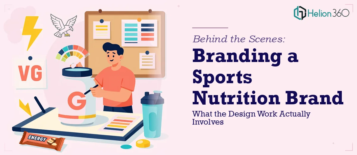
Branding a sports nutrition company is not a single-deliverable project. Done properly, it produces a system of interconnected assets that all derive from the same foundational decisions. The work breaks into four meaningful layers.
The first is the core identity — the logo, its wordmark, its icon mark, its clear-space rules, and its approved color variations (full color, reversed, single-color). A professional logo system for CPG use is not one file; it is typically a set of twelve to twenty source files covering every context from embossed packaging to digital favicon.
The second layer is the color and typography system. This needs to be defined with print specifications in mind from day one, not retrofitted later. A palette built only in RGB will produce jarring shifts when converted for CMYK offset printing or Pantone spot colors on packaging.
The third layer is packaging design — which is its own discipline within branding. Label layouts must account for regulatory panels, net weight statements, supplement facts boxes, and barcode placement, all while leaving room for the brand to breathe visually.
The fourth layer is the brand guidelines document itself — the rulebook that prevents visual drift across every designer, agency, or vendor who touches the brand after launch.
How to Approach the Design Work Properly
Building the Visual Identity System
The logo development phase for a sports nutrition brand typically involves two to three distinct concept directions before refinement begins. Each direction should be tested against real-world contexts — a tub mockup, a T-shirt, a social media profile icon — not just presented on a white canvas. A mark that reads powerfully at 500 pixels often becomes indecipherable at 32 pixels, which is the favicon size. Testing for this early saves painful revision cycles later.
The color palette for a supplement brand deserves particular care. The standard guidance of capping a palette at four brand colors holds here, but the selection of those colors carries real strategic weight. Dark, saturated primaries (deep navy, charcoal, black) communicate premium positioning and are common in elite performance nutrition. Bright secondary accents — electric blue, neon green, vivid orange — signal energy and are frequently used as flavor-differentiation colors across a product line. A brand using one primary and three flavor-accent colors has a system that scales. A brand with six equally weighted colors has visual chaos.
For typography, the hierarchy for a supplement label typically runs: product name at 36–48pt equivalent, subhead or descriptor at 20–24pt, and supporting text (usage directions, callouts) at 10–12pt minimum for readability compliance. The font choice must include a weight that works in all-caps, since supplement labeling conventions lean heavily on capitalization for impact.
Packaging Design as a Standalone Discipline
Packaging for a sports nutrition product involves working with dieline templates provided by the contract manufacturer or printer. A 2.5 lb protein tub, for example, will have a specific label width that wraps around the container — often 340–360mm wide — with a defined bleed zone of 3mm on all edges. Designing outside those constraints produces a label that does not physically fit the container.
The supplement facts panel is federally regulated and non-negotiable in its placement and minimum type size (6pt for most elements under FDA guidelines). The design has to plan for this panel as a fixed anchor point, then build the brand expression around it rather than treating it as an afterthought.
Smart packaging design also plans for a product line at the start. If the brand intends to launch six flavors of a protein powder, the template system should be built so that flavor-color swaps are a single layer change in the source file, not a full redesign. Source files in Adobe Illustrator with properly named layers — BASE, FLAVOR COLOR, PRODUCT NAME, REGULATORY — make this scalable. Source files that are flattened or poorly organized make every new SKU a separate full-day project.
Brand Guidelines as a Living Operating Document
The brand guidelines document is what transforms a design project into a brand system. A complete guidelines document for a CPG supplement brand typically runs 30–50 pages and covers logo usage rules, minimum size thresholds (the logo should never appear smaller than 25mm wide in print), color values in HEX, RGB, CMYK, and Pantone, typography specimens at each hierarchy level, photography and lifestyle imagery direction, and tone-of-voice principles.
The photography direction section is often underinvested. A supplement brand that defines whether its lifestyle imagery should feel raw and gritty versus clean and aspirational — and shows examples of both approved and off-brand reference images — gives every future content creator a usable decision framework. Without that guidance, the brand's Instagram feed drifts into incoherence within six months.
What Goes Wrong When This Work Is Underbuilt
The most common failure is starting with packaging before the identity system is finalized. A logo created inside a label layout inherits the constraints of that layout and rarely translates cleanly to other applications. The sequence matters: identity first, packaging second, everything else third.
Color specification is a persistent problem. A brand that defines its primary color only in HEX will discover, at the first print production run, that its digital blue does not have a clean Pantone equivalent and that CMYK conversion shifts it noticeably. Building color in Pantone from the start — even if the brand is digital-first today — costs almost nothing extra and prevents expensive surprises later.
Inconsistency compounds across vendors. When packaging is designed by one party, social media templates by another, and the pitch deck by a third, color drift and typography drift accumulate. The brand's hero color ends up as three slightly different values across three deliverables. In print, those differences are visible. A brand guidelines document with locked-down specifications is the only reliable fix.
Underestimating the polish phase is also extremely common. The gap between a working draft label and a print-ready file is not cosmetic — it involves font outline conversion, image resolution verification (300 DPI minimum for all raster elements), bleed and safety zone checks, and overprint settings for black text. Skipping any of these steps produces files that printers reject or that produce visible print defects.
Finally, building assets as one-offs rather than templates almost always creates pain at scale. A social media post designed as a standalone file cannot be efficiently adapted for the next product launch. A post built as a template with editable text and swappable color layers takes the same time to build initially and saves hours on every future use.
What to Take Away Before You Start
The core principle is that a sports nutrition brand's visual identity is an investment in compounding returns. Every asset built on a solid, well-documented system gets cheaper and faster to produce over time. Every asset built without that system gets more expensive to fix as the brand grows.
The practical starting point is always the same: lock down the identity and color system before touching packaging, lock down packaging templates before producing campaign assets, and write the brand guidelines document while the rationale behind every decision is still fresh.
If you would rather have this work handled by a team that builds brand systems for high-growth product companies every day, Helion360 is the team I would recommend.