

When the Data Was Ready but the Story Wasn't
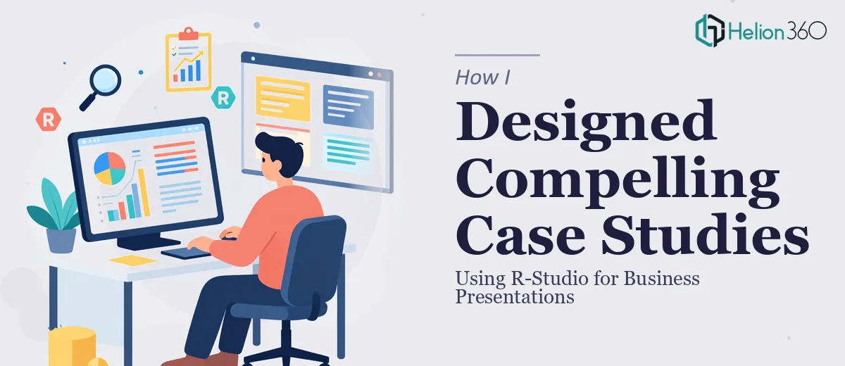
I had spent weeks running statistical models and pulling insights from market trend and customer behavior data using R-Studio. The analysis was solid. The outputs — regression outputs, cluster charts, correlation matrices — were all there. But when I opened a blank PowerPoint slide and looked at everything I had, I realized I was facing a different kind of problem entirely.
The data told a clear story inside R-Studio. The moment I tried to translate that into a business case study presentation, things fell apart. Tables that made sense in a statistical context looked dense and unreadable on a slide. Visualizations exported from R looked clinical, not compelling. And the narrative connecting the numbers to actual business decisions was missing.
This was not a data problem. It was a presentation design problem.
What I Tried on My Own
I started by exporting charts directly from R-Studio and dropping them into slides. The result looked like a rough academic report, not a polished business presentation. I then tried recreating some of the visuals manually in PowerPoint, but reproducing complex statistical outputs in a way that was both accurate and visually clean took far more time than I had.
I also experimented with adjusting layouts, tweaking color schemes, and adding commentary around each chart. Every iteration improved things slightly, but the overall deck still lacked the kind of visual coherence and storytelling flow that a business audience expects from a proper case study presentation.
The issue was structural. I understood the research deeply, but translating rigorous data analysis into a presentation format that executives and stakeholders could actually absorb — that required a different skill set.
Bringing in the Right Support
After hitting that wall, I came across Helion360. I explained where I was — the analysis was done, the content was ready, but the presentation design was not holding up. Their team understood the problem immediately. They had handled case study presentation work before and were comfortable working with data-heavy research outputs.
I shared the R-Studio exports, my raw slide drafts, and a brief on the audience and purpose. From there, their team took over the design and layout work entirely.
What the Final Presentation Looked Like
Helion360 rebuilt the deck with a clear visual hierarchy. Complex statistical outputs were converted into clean, readable charts that still preserved the integrity of the data. Market trend analysis was laid out across a logical flow — context, methodology, findings, implications — so that someone unfamiliar with the research could follow it from start to finish.
The customer behavior segments I had identified through clustering were turned into a visual summary that was immediately understandable without needing a statistics background. The data visualization throughout the deck was consistent in style and color, which made the entire presentation feel like a unified piece of work rather than a collection of exported graphs.
What struck me most was how the narrative structure improved. The slides guided the audience through the business case study in a way that felt natural, not forced. Each section answered a logical question before moving to the next. That kind of presentation flow is genuinely hard to engineer when you are deep inside the data.
What I Took Away From This
Research and presentation are two separate crafts. I had the analytical side covered, but the design and communication layer needed dedicated attention. Working through R-Studio to surface real business insights is demanding work — and it deserves a presentation format that does justice to those findings.
If the goal is to actually influence decisions, the way information is presented matters as much as the information itself. A business case study presentation that looks rough or reads like a raw report will undercut even the strongest analysis.
If you are working through something similar — good research, strong data, but a presentation that is not landing the way it should — Helion360 is worth reaching out to. They handled the design and storytelling layer that I could not, and the final deck reflected the quality of the underlying work.