

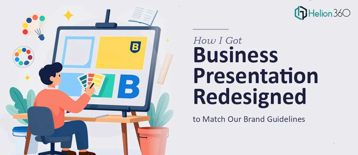
The Presentation Existed. The Problem Was It Didn't Look Like Us.
We had a business presentation that needed to go out to a group of stakeholders who would be forming opinions about our company based on what they saw on those slides. The copy was written, the images were gathered, and the structure was roughly in place. But the file looked like it had been assembled in a hurry — inconsistent fonts, misaligned elements, and not a single slide that reflected our actual brand guidelines.
That mattered. This wasn't an internal working document. It was going in front of people who would be judging our credibility and professionalism before we even said a word. A presentation that looks off-brand or amateurish sends a signal that's hard to walk back. I knew the content was solid. I just needed the design to match the quality of what we were actually saying.
It was clear this had to be done properly — not patched up.
What I Discovered About What "Properly" Actually Means
My first instinct was to think this was a formatting job. Apply the logo, swap some colors, adjust a few fonts, done. That assumption fell apart quickly once I started looking at what brand-consistent professional presentation design actually involves.
Brand guidelines aren't just a color palette. They specify exact hex values, approved typeface pairings, logo placement rules with defined exclusion zones, and permitted image treatments. A presentation that violates any of these — even subtly — doesn't just look off, it creates legal and brand integrity issues for larger organizations.
Beyond brand compliance, there's the matter of visual hierarchy. Good presentation design uses a strict type scale — typically something like 36pt for headlines, 24pt for subheadings, 16pt for body — and that scale has to be applied consistently across every slide, including ones with unusual amounts of content. Then there's layout discipline: a proper 12-column grid that keeps elements aligned, breathing room between content blocks, and slide-to-slide visual rhythm that makes the deck feel intentional rather than assembled.
I realized fast that this was not a weekend project.
What the Work Actually Involves
The right approach to a brand-consistent business presentation redesign starts with a structural audit of the existing file. Before any visual work begins, the source content needs to be reviewed slide by slide — what's the hierarchy on each slide, what's the primary message, and does the current layout actually support that message? Sometimes a slide is carrying three ideas that should live on two slides, or a visual is placed where it fights the headline. Practitioners make deliberate decisions here about what stays, what moves, and what gets stripped back. This phase alone can take several hours on a deck of even moderate length, and getting it wrong means the design work that follows is built on a shaky foundation.
Visual mechanics are where the bulk of the execution friction lives. A proper layout grid — typically 12 columns with defined margins and gutters — has to be configured in the slide master so it propagates reliably across every layout variant in the deck. Type scales need to be set and locked: the right pairing of a strong display font at 36pt for headlines and a legible body face at 16pt, with intermediate sizes that don't break the rhythm. Imagery needs to be placed, cropped, and masked consistently — not just dropped in at whatever size it arrived. For someone doing this without an established workflow, each of these decisions is a research project unto itself, and the accumulated time adds up fast.
Polish and brand consistency across many slides is the final layer, and it's where most self-directed attempts unravel. Applying a brand palette correctly means using no more than four approved colors in defined roles — primary, secondary, accent, neutral — and never improvising. Logo placement has to honor exclusion zones on every background variant. Slide transitions, icon styles, and chart formatting all need to follow a single visual language from the first slide to the last. Even experienced designers building outside their usual toolkit will spend significant time on QA passes just to catch the inconsistencies that creep in across a multi-slide file.
Why I Brought Helion360 In to Handle It
I looked at the scope of what proper execution required and made the decision quickly: this wasn't something to attempt on the side while managing everything else on my plate. The learning curve alone on master slide configuration and brand-compliance QA would have cost more time than the deadline allowed.
Helion360 handled the full project end-to-end. That meant taking the existing file with its raw copy and images, auditing the structure, building out a properly configured slide master that matched our brand guidelines exactly, and redesigning every slide within that framework. They also handled the image treatment and chart formatting so the visual language held throughout.
The turnaround was fast — done in days, not weeks. What would have taken me significantly longer to attempt — and likely still not match the standard required — was handled in a fraction of that time by a team that does this work daily with the tooling and process already in place.
What Came Back and What I'd Tell Anyone in the Same Spot
What came back was a deck that looked like it came from the same house as our other branded materials. The fonts, the spacing, the color application, the logo placement — all of it was correct and consistent. The slides had a clarity and visual rhythm that the original version didn't come close to. The stakeholders who received it made comments about how professional it looked before the conversation even started. That's exactly the kind of first impression the content deserved.
If you're sitting on a presentation that has the right content but doesn't yet look the part — especially one that needs to hold up to brand scrutiny — the path I'd recommend skips the trial-and-error entirely. Helion360 is the team to engage when you need this handled end-to-end and delivered fast, without the weeks of iteration that come with attempting it yourself.