

Why Charity Event Design Is Harder Than It Looks
There is a particular kind of design work that gets underestimated nearly every time: the complete visual package for a nonprofit charity event. A golf classic for an organization like the American Cancer Society is not just a logo job. It is a coordinated system of assets that all have to feel like they came from the same place — the logo, the sponsorship packet, the website banner, the save-the-date card — while also speaking clearly to a specific audience in a specific place.
When that system is fragmented, the consequences are visible. Sponsors receive a packet that looks disconnected from the event website. Guests open a save-the-date that feels generic rather than exciting. Donors who might have increased their giving quietly disengage. The stakes are real: nonprofit events live and die by first impressions, and those impressions are built on design before a single conversation happens.
Done well, event graphic design creates immediate credibility. Sponsors feel like they are attaching their brand to something polished and professionally run. Attendees feel anticipation. Donors feel the mission is being taken seriously. That is the difference between design that is simply completed and design that actually works.
What a Proper Event Design Package Actually Requires
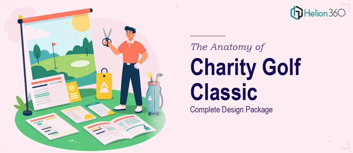
The scope of a charity golf classic design package is wider than most people expect before they sit down with it. There are at least four distinct deliverable types — each with its own format requirements, audience context, and production constraints — and they all need to share a coherent visual identity.
The logo anchors everything. It has to work at multiple sizes, from a small corner stamp on a banner to a large header on the sponsorship packet. That means it cannot be raster-heavy or overly detailed at small scale. The logo also has to carry the tone of the event: a coastal California golf tournament for a cancer research charity needs to feel both elevated and warmly approachable.
The sponsorship packet is a persuasion document as much as it is a design artifact. It has a job: to convince a business to write a check. That means hierarchy matters enormously — what the sponsor sees first, second, and third is a strategic choice, not an aesthetic one.
The website banner and save-the-date card operate in completely different contexts. A web banner competes for attention in a browser environment where loading speed and pixel density both matter. A save-the-date card is often printed, which means CMYK color management, bleed settings, and resolution requirements (300 dpi minimum) come into play in ways that digital-only designers sometimes miss.
Distinguishing good from rushed execution comes down to whether these four deliverables feel like a family or like four separate jobs stitched together at the end.
How to Approach Event Graphic Design the Right Way
Start with the Visual Identity Before Any Deliverable
The single most important decision made early in this kind of project is the palette and typographic system. Everything else derives from it. For a coastal San Diego golf event, the palette logic often pulls from the environment: deep Pacific blues, warm sand neutrals, coastal greens that stop short of being too country-club predictable. A well-built palette for this context caps at four brand colors — one primary action color (used for calls to action, key numbers, and logo marks), one supporting color, one neutral, and one accent. Going beyond four introduces drift across deliverables.
Typography should follow a clear three-level hierarchy: a display face for event titles and headlines (typically 36–48pt in print contexts), a subheading face for section labels and sponsor tiers (24pt), and a body face for all supporting copy (10–12pt for print, 14–16pt for digital). Mixing more than two typeface families at this stage is a common source of visual noise that compounds badly across a six-asset package.
Building the Logo So It Actually Travels
A charity golf event logo needs to be designed in vector format from the start, delivered as an SVG and AI source file, with clean PNG exports at multiple resolutions: 72 dpi for web at full banner width, 300 dpi for print use. The mark itself should be legible when reduced to roughly 1.5 inches wide — a useful test is to drop it into the corner of a letter-sized document at that size and check whether the detail holds.
For a coastal California event with a golf theme, the strongest logo compositions tend to combine a simple iconic mark (a golf element, a coastal silhouette, or a sun reference) with a clean wordmark rather than trying to pack everything into an emblem. Emblems with fine detail break at small sizes and reproduce poorly on embroidered merchandise — a practical constraint that matters if the event sells branded gear.
Designing the Sponsorship Packet as a Persuasion Document
The sponsorship packet is where design and strategy intersect most visibly. The structure that tends to perform well starts with a one-page overview: the event mission, date, venue, and expected attendance presented in a visually clean layout with the logo prominent and the charity affiliation clear. Page two introduces sponsorship tiers — Title, Gold, Silver, Community — each with a distinct visual weight in the layout. The highest tier should occupy the most visual real estate; a common rule is that the Title tier block should be roughly 2.5 times the visual size of the lowest tier block.
Color is used functionally here: each tier gets a color treatment drawn from the brand palette so that the hierarchy is readable at a glance. Benefits lists within each tier should be formatted as clean prose or short inline descriptions, not dense bullet cascades — sponsors read this document quickly, and cognitive load matters.
Web Banner and Save-the-Date Card Specifics
The website banner typically needs to function at a standard leaderboard size (728×90px) and a hero or event-page banner size (1440×480px or similar). At leaderboard scale, only the event name, date, and a single call to action survive legibly. At hero scale, there is room to introduce the visual world — the palette, a coastal imagery reference, the logo — more fully.
The save-the-date card, if going to print, should be built at 5×7 inches at 300 dpi with a 0.125-inch bleed on all sides. The front carries the event visual and essential information; the back carries the URL, registration details, and any QR code if the event uses digital registration. Typography at this size needs to be tested in a printed proof — screen renderings of small type are consistently more optimistic than the physical result.
What Goes Wrong When This Work Is Underestimated
The most common failure mode is treating the four deliverables as independent jobs rather than a coordinated system. A designer who builds the logo first and then adapts it for each downstream asset without a defined style guide will find that color values drift — what starts as a specific hex (#1A5276, for example) becomes a slightly different blue in the sponsorship packet because the color was eyedropped rather than defined. After three or four deliverables, the package no longer looks unified.
Another persistent problem is underestimating the polish phase. Getting a layout to "working draft" state takes a fraction of the time that getting it to "ships to print or goes live" state takes. Alignment checks across a multi-page sponsorship packet, kerning corrections in headline text, and margin consistency across all four deliverables are hours of work that drafts do not reveal.
File handoff is also where projects frequently stumble. Delivering a logo only as a flattened PNG — without the vector source — leaves the client unable to resize the mark cleanly for future uses like event signage, merchandise, or next year's package. Every deliverable in this context should come with an editable source file and a clear export.
Finally, color management between print and digital is a real technical constraint that gets skipped in fast turnarounds. Building the palette in RGB for web and forgetting to define the CMYK equivalents for print means the save-the-date card comes back from the printer with colors that look noticeably different from the website. That gap is jarring and avoidable.
What to Take Away Before You Start
Charity golf event design is a systems problem as much as it is a creative one. The visual identity has to be established before any individual asset is built, the deliverables have to be treated as a family, and the technical requirements of each output format — print resolution, digital sizing, file format — have to be respected from the beginning rather than retrofitted at the end.
If you would rather have this work handled by a team that does exactly this kind of coordinated event and brand design every day, Helion360 is the team I would recommend.