

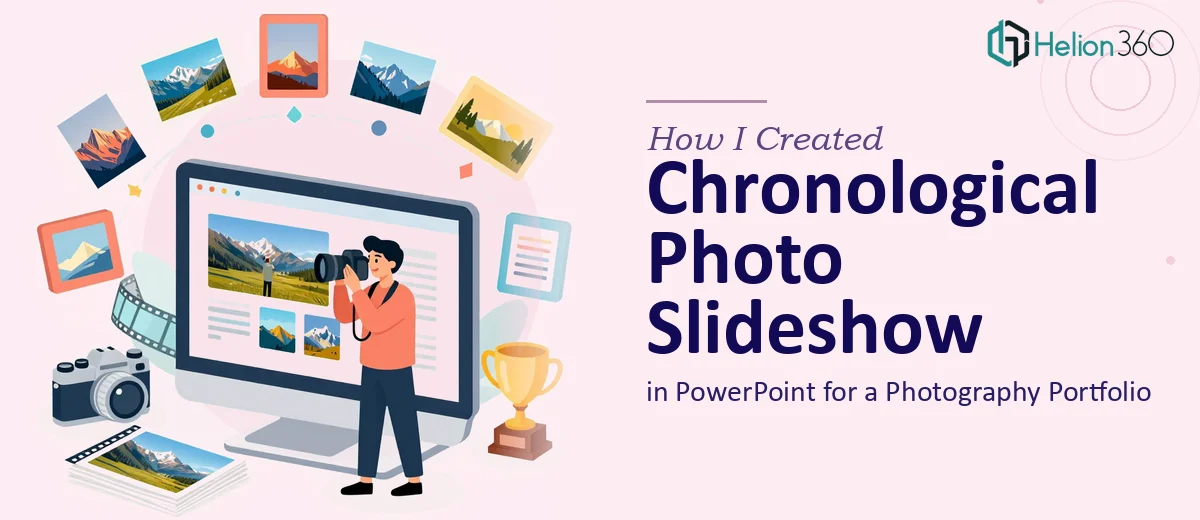
The Goal: A Slideshow That Tells a Story Over Time
When I decided to put together an online portfolio for my photography business, I knew one thing for certain — I wanted visitors to experience my work the way it actually unfolded. Not a random collection of shots, but a year's worth of projects arranged in chronological order, showing growth, range, and consistency.
The plan was simple: a clean, engaging photo slideshow in PowerPoint that could be embedded on the website. Chronological order would give it a natural flow, almost like flipping through a visual journal.
Why I Tried Building It Myself First
I've used PowerPoint before. Mostly for basic presentations, but enough to feel reasonably comfortable. So I opened it up, started pulling in images, and set up a rough slide structure — one project per month, photos laid out with minimal text, clean transitions.
It looked okay. But okay wasn't the problem.
The problem was that my photos deserved better than okay. When I started trying to match the layout to my brand — specific colors, fonts, consistent image sizing across different aspect ratios — things got messy fast. Some images stretched. Others felt cramped. The timeline I wanted to show across slides had no visual cohesion. And the transitions I applied felt either too flashy or too flat.
I also realized that what I'd imagined in my head — a slideshow that feels like a curated photography portfolio, not a school project — required a level of design thinking I just didn't have the time or tools to execute properly.
Bringing in the Right Help
After a few frustrating evenings trying to fix layouts and redo slide masters, I reached out to Helion360. I explained the project: a chronological photo slideshow in PowerPoint covering roughly the last 12 months of work, meant to sit on a photography portfolio website, and designed to reflect my brand visually.
Their team asked the right questions upfront — what was my brand palette, how many projects did I want to include, did I want subtle animations or purely static transitions, and how would the file ultimately be used online. That conversation alone gave me confidence that they understood the brief beyond the surface level.
What the Final Slideshow Actually Looked Like
Helion360 came back with a structure that I hadn't fully thought through myself. They organized the slides into monthly sections with a light visual separator between each time period — nothing heavy, just enough to reinforce the chronological flow. Each project got its own consistent layout, with images given room to breathe and minimal text used only where context was genuinely needed.
The design matched my brand without overwhelming the photography. The fonts, spacing, and color accents were pulled from the brand references I'd shared, and they held consistently across all slides. The transitions were smooth and understated — the kind that move the viewer forward without distracting from the images.
They also set up the master slide properly, so if I ever want to add new work later, the format is already there waiting.
What This Project Taught Me About Presentation Design
Building a chronological photo slideshow in PowerPoint sounds like a straightforward task. And technically, it is something anyone can attempt. But there's a real gap between a slideshow that functions and one that actually represents your work well.
For a photography portfolio especially, the presentation design has to stay out of its own way. The layout, pacing, and visual consistency need to serve the images — not compete with them. That kind of restraint takes design judgment, not just software skills.
The version I built myself was usable. The version Helion360 delivered was something I was genuinely proud to put on my website.
Need a Slideshow That Actually Represents Your Work?
If you're working on a photography portfolio or any visual presentation where the design needs to support rather than distract, Helion360 is worth reaching out to. They handle the complexity so you can focus on what you actually do well.