

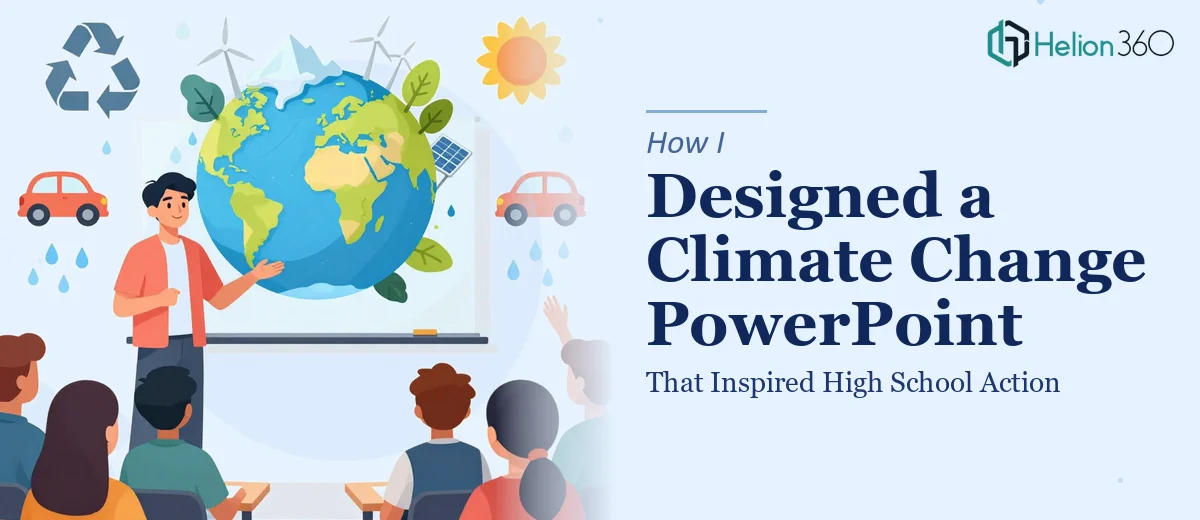
The Assignment Was Simple. The Execution Was Not.
When I was asked to put together a climate change PowerPoint for high school students, I thought it would be straightforward. Pick some facts, add a few charts, use a green color palette, done. But the moment I sat down and started building slides, I realized the gap between "informative" and "actually engaging for a 17-year-old" was much wider than I expected.
The presentation needed to cover the effects of climate change, the role individual actions play in mitigation, and realistic solutions — all without sounding like a textbook. It also needed to look sharp enough to hold attention in a classroom setting where students are already distracted by their phones.
Where My DIY Approach Hit a Wall
I started by pulling together data from reputable sources — global temperature trends, carbon emission stats, sea level projections. The content was solid. The problem was translating it into something visually digestible for students who had never sat through a data-heavy presentation willingly.
My first draft had too much text on each slide. The charts looked functional but flat. I tried adding stock images but the slides started feeling inconsistent — some slides looked clean, others looked like a science fair poster from 2009. When I added the interactive discussion questions at the end of each section, they broke the visual flow entirely.
I also struggled with tone. Climate change is urgent, but if the slides lean too heavily into doom-and-gloom, students disengage. I needed a balance between urgency and empowerment — something that made them feel like their choices actually matter. That required a storytelling structure I was not experienced enough to execute through slide design alone.
Bringing in the Right Help
After about two frustrating days of revisions that made things worse, I reached out to Helion360. I shared my draft, explained the audience — final-year high school students — and walked through what the presentation needed to accomplish. Their team asked the right questions immediately: What was the call to action? Were the discussion questions meant to be facilitator-led or student-driven? What tone should the visuals carry?
That conversation alone told me I had been approaching the design without enough clarity on the communication goal.
What the Final Presentation Looked Like
Helion360 restructured the entire flow. The presentation opened with a single striking statistic — the kind that lands in the gut before the brain has time to rationalize it. From there, each section moved logically: what is happening, why it matters at a personal level, what the data actually shows, and what students can realistically do.
The data visualization was handled thoughtfully. Instead of raw bar charts, they used simplified infographics that compared familiar reference points — how much CO2 one flight produces versus a year of plant-based meals, for example. The visuals were bold and clean without being childish. The color palette stayed consistent throughout, which made the whole deck feel intentional rather than assembled.
The interactive elements — discussion prompts and reflection questions — were designed as distinct slide types with their own layout, so they stood out from the informational slides without disrupting the visual rhythm. Students could clearly tell when it was time to think and respond versus when they were receiving information.
What This Experience Taught Me About Educational Presentation Design
Designing a climate change presentation for high school students is not just a content challenge — it is a design and communication challenge. The information has to be accurate, but the packaging determines whether students actually absorb it or zone out after slide three.
A few things became clear through this process. Visual storytelling has to do real work in educational decks — it cannot be decorative. Data needs context and comparison, not just numbers. And interactive moments need to be designed, not just dropped in as text boxes.
The final deck was used in a classroom setting and the feedback from the teacher was that students were noticeably more engaged than in previous sessions on the same topic. That outcome came from the design doing its job.
If you are working on an educational or awareness presentation and finding that your content is solid but the slides are not landing the way you hoped, Helion360 is worth reaching out to — they brought both the design clarity and the communication strategy that turned a decent draft into something that genuinely worked.