

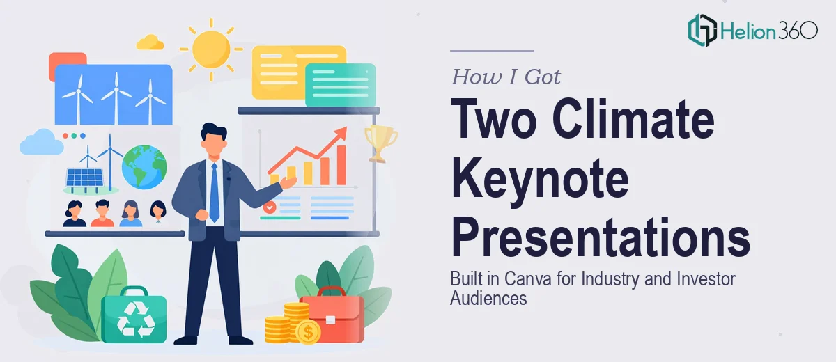
The Problem Was Two Audiences, One Subject, Zero Margin for Error
I had two keynote presentations to deliver on climate change research — one for a room of industry professionals who wanted operational and scientific depth, and one for a group of investors who needed the same findings framed around opportunity, urgency, and financial relevance. Same underlying data. Completely different audiences. Completely different jobs for the content to do.
Both were being built in Canva, and both had hard deadlines. The stakes were real: the industry deck would be used as a recurring reference piece at sector conferences, and the investor deck was going into active fundraising conversations. Getting the copy structure wrong — or worse, using the same narrative structure for both — would have meant walking into those rooms with the wrong tool.
I recognized immediately that this wasn't a formatting problem. It was a content architecture problem, and it needed to be handled properly.
What I Found the Solution Actually Required
Once I started mapping out what "done well" actually looked like here, the complexity became obvious fast.
The first signal was the audience divergence. Industry audiences engage with technical specificity — data provenance, methodology, sector implications. Investor audiences need a compressed problem-solution-scale arc where every slide is quietly answering "why does this matter to my return?". Writing copy that serves both from the same source material isn't a matter of trimming words. It requires two completely different narrative architectures built from scratch.
The second signal was the Canva constraint. Canva's presentation environment has real strengths, but maintaining copy hierarchy, visual consistency, and slide-level pacing across a long deck — particularly when working with dense scientific content — requires deliberate structural discipline that doesn't come for free from the tool.
The third signal was the illustration and infographic layer. Climate data is inherently visual — temperature trends, emissions trajectories, sector-level breakdowns — and presenting it in a way that reads quickly in a live keynote context is a specialized skill that sits at the intersection of data visualization and editorial judgment.
What the Work Actually Involves
The right approach starts with a structural audit of the source material before a single slide gets touched. For a climate research presentation, this means mapping which findings are claim-level versus evidence-level, then sequencing them differently depending on the audience's decision-making frame. An industry audience needs the evidence surfaced early to establish credibility. An investor audience needs the claim surfaced early and the evidence used to defend it. Building two separate narrative maps from the same research — with clear slide-by-slide copy briefs for each — is typically a multi-hour exercise even for experienced content strategists, and skipping it produces decks that feel unfocused regardless of how polished the visuals are.
The visual mechanics layer is where climate content specifically gets difficult. Proper data visualization for keynote use follows rules that aren't intuitive: a single chart per slide, axis labels set no smaller than 14pt for room projection, a maximum of four data series before a chart becomes unreadable at distance, and color palette limited to three to four brand-consistent hues with one accent for the key data point being argued. Infographics depicting complex systems — carbon cycles, emissions flows, policy timelines — require a grid-based layout (typically a 12-column base) so that visual weight is balanced and the eye follows the intended reading path. Executing this inside Canva means building custom frames and element groups that don't drift across slides, which takes both design skill and tool fluency.
Polish and consistency across a multi-deck project adds another layer of execution risk. When two decks share a visual identity but serve different audiences, the temptation is to treat them as variations of each other. Done properly, they should share a palette, a type hierarchy (typically 36pt titles, 24pt subheads, 16pt body), and a logo/brand application standard — but diverge completely in layout density and copy tone. Maintaining that discipline across every slide in both decks, without letting one bleed into the other's register, is the kind of detail that consumes hours of revision if the consistency framework isn't locked in from the start.
Why I Brought in Helion360 to Handle It
I looked at what the work genuinely required — dual narrative architecture, research-grade data visualization, and consistent brand execution across two separate Canva decks — and I didn't see a path to doing it well myself in the time available. I wasn't going to spend weeks learning the nuances of keynote-ready infographic design while also trying to think clearly about what each audience actually needed to hear.
Helion360 handled the full project end-to-end. That meant the narrative structuring for both decks, the copy framing calibrated to each audience, and the complete visual build in Canva — including the data visualization and custom illustration work for the climate research content. They turned it around quickly, in a fraction of the time it would have taken me to work through the learning curve and execution depth this kind of project demands. The two decks came back as genuinely distinct pieces — not variations of each other — each built for the room it was walking into.
What the Delivered Work Made Possible — and What I'd Tell Anyone in My Spot
The industry deck landed with the kind of credibility that dense technical content needs — the findings were structured to be followed, not just absorbed, and the infographics made complex data readable without oversimplifying. The investor deck did the other job: it moved. The narrative arc was tight, the data was used to support an argument rather than document a study, and the visual language signaled that the people behind this content understood the room they were in.
Both decks were done in days, not weeks, and came back ready to use without a round of structural rework.
If you're looking at a similar challenge — dual audiences, research-heavy content, and a tool like Canva that requires real discipline to execute well at this level — Helion360 is the team I'd engage. They handled the full scope fast, and the execution depth showed in both decks.