

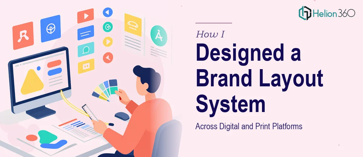
The Situation That Made It Clear This Needed to Be Done Right
We were at a critical stage for our startup. The website wireframes were ready, the marketing direction was set, and the pressure was on to get everything looking and feeling like one unified brand — across the website, slide decks, and print collateral. It wasn't just about aesthetics. Every touchpoint needed to communicate the same visual identity, or the credibility we'd spent months building would quietly fall apart the moment a prospective client moved from our website to a proposal deck and noticed the disconnect.
The stakes were real. We had a launch window, a marketing team ready to execute, and no margin for a design system that only half-worked. I knew quickly that pulling this off well — with genuine consistency across digital and print — was not a casual weekend project. The right approach was to bring in people who do this for a living.
What I Found a Real Brand Layout System Actually Requires
When I started looking at what doing this properly involved, the scope became apparent fast. A brand layout system isn't a single deliverable — it's a set of interlocking decisions that have to hold together across very different formats and contexts.
The first signal of real complexity was the platform diversity. Designs built for a 1440px web grid don't automatically translate to a 1920x1080 presentation slide, and neither of those translates cleanly to a print format with CMYK color profiles and bleed margins. Each medium has its own technical rules, and a layout that looks sharp on one can feel broken on another if the foundational system wasn't designed with cross-platform discipline from the start.
The second signal was typography. A proper type hierarchy for a brand layout system requires more than picking two fonts. The relationship between heading sizes, body text, captions, and callouts has to be deliberate and consistent — and it has to work at different scales without being rebuilt from scratch each time. That level of typographic precision takes trained judgment, not guesswork.
The third was brand guideline enforcement at the execution level. Having a set of brand guidelines is one thing. Building layouts that actually honor them — across every color application, spacing rule, and component state — is entirely another.
What the Work Actually Involves at Each Stage
The foundation of a brand layout system is the structural grid. For digital, the standard is a 12-column grid with defined gutters and margins, typically 24px gutters at desktop breakpoints, scaling down for tablet and mobile. For print, the grid shifts to a baseline grid tied to leading, often 8pt or 12pt increments, with bleed allowances of 3–5mm depending on the print vendor's specifications. Getting both grids set up correctly, and ensuring they inform every subsequent layout decision rather than being treated as suggestions, is where most DIY attempts start to unravel. The grid has to be established in the master files before any content is placed — retrofitting it later means rebuilding everything.
Visual mechanics — specifically typography and color — carry the heaviest consistency burden. The right approach defines no more than 4 brand colors with clearly specified hex, RGB, and CMYK values, then maps each color to a precise role: primary CTA, background, body text, accent. Typography follows a strict hierarchy: display at 48–56pt, section headings at 32–36pt, subheadings at 20–24pt, body at 14–16pt, captions at 10–12pt. Practitioners enforce these ratios across every layout format, adjusting only for medium-specific optical corrections. Deviating even one level breaks the visual rhythm, and clients rarely notice it consciously — they just feel that something is off.
Polish and cross-platform consistency is the stage that consumes the most invisible time. Every component — buttons, callout boxes, data tables, image frames — has to behave identically whether it appears on a web page, a presentation slide, or a printed one-pager. That means building a component library, not just individual layouts. It means testing how brand colors render on screen versus in print, adjusting for the perceptual shift between RGB and CMYK. It means catching the edge cases: what happens to the layout when a heading runs two lines instead of one, or when an image is portrait instead of landscape. These are the details that separate a brand layout system that actually scales from one that looks fine in the first five uses and then quietly degrades.
Why I Brought Helion360 in to Handle It End-to-End
I didn't attempt this myself. The scope was clear, the technical depth was real, and the timeline wasn't compatible with a learning curve. What I needed was a team that already had the tooling, the cross-platform expertise, and the discipline to enforce brand consistency at the execution level — not just produce attractive individual layouts.
Helion360 handled the full project: structural grid setup for both digital and print formats, typography system, color palette mapping with CMYK and RGB specifications, and a component library that the marketing team could actually use going forward. The turnaround was fast — what would have taken me weeks to research, set up, and get right was delivered in days. The team worked directly from our wireframes and brand guidelines, asked the right questions early, and came back with a system that held together across every format we needed.
What the Project Delivered — and What I'd Tell Anyone in My Position
The result was a brand layout system that the marketing team adopted immediately and has been using consistently ever since. The website, the pitch deck, and the printed leave-behind all feel like the same brand — not three different teams working from a shared mood board. That consistency has paid off in ways that are hard to quantify but easy to notice: meetings where prospects comment on how polished the materials feel, and no one has to explain why the slide deck looks different from the website.
If you're looking at a similar scope — cross-platform brand layout design that needs to actually hold up under real-world use — and you want it handled end-to-end without the weeks of setup and iteration, Helion360 is the team I'd engage. They delivered fast, brought genuine execution depth, and the system they built has scaled well beyond the initial launch.