

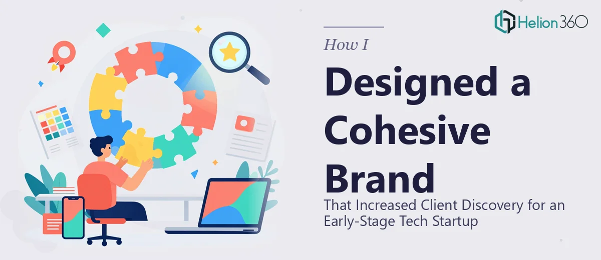
When a Business Profile Is More Than Just a Slide Deck
When I first took on the task of building a business profile presentation for an early-stage tech startup, I thought it would be straightforward. The founder had a clear idea of what the company did, a rough color palette in mind, and a short list of services they wanted to highlight. On paper, it sounded like a contained project.
What I did not fully anticipate was just how many moving parts a cohesive company profile actually involves — especially when the goal is to use it as a discovery tool across digital platforms, not just a one-time pitch document.
The Real Scope of Building a Brand Profile Presentation
The startup was in its early stages, which meant there was no existing brand system to work from. No finalized logo suite, no established color hierarchy, no typography decisions that had been tested across different formats. Everything needed to be built from the ground up and then applied consistently.
I started by drafting the structure — an introduction to the company, a services overview, a value proposition section, and a brief team snapshot. That part came together reasonably well. But when I tried to extend the visual language into a presentation format that could also function as a shareable digital profile, things started to get complicated.
The slides looked fine individually, but they did not feel like a unified brand. The typography felt inconsistent across sections, the icon style shifted between slides, and the overall visual tone did not quite match what the startup was trying to communicate — something modern, credible, and approachable for enterprise clients.
I spent a few evenings trying to resolve it. I adjusted color weights, swapped fonts, reworked the layout grids. Each fix seemed to introduce a new inconsistency somewhere else.
Bringing in the Right Support
After a week of going back and forth on the same slides, I reached out to Helion360. I described the situation honestly — the structure was mostly in place, but the visual execution and brand consistency were falling short of what the client needed. Their team asked a few pointed questions about the intended audience, the platforms where the profile would be used, and the overall brand personality the startup was going for.
Then they got to work.
What came back a few days later was a fully redesigned business profile presentation that actually looked and felt like a coherent brand. The typography was deliberate and consistent. The layout had a clear visual rhythm that carried across every section. The color usage was disciplined — accent colors were used purposefully rather than decoratively. Even the icon set had been unified so that every element felt like it belonged in the same visual world.
What Made the Difference
Looking at the finished presentation, it was clear that the gap had not been about effort — it was about design system thinking. Building a brand profile presentation for a startup is not just about arranging content on slides. It is about establishing a visual language from scratch and then applying it with enough discipline that every slide reinforces the same impression.
Helion360 approached it like a brand design problem, not just a slide formatting task. They considered how the presentation would appear when shared as a PDF, how it would look on a company profile page, and how the visual tone would be read by a potential enterprise client seeing the startup for the first time.
The result was a company profile presentation that the startup could genuinely use as a client discovery asset — something they could send in a first outreach email, share on their website, or display at a demo event without any visual inconsistency undermining the message.
What I Took Away From the Process
The experience reinforced something I had suspected but not fully acted on before: presentation design for brand identity work requires a different skill set than general slide building. When a company profile is meant to represent a brand to new audiences, every design decision carries more weight. The spacing, the hierarchy, the color relationships — all of it communicates credibility before the reader processes a single word.
For an early-stage startup trying to establish trust with potential clients, that first visual impression matters more than most founders realize.
If you are working on a company profile presentation and finding that the visuals are not coming together the way the content deserves, Helion360 is worth reaching out to — they handled the part of this project that was genuinely beyond a quick fix, and the outcome spoke for itself.