

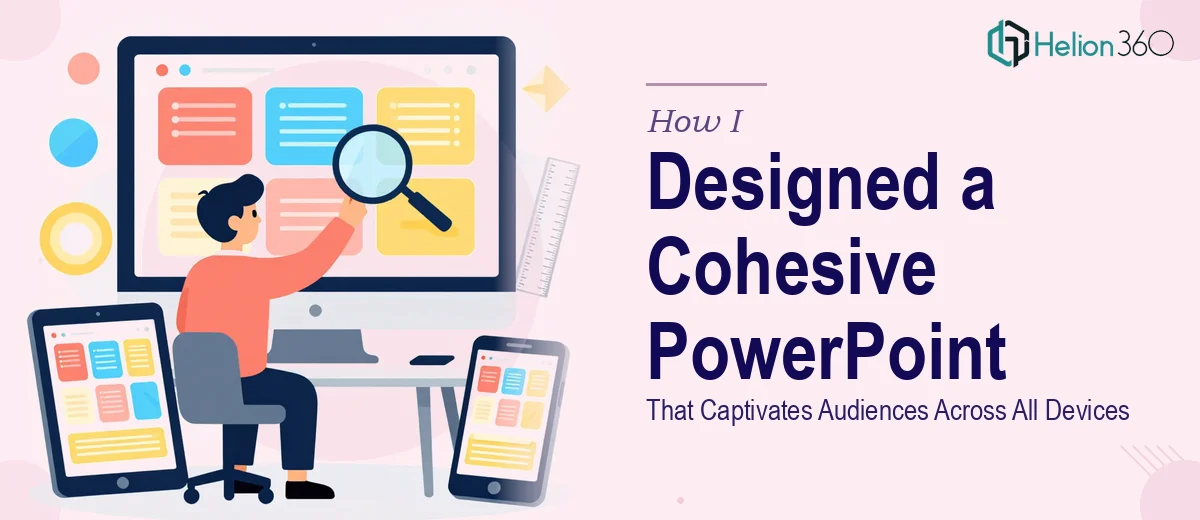
The Problem With My Presentation Was Bigger Than I Thought
I had a multi-purpose presentation that needed to work across every context imaginable — projected on a conference room screen, viewed on a laptop during a one-on-one, and shared as a PDF follow-up after the meeting. The same deck. Every surface. And it needed to look intentional and consistent every single time.
What I had was a collection of slides built at different times by different people. The fonts didn't match. The brand colors were slightly off across slides. Charts looked sharp on one screen and muddy on another. It wasn't unusable — but it wasn't the kind of presentation that builds confidence in a room.
The stakes were real. This deck represented the organization externally. It was going to be in front of decision-makers. I knew immediately that patching it slide by slide wasn't going to produce the result I needed. It had to be rebuilt with coherence as the starting point, not an afterthought.
What I Found a Cohesive Presentation Design Actually Requires
When I started looking into what it actually takes to build a presentation that holds together visually across all contexts, I quickly realized this was not a formatting job. It was a design system job.
First, the slide master architecture in PowerPoint is the foundation of everything. If the master slides aren't set up correctly — with properly defined layouts, font styles, and placeholder positions — every slide that gets built on top of them will drift. One wrong edit to a base layout can cascade across thirty slides.
Second, cross-device rendering is genuinely technical. Colors defined in RGB display differently when projected through a standard business projector. Font rendering shifts between Windows and macOS. A layout that looks balanced on a widescreen monitor can feel cramped on a 1024×768 projector output. Getting this right requires knowing which color models to use when, not just picking what looks good on your own screen.
Third, the visual logic of the deck — the hierarchy of information, the pacing of slides, the use of white space — needs to be intentional from the start. These aren't decorative decisions. They're structural ones. And getting them right across a full deck takes more than design taste; it takes discipline and time.
What the Work on a Professional Presentation Design Project Actually Involves
The first major area of work is structural and narrative — auditing what the existing content is trying to communicate and building a logical slide architecture around it. A well-structured presentation follows a clear hierarchy: a title treatment, section openers, content slides, and a summary framework. Typography in a correctly built deck follows a strict scale — typically 36pt for primary headings, 24pt for subheadings, and 16–18pt for body text — applied uniformly through the master slide system. Getting this right means rebuilding the slide master from scratch rather than patching over what already exists. For someone unfamiliar with how PowerPoint's master-layout-slide relationship works, this step alone can consume an entire day before a single content slide is touched.
The second area is visual mechanics — the grid, the color system, and the chart and icon treatment. A presentation built to a 12-column layout grid holds together visually in a way that freehand-positioned content never does. Brand color application needs to be disciplined: no more than 4 primary colors used with intention across the full deck, with accent colors reserved for emphasis rather than decoration. Charts require consistent styling — matching axis labels, unified line weights, and color assignments that map logically to the data being shown. The friction here is subtle but significant: small inconsistencies in stroke weight or color hex values across slides are invisible to an untrained eye during the build and completely obvious on a projected screen.
The third area is cross-device polish and consistency — ensuring the deck renders correctly whether it's displayed on a 16:9 projector, viewed in PowerPoint on a Windows machine, opened in a browser via a sharing link, or exported to PDF. This involves checking embedded font behavior, verifying that image resolution holds up at projection scale (minimum 150 DPI for in-deck graphics), and confirming that animations or transitions don't break on systems where hardware acceleration behaves differently. Each of these checks takes time even for experienced practitioners, and skipping any of them creates problems that surface at exactly the wrong moment.
Why I Brought Helion360 In to Handle the Full Project
I didn't attempt to rebuild this myself. Looking at what the work actually required — master slide architecture, a disciplined grid system, cross-device rendering checks, consistent brand application across every slide — it was clear this was a full design system project, not a cleanup task.
The right move was to engage a team that already had the process, the tooling, and the eye for this kind of work. Helion360 handled the full project end-to-end: the slide master rebuild, the brand color and typography system, the chart and layout standardization, and the cross-device verification pass.
What would have taken me weeks to research, attempt, and iterate through was delivered fast — done in days, not weeks. The team understood exactly what a cohesive presentation design requires and didn't need ramp-up time to figure out the approach. That speed mattered. So did the confidence that came from knowing the execution depth was actually there.
The Result and What I'd Tell Anyone Who's Looking at the Same Problem
The delivered deck held together the way a professionally designed presentation should. The typography was consistent. The color system was clean. Charts read clearly at every screen size. The slide master was built so that any future additions could be made without breaking the visual logic of the rest of the deck.
More practically: the presentation stopped being something I felt I needed to apologize for or explain in the room. It did its job visually so the content could do its job substantively.
If you're looking at a presentation that needs to be rebuilt into something cohesive and professional — and you can see how much the work actually involves — Helion360 is the team to engage. They handled the full scope fast, and the execution depth showed in every slide.