

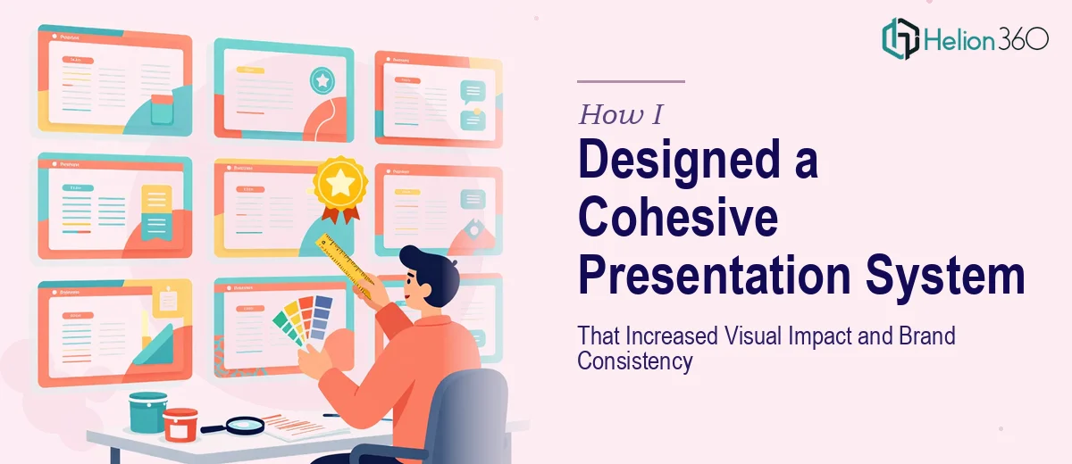
The Slides Were Fine — But They Didn't Feel Like Us
I had been sitting with a folder full of presentation files for weeks. Each one had been built at different times, by different people, with different goals. The fonts didn't match. The color palette drifted from slide to slide. Some layouts felt spacious and modern, others looked like they were built in 2009.
None of it was broken, exactly. But none of it felt consistent either. When I put the full deck together ahead of a major presentation, the lack of cohesion was impossible to ignore.
I knew what the problem was. What I didn't know was how to fix all of it without starting from scratch.
Trying to Fix It Myself
I started by pulling everything into a single PowerPoint file and going slide by slide. I updated the fonts on a few sections, swapped out some color fills to better match our brand palette, and tried to standardize the title layout across the deck.
After a few hours, I had made some progress — but the result still felt patchy. The slides I had redesigned looked noticeably better than the ones I hadn't touched yet, which only made the inconsistency worse. I also realized I had no real system. I was making one-off decisions on every slide instead of building a presentation design framework that could scale across the whole deck.
The deeper issue was that I was treating symptoms rather than the cause. There was no master layout, no defined type hierarchy, no consistent approach to how graphics and images were used to support slide content. Every fix I made revealed two more things that needed attention.
Bringing in Professional Help
After hitting a wall, I came across Helion360. I explained the situation — a multi-section deck that had grown organically over time, no consistent brand application, and a deadline that was closer than I would have liked.
Their team asked the right questions upfront. What did the brand guidelines look like? What kind of audience would be viewing the slides? Were there existing materials I wanted to preserve, or was I open to a full visual refresh? Within a day, they had reviewed the sample slides I sent and came back with a clear plan.
What the Redesign Actually Involved
The work Helion360 did went well beyond swapping fonts and adjusting colors. They built a consistent slide design system from the ground up — starting with a defined color palette drawn directly from our brand assets, a clear typographic hierarchy with readable font sizes for both large screens and laptop presentations, and a set of master layouts that covered every slide type we used regularly.
Every graphic and image placement was purposeful. Instead of decorative visuals added for filler, each image was chosen and positioned to reinforce the slide's main point. The whitespace was balanced intentionally. The overall result felt like it had been designed as a single product, not assembled from separate parts.
What struck me most was how consistent the alignment and spacing was across every slide. It sounds like a small thing, but when everything lines up correctly and the visual weight is distributed evenly, the whole presentation gains a level of professionalism that is difficult to achieve when you're doing it manually, slide by slide.
What Changed After the Redesign
When I presented the updated deck, the feedback was immediate. People noticed the visual clarity before they even engaged with the content. The branded color scheme grounded everything visually and made each section feel like it belonged to the same story.
More practically, I now had a reusable system. The master layouts and style guide Helion360 built meant that any new slides I added going forward would automatically match the rest of the deck. That alone saved time on every future presentation update.
The process also taught me something I had underestimated: PowerPoint design and formatting is not just about making things look good. It is about building a visual system that communicates clearly, reinforces your brand, and holds together under pressure — whether you're presenting to ten people or a hundred.
If your presentation materials are in a similar state — technically usable but visually inconsistent — reach out to Business Presentation Design Services. They took a scattered set of slides and turned them into a coherent, brand-aligned presentation system that I could actually build on.