

The Situation Was Simpler Than I Made It Sound — Until It Wasn't
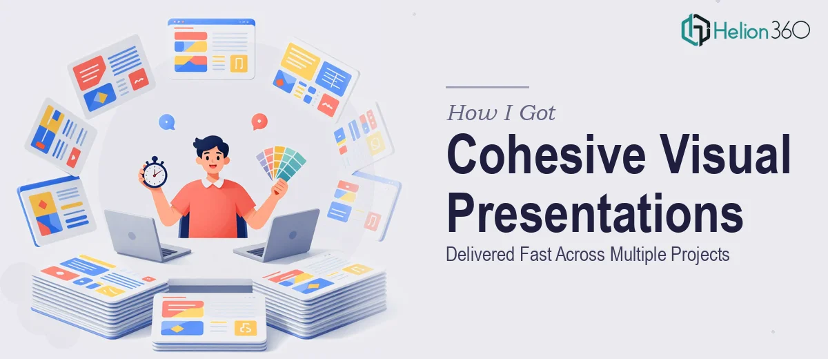
We were a startup in growth mode, pushing out marketing materials, pitch assets, and internal presentations at a pace that made "we'll clean it up later" a dangerous habit. The problem wasn't a lack of content. We had content. What we didn't have was visual coherence. Every deck looked like it came from a different company. Infographics were inconsistent. Slide layouts varied slide to slide. Brand colors drifted depending on who touched the file last.
The stakes were real. These materials were going in front of prospects, partners, and people who form opinions fast. A presentation that looks disjointed signals a company that isn't buttoned up — and in a competitive market, that impression sticks. I knew the only acceptable path forward was cohesive, professional visual presentation design across every asset we were producing. That meant doing it right, not doing it quickly and hoping no one noticed.
What I Found Out This Kind of Work Actually Involves
My first instinct was to scope this out properly before making any decisions. What I found was that professional visual presentation design is not just "making slides look nicer." It operates at the intersection of brand discipline, visual storytelling, and audience psychology — and each one of those things has real mechanics behind it.
The first signal of complexity was brand consistency at scale. Keeping a palette disciplined across twenty or thirty slides — where every chart, icon, and background element obeys the same rules — requires a working design system, not just good taste. The second was the storytelling layer. Visuals that actually engage audiences aren't just attractive; they're sequenced deliberately to guide attention and build understanding. That's a craft skill, not a production skill. The third signal was the sheer volume. Multiple concurrent projects — decks, infographics, brochures — with different audiences and different purposes, all needing to feel like they came from the same brand. That's not a weekend project. That's a sustained, specialized workflow.
What the Work Actually Requires to Be Done Well
The structural and narrative foundation of a strong visual presentation starts before a single slide is designed. The right approach involves auditing all existing source material, identifying the core message each piece needs to communicate, and mapping a story arc that shapes how information is sequenced. A well-structured deck uses a clear hierarchy — typically a 36pt headline, 24pt supporting text, and 16pt detail copy — so every slide communicates its point in the first three seconds of viewing. Getting this foundation wrong means beautiful visuals built on a confusing structure, which is one of the most common failure modes in presentation design. Practitioners who skip this step usually pay for it during revisions.
Visual mechanics — how layouts, grids, and chart types are chosen and applied — is where execution complexity compounds quickly. Proper slide layout relies on a 12-column grid that defines margins, content zones, and alignment anchors consistently across every master and layout slide. Chart selection follows deliberate rules: a waterfall chart for sequential financial changes, a dot plot for comparative rankings, a stacked bar only when part-to-whole relationships are the point. Getting these choices wrong doesn't just look amateur — it actively misleads the audience. Setting up a master slide system that enforces these rules correctly, without breaking across different screen ratios or export formats, takes hours of careful configuration even for experienced designers.
Polish and brand consistency across a multi-project scope is where most in-house attempts fall apart. The discipline required means no more than four active brand colors applied according to a hierarchy — primary for dominant surfaces, secondary for accents, a neutral for backgrounds, and one reserved highlight. Every icon set must share the same stroke weight and visual style. Photography and illustration treatments must follow a defined tone. When this discipline is applied across brochures, infographics, and presentation decks simultaneously, the cognitive load of checking every element for compliance is significant. A single inconsistent typeface or off-brand chart color is usually invisible in isolation and obvious the moment everything is placed side by side.
Why I Brought in Helion360 to Handle It
I looked at the scope — multiple live projects, brand consistency requirements across formats, real audiences with real opinions — and it was immediately clear that the smart move was to engage a team that does this work every day rather than attempt to staff or execute it piecemeal.
Helion360 handled the full project end-to-end: they established the visual design system from the ground up, applied it consistently across all presentation decks and marketing collateral, and built the infographics with both brand accuracy and audience clarity in mind. What would have taken weeks of learning curve, tool setup, and iterative trial-and-error was turned around quickly — done in days, not weeks. The team came in with the master slide architecture, grid system, and brand application logic already in their workflow. There was no ramp-up time. They absorbed the brief, understood the brand direction, and executed at a level that made every asset feel like it came from the same confident, coherent company.
The Result and What I'd Tell Anyone Looking at the Same Problem
What came back was a complete set of visually compelling presentations — presentations, infographics, and marketing collateral that all read as the same brand without looking like they were stamped from a template. The response from partners and prospects shifted noticeably. Materials that used to prompt questions about "which version is current" now landed cleanly. Internal teams stopped touching the files because there was nothing left to fix.
The output wasn't just good-looking. It was structurally sound, brand-compliant, and built on a design system we could actually maintain going forward. That's the difference between a one-off polish job and work done by people who understand visual presentation design at a systems level.
If you're looking at a similar situation — multiple projects, brand consistency requirements, real audiences, and not enough runway to do it right yourself — Helion360 is the team I'd engage. They delivered end-to-end, fast, and at the level of craft this kind of work genuinely requires.