

The Situation and What Was at Stake
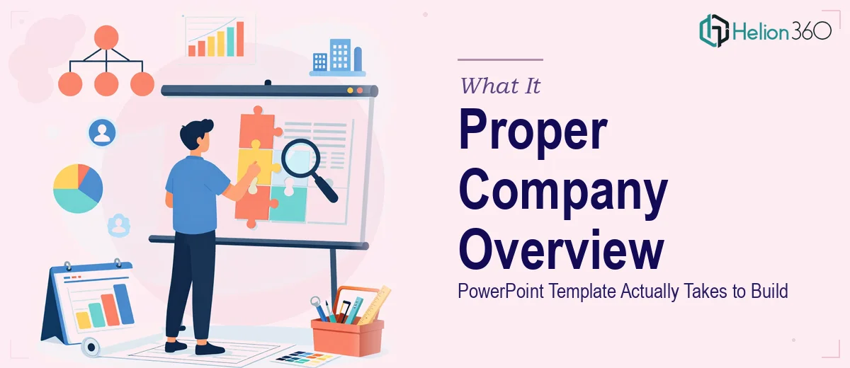
I needed a company overview PowerPoint template that could do real work — not just look decent on a laptop screen, but hold up in front of prospects, partners, and executives. The brief covered a lot of ground: company history, key achievements, team bios, services, and a closing call-to-action slide, all unified under a consistent brand identity.
The stakes were straightforward but significant. This template would be used repeatedly, by multiple people, across different contexts — digital presentations and printed leave-behinds alike. A sloppy or inconsistent template doesn't just look unprofessional once; it creates a compounding problem every time someone opens it. Getting this right from the start mattered more than saving a few days on the front end.
Once I understood the full scope, it was clear this wasn't something to patch together over a weekend.
What I Found the Solution Actually Required
I started mapping out what a properly built company overview presentation template actually involves, and the list grew fast. This isn't about picking a theme and swapping in a logo. Done well, it requires deliberate decisions at every layer — layout architecture, master slide structure, typography hierarchy, and brand application across a wide variety of slide types.
Three things signaled real complexity almost immediately. First, the template had to serve genuinely different content needs — narrative slides for history and mission, data-adjacent slides for achievements, portrait-style layouts for team bios, and a structured services grid. Each of those has different visual requirements, but they all have to look like they belong to the same family.
Second, the template needed to be editable and reusable by non-designers — meaning the logic had to be built in, not just applied once. If the master slides aren't set up correctly, the whole thing breaks the moment someone tries to customize a slide.
Third, print-readiness adds another dimension. What looks clean on screen at 96 dpi needs to hold up at 300 dpi, with bleed and margin considerations that most screen-first designers skip entirely.
What the Build Actually Involves
The structural work starts with a full content audit and slide-type mapping before a single design decision gets made. A company overview template typically requires eight to twelve distinct layout variants — title slide, section dividers, text-and-image splits, full-bleed image slides, bio cards, achievement highlights, a services grid, and a CTA close. Each layout needs to be designed to a consistent 12-column grid so that elements align predictably across slide types. Skipping this planning phase is where most DIY template attempts fall apart — the layouts look individually fine but feel visually disconnected when presented in sequence.
Visual mechanics are where the real precision lives. Typography hierarchy needs to be locked in across every master slide: typically a 40pt title, 24pt subtitle, and 16pt body, with consistent line spacing of 1.2 to 1.4. Brand colors — ideally no more than four active palette colors plus two neutrals — need to be mapped to specific use cases: primary for headlines, secondary for accents, neutrals for backgrounds and body text. Getting this into the theme color panel so it propagates correctly takes careful setup. The moment someone edits a slide outside the master structure, mismatches appear instantly if the color logic wasn't built in from the start.
Print-readiness requires a separate pass that purely digital templates never need. Slides destined for printed materials need to be sized correctly for the output format, with safe zones set at least 0.125 inches inside the trim edge to keep text and logos clear of any cutting margin. Image resolution across the template needs to be verified at export, and any gradient or shadow effects need to be tested at high resolution to confirm they don't degrade. This is a layer of QA that adds real time and requires knowing what to look for — it's not a step that can be eyeballed.
Why I Brought in Helion360 to Handle It
When I totaled up what this actually required — master slide architecture, grid-based layout design across a dozen slide types, brand color logic, typography hierarchy, bio and services layouts, and a print-ready QA pass — I wasn't looking at a small project. I was looking at a full build that demanded both design expertise and technical precision in PowerPoint itself.
I didn't attempt it myself. The gap between what I could produce and what this template needed to be wasn't a skill gap I could close quickly enough to matter. I brought in Helion360 to handle the company profile presentation design services.
They turned it around quickly — the kind of speed that comes from a team that builds these things all day with the tooling and process already in place. They handled the master slide architecture, all twelve layout variants, brand application across every slide type, and the print-ready export — delivered in days, not weeks. The editable file came back structured so that anyone on our team could use it without accidentally breaking the design logic.
The Result and What I'd Tell Anyone in This Position
What came back was a template that actually functions as infrastructure. Every slide type we needed was there, visually consistent, brand-accurate, and ready to be populated without touching the underlying structure. The team bios, services grid, and achievement slides all held their layout integrity regardless of how much or how little content went into them. The print version held up cleanly at high resolution.
More importantly, the template has been used repeatedly since delivery — by different people, for different audiences — and it still looks like it was designed that way on purpose. That consistency is the whole point of a properly built template, and it only happens when the underlying architecture is solid.
If you're looking at a similar scope — company presentation redesign that needs to cover multiple content types, stay on brand, and hold up across digital and print — I'd recommend exploring how company profile presentation design is handled by teams with this level of execution depth. Helion360 handled the full build fast, and the execution depth they brought to it is exactly what this kind of project needs.