

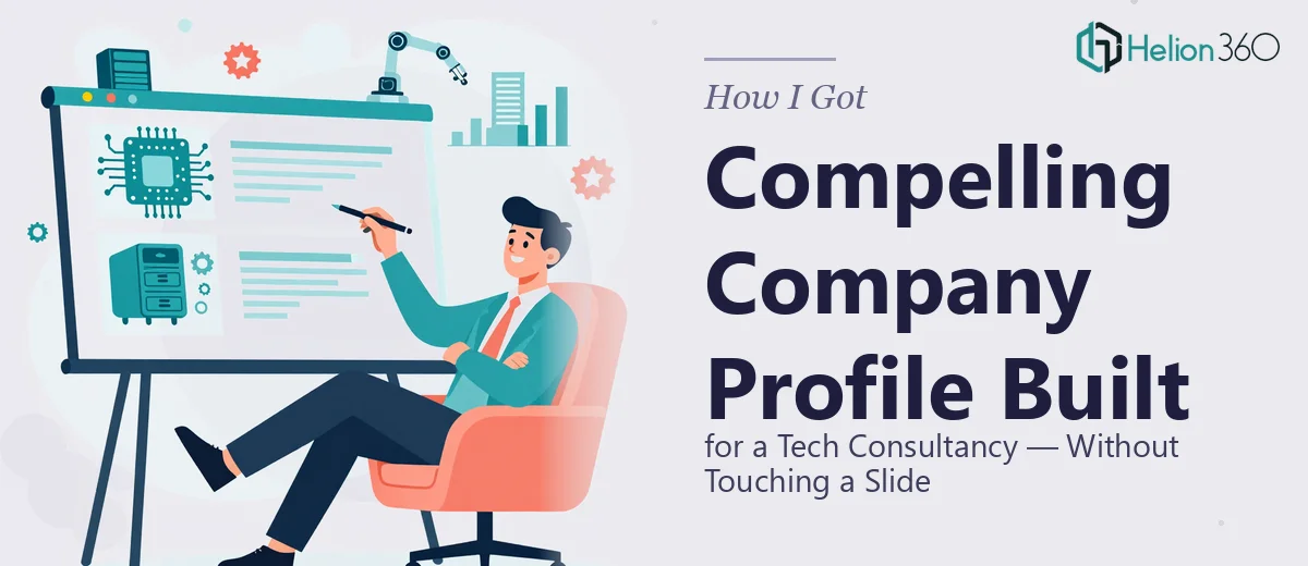
The Problem With Our Company Profile — and What Was at Stake
We had a company profile that existed in name only. There was a draft — some slides with text, a logo dropped on a white background, a few bullet points about our services — but nothing that reflected the actual caliber of what we do. As a consultancy operating at the intersection of technology and strategy, our work is sophisticated. Our clients are tech-savvy. They can spot a generic, thrown-together presentation from across a conference table.
The stakes were straightforward: we were walking into meetings with potential enterprise clients and early-stage startups that needed both advisory depth and technology execution. Our company profile was the first thing they'd see. If it didn't communicate credibility, strategic clarity, and a distinct identity — immediately — we were losing the room before the conversation started. I knew a polished, professional company profile presentation wasn't optional. It needed to be done right, and it needed to reflect a firm that genuinely understood both worlds it operated in.
What I Found a Proper Company Profile Presentation Actually Requires
When I started researching what a high-quality company profile presentation actually involves — not a passable one, but one that does real work in a sales context — the scope got bigger fast.
First, there's a narrative architecture problem. A company profile isn't just a formatted list of services. It has to tell a coherent story: who we are, what problem we solve, why we're the right team, and what it looks like to work with us. Each section has to earn the next slide. That structure isn't obvious — it takes deliberate information architecture before a single design decision is made.
Second, the visual system has to do real work. For a consultancy serving tech clients, the design language has to signal both credibility and innovation simultaneously. That's a harder brief than it sounds. Generic corporate templates don't get there. Custom visual systems — grids, type hierarchies, color logic — need to be built with intent.
Third, case studies and project showcases require their own design treatment. Presenting real work in a way that's both concise and convincing involves layout decisions that are entirely different from narrative slides. These sections trip up even experienced designers when the source material is dense or unformatted.
What the Work Actually Involves — From Structure to Final Slide
The structural and narrative work is where a company profile presentation either succeeds or falls apart before design begins. The right approach starts with auditing all source material — drafts, service descriptions, case study notes, mission statements — and mapping them against a logical story arc. For a consulting and technology firm, that arc typically runs: positioning and mission, core service lines, proof of capability through case studies, team and credibility signals, and a clear next-step close. Getting that sequence right so each section builds on the last is editorial work. It takes judgment calls about what to include, what to cut, and what order creates the most persuasive momentum. Done poorly, the deck reads like a brochure. Done well, it reads like a conversation.
Visual mechanics are the next layer of real complexity. A professional company profile presentation uses a defined layout grid — typically a 12-column structure — to maintain visual consistency across slides that carry very different types of content. Typography follows a strict hierarchy: a primary display size for slide headlines, a secondary size for body copy, and a tertiary for captions or supporting labels. A disciplined palette stays within three to four brand colors applied consistently, not improvised slide by slide. Setting up these systems correctly in a master slide environment — so that every layout inherits the rules and nothing drifts — takes hours of careful configuration. Doing this without a solid foundation in slide master architecture leads to visual inconsistency that experienced eyes notice immediately.
Polish and brand consistency across the full deck is where most self-built presentations visibly break down. A 20-plus slide company profile includes section dividers, data slides, case study layouts, team pages, and a closing call to action — each with different content density. Maintaining brand discipline across all of them means icon style, image treatment, color usage, and spacing all have to follow the same rules without exception. A single out-of-place slide — wrong font weight, inconsistent icon set, a photo that doesn't match the established treatment — undermines the credibility the rest of the deck is building. Systematic QA across every slide, checking alignment, spacing, and brand application, is time-consuming work that's easy to underestimate.
Why I Brought Helion360 In to Handle the Full Project
I looked at what the work actually required and made a straightforward call: this wasn't something I was going to pull off in the time I had, at the quality level we needed. The expertise — narrative architecture, custom visual systems, brand-consistent execution across a complex multi-section deck — wasn't something I could build on the fly.
Helion360 handled the full project end-to-end. That meant taking our raw draft and source material, developing the narrative structure, building the visual system from scratch to reflect a consulting and technology firm, designing every section including the case study layouts and service overview slides, and delivering a complete, production-ready deck. They turned it around quickly — done in days, not weeks — and the depth of execution covered everything from the slide master architecture to final brand consistency checks across every page. No hand-holding required on my end. That's the kind of team you want on work like this.
The Result — and What I'd Tell Anyone Facing the Same Problem
The delivered presentation looked and felt like the company we actually are. The narrative moved cleanly from positioning through proof to next steps. The visual system held up across every slide type — no drift, no inconsistency. Case studies were presented in a format that was concise and convincing without losing the substance. When we walked into meetings, the deck did its job: it signaled credibility before we said a word.
The business outcome was tangible. Conversations with potential clients started from a different baseline. The profile was doing real selling work, not just filling a gap in the process.
If you're looking at a similar situation — a company profile that doesn't reflect the quality of what you actually do, and a deadline that doesn't give you time to figure out narrative design and visual systems from scratch — Helion360 is the team to engage. They handle this kind of work end-to-end and deliver fast, with the expertise and tooling already in place.