

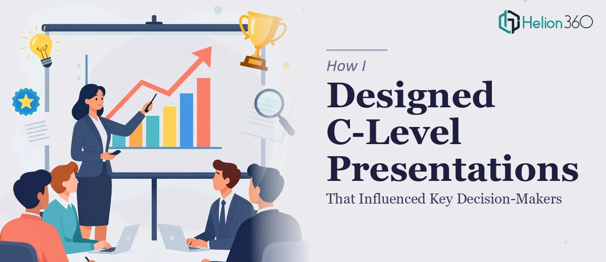
When the Stakes Were Too High to Get the Presentation Wrong
I had a board-level briefing on the calendar — the kind where the audience walks in already skeptical and walks out either ready to act or ready to move on. The presentation needed to distill months of research and strategic analysis into something that could hold the room for thirty minutes and close with a clear recommendation. The content existed, but it was scattered across reports, databases, and internal documents. Nothing was structured for a C-suite audience, and the visual layer was nonexistent.
This wasn't a situation where a passable deck would do. The decision-makers in that room would form a judgment within the first few slides, and if the narrative didn't land immediately, the analysis behind it wouldn't matter. I knew quickly that this needed to be done right — not assembled overnight with a template.
What I Found a C-Level Presentation Actually Required
Once I started looking seriously at what a high-quality executive presentation involves, the scope became clear fast. It isn't just about making slides look polished. The real work starts with the source material — research findings, data outputs, supporting documents — and requires someone to make deliberate decisions about what the audience needs to understand, in what order, and at what level of detail.
A C-level presentation has to carry a single coherent argument. Every slide has to earn its place in that argument. That means the narrative architecture has to be built before a single visual is created. Structuring a story arc for a skeptical executive audience is a specific skill — knowing where to lead with insight versus evidence, when to compress data into a single chart, and when a full-page visual says more than three bullet points ever could.
Adding to the complexity: the data had to be visualized in a way that communicated instantly, the branding had to be consistent and intentional throughout, and the whole thing had to feel cohesive — not like it was assembled from parts. That combination of requirements is not a weekend project.
The Work That Goes Into Getting This Right
The foundation of a strong executive presentation is structural. The right approach starts with a thorough audit of all source material — research, reports, data sets — followed by a deliberate mapping of the narrative arc. Done well, this means identifying the three to five core insights the audience must walk away with, then sequencing the slides to build toward a recommendation rather than simply reporting findings. The friction here is real: source material is rarely organized around a story. Pulling the signal from the noise, deciding what to cut, and writing slide-level headlines that drive the argument forward can easily take a full day of focused work before any design begins.
Visual mechanics are where a presentation either earns credibility or loses it. Proper layout uses a consistent grid — typically a 12-column structure — with a typography hierarchy that holds across every slide: 36pt for primary headlines, 24pt for supporting headers, 16pt for body content. Chart selection matters too — a poorly chosen chart type can obscure the very insight it's meant to communicate. A bar chart works for comparison; a slope chart shows change over time far more clearly than a standard line graph with crowded labels. Getting these decisions right for each data point requires both design fluency and analytical judgment. For someone building this type of deck infrequently, the trial-and-error alone adds hours.
Consistency across the full deck is what separates a professional result from something that looks assembled. A four-color brand palette applied correctly means every accent, background, and data series follows a rule — not a guess. Master slide architecture has to be set up so that changes propagate without breaking layout integrity across twenty or thirty slides. Achieving that level of polish requires working within slide master systems that most people haven't spent meaningful time in. The edge cases — slides that need custom layouts, data tables that don't fit the standard grid, charts that need brand-accurate color mapping — are where inconsistency creeps in and where an experienced team's familiarity with the tooling shows immediately.
Why I Brought Helion360 In to Handle the Full Project
I recognized early that attempting this myself wasn't the right move. The structural work alone — auditing the source material, mapping the argument, writing executive-level slide headlines — would have taken me significantly longer than the timeline allowed. The visual execution layer added another dimension I simply didn't have the tooling or practice to deliver at the standard this audience expected.
Helion360 handled the full project end-to-end. That meant taking the raw research and reports, building the narrative architecture, designing the full visual system, and delivering a deck that was presentation-ready. They turned it around quickly — done in days, not weeks — which mattered because the briefing date wasn't moving. The speed came from a team that does this type of work continuously, with established processes and design systems already in place. There was no ramp-up time, no back-and-forth on basics, and no version one that needed to be rebuilt from scratch.
What Was Delivered — and What I'd Tell Anyone Facing the Same Situation
What came back was a presentation that held together as a single argument from the opening slide to the final recommendation. The narrative moved in a way that respected the audience's time — leading with insight, supporting with evidence, and closing with a clear call to action. The visual layer was clean, brand-consistent, and built around data visualization choices that made the analysis immediately readable rather than requiring the room to decode a chart while I was speaking.
The briefing landed well. The decision-makers engaged with the content because the presentation didn't get in the way of it. That outcome came directly from the quality of execution — structure, visual design, and consistency working together.
If you're looking at a similar situation — research or analysis that needs to become a presentation that actually moves a room — and you want it handled end-to-end without the weeks of learning curve, consider an Executive Style Research Reports approach. For additional perspective on transforming analytical work into compelling presentations, see how others have tackled literature review to research presentation design, and explore what a thesis presentation on qualitative research actually requires. Helion360 is the team I'd engage — they delivered fast and brought exactly the depth of execution this kind of work requires.