

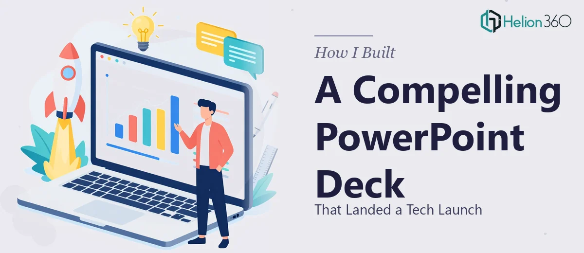
The Pressure of a High-Stakes Tech Launch Presentation
We had a product launch coming up and a window that wasn't going to stay open. The audience was a room of executive stakeholders — people who fund decisions, not follow slide transitions. The story we needed to tell was layered: market opportunity, technical differentiation, performance data, and a clear path to traction. All of it had to land in under twenty minutes.
I had the data. I had the narrative in my head. What I didn't have was a presentation that could carry the weight of that story in a room where first impressions are everything. A rough deck wasn't an option — not at this stage, not with this audience. I recognized quickly that doing this right was a job in itself.
What I Found Out a Good Tech Launch Deck Actually Requires
I started looking into what separates a presentation that moves a room from one that just reports information. The gap was bigger than I expected.
A data-driven presentation for a tech launch isn't just about making slides look clean. It starts with a narrative architecture — the decision about what story the data is actually telling, what gets foregrounded, what supports it, and what gets cut entirely. Get the arc wrong and even good data becomes confusing.
Then there's the visual translation problem. Raw findings from analysis — trend lines, market sizing numbers, performance benchmarks — need to be rendered into chart types that communicate at a glance. The wrong chart type for a given dataset doesn't just look bad; it obscures the point. And beyond charts, the overall visual system — grid, type hierarchy, color language — has to hold together across every slide without drifting.
The third signal that stopped me from attempting this myself: consistency at scale. A 25-slide deck that starts polished and deteriorates halfway through reads as unfinished. Maintaining that level of execution across the full deck, under time pressure, is a different skill set than knowing what good looks like.
What the Work Actually Involves
The foundation of a strong tech launch presentation is structural and narrative work — and it's more analytical than most people expect. The right approach starts with auditing all the source material: the research findings, the market data, the product specs, the KPIs. From there, a practitioner maps a story arc that follows a problem-solution-evidence-outcome logic, deciding which data points anchor each section and in what order. A deck like this typically needs five to seven distinct narrative beats to carry an executive audience from context to conviction. Getting this structure wrong means the visual work that follows it will also land wrong — no amount of design polish fixes a broken argument.
Visual mechanics are where the execution complexity accelerates. The standard for a professional data-driven deck involves a 12-column layout grid applied consistently across master slides, a typography hierarchy running at roughly 36pt for titles, 24pt for section headers, and 16pt for body and data labels. Chart selection follows specific rules — a waterfall chart for cumulative growth, a slope chart for before-and-after comparisons, a grouped bar for multi-variable benchmarking. Applying these conventions correctly across 20-plus slides, while keeping data labels readable and axis scales honest, takes a practiced eye and considerable time even for someone who knows the rules.
Polish and consistency across the full deck is the layer that separates a presentation that reads as authoritative from one that reads as assembled. The work involves holding a palette to a strict maximum of four brand colors, applying them with a defined hierarchy so that accent colors signal emphasis rather than decoration. Every chart frame, every icon, every data callout needs to sit on the same invisible grid. Spacing inconsistencies of even a few pixels compound across slides and create a sense of visual noise that an executive audience registers subconsciously. Running a full consistency audit across a finished deck — checking alignment, padding, font weights, and color usage slide by slide — is easily a multi-hour task on its own.
Why I Brought in Helion360 to Handle It
I looked at the scope clearly and made the call without spending time on an attempt I knew wasn't going to get there. The structural work, the data visualization decisions, the visual system, the consistency pass — that's a full project, not an afternoon.
Helion360 handled it end-to-end. They took the raw research output and source data, built the narrative architecture from it, and executed the full visual design across every slide. The data visualization work — translating market sizing figures, performance benchmarks, and trend data into the right chart types with proper labeling and hierarchy — was handled as part of the same engagement. The deck came back fast, done in days, not weeks, and built to the standard the audience expected.
What made the decision easy was knowing they do this work all day. The tooling, the design conventions, the judgment calls on narrative structure — it's already built in. I didn't have to manage a learning curve or a back-and-forth that would eat the timeline.
What Was Delivered and What I'd Tell Anyone in My Spot
The finished deck was 24 slides. It told a clean, evidence-backed story from market context through product differentiation to a credible growth path. The data visualization held up under scrutiny — the charts were readable, correctly typed for the data they carried, and consistent with the visual system throughout. The executive audience engaged with it the way a well-structured argument gets engaged with: they asked questions about the strategy, not about what a slide was trying to say.
The business outcome was exactly what the presentation was designed to support. The launch moved forward with stakeholder alignment in place.
If you're looking at a similar situation — a high-stakes deck, real data that needs to be communicated clearly, and a deadline that doesn't flex — Business Presentation Design Services is what you need. They deliver the full execution fast, and the depth of work they bring to it is exactly what this kind of presentation requires.