

The Situation and What Was on the Line
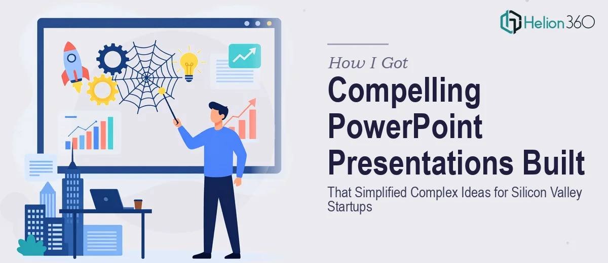
Working with early-stage Silicon Valley startups means operating in a world where first impressions carry serious weight. The investor pitch decks we were putting in front of investors, partners, and internal stakeholders needed to do more than look clean — they needed to take genuinely complex ideas and make them immediately legible to a room full of people who had seen hundreds of pitches before.
The problem wasn't a lack of ideas. It was that the raw material — product logic, market positioning, roadmap thinking — was dense and scattered across docs, whiteboard photos, and half-finished slides. Turning that into a presentation that actually moved people required a level of craft and structure that goes well beyond knowing your way around PowerPoint. I recognized quickly that this needed to be approached properly, not patched together under deadline pressure.
What I Found the Work Actually Required
Before doing anything, I spent time understanding what a genuinely well-built startup pitch deck or internal presentation actually involves. The gap between a passable slide deck and one that earns a second meeting is significant — and it's mostly invisible to people who haven't built them at this level.
The first thing that stood out was the narrative architecture. The sequence of slides isn't just a list of topics — it's a structured argument, and every slide has to earn its place in that argument. A slide that's out of order, or that front-loads complexity before the audience is oriented, can lose a room in seconds.
The second thing was the visual discipline required. Consistent typography hierarchies, on-brand color palettes applied across dozens of slides, and the use of infographics and diagrams that genuinely clarify rather than decorate — these aren't default behaviors in PowerPoint. They require deliberate decisions and the ability to execute them reliably across the entire deck.
The third was the sheer time involved. Even knowing what the solution looks like, doing it well from scratch is a substantial undertaking — not something that gets resolved in an afternoon.
The Work That Needs to Happen
The right approach to a compelling PowerPoint presentation for a startup context starts with a structural audit of the source material. That means mapping the narrative arc before a single slide is designed — identifying what the audience needs to know first, what the pivotal proof points are, and where visual support will actually accelerate understanding versus where prose is more appropriate. Practitioners working at this level will typically define a slide-by-slide outline, often 15 to 25 slides for a pitch context, before any design work begins. Getting this wrong at the outset means redesigning slides later, which is how projects double in time.
Visual mechanics are where many self-built decks quietly fall apart. A well-constructed presentation operates on a consistent layout grid — often a 12-column structure — with a defined typographic hierarchy using something close to 36pt for primary headlines, 24pt for section labels, and 16pt for body copy. The color palette should be constrained to four brand colors maximum, applied with strict rules about where each appears. Charts and data visuals need to be selected by what they actually communicate — a trend calls for a line chart, a composition calls for a stacked bar, a comparison calls for a grouped bar — not by what looks interesting. Each of these decisions compounds across every slide, and inconsistency is immediately noticeable to a sophisticated audience.
Polish and consistency across the full deck is the final layer, and it's often underestimated. This means every slide shares the same margin treatment, icon style, image crop approach, and caption behavior. In practice, this requires working from a properly built master slide system, not applying formatting manually slide by slide. Setting up slide masters that propagate correctly across a 20-slide deck — including handling layout variants, section breaks, and title slides — takes hours for someone who doesn't do it regularly. The difference between a deck that looks cohesive and one that looks assembled is almost entirely in this layer.
Why I Brought Helion360 in to Handle It
Once I understood what the work genuinely involved, the decision was straightforward. I wasn't going to spend weeks learning the tooling and conventions that a proper presentation design team already has built in. The decks needed to be good and they needed to be ready — not eventually, but on a timeline that matched actual business needs.
Helion360 handled the full project end-to-end. That meant taking the raw source material — scattered docs, rough slide outlines, brand guidelines — and turning it into structured, polished presentations without requiring me to manage each step. They handled the narrative architecture, the visual system, the custom infographics, and the consistency pass across every slide. The turnaround was fast — done in days, not weeks, and at a quality level that would have taken me significantly longer to attempt and still not match.
What made it work was that this is the kind of work they do at volume. The expertise and the tooling were already in place.
The Result and What I'd Tell Anyone in This Situation
What came back was a presentation system that actually served its purpose — decks that made complex product and market ideas immediately clear, that looked cohesive and professional from slide one to the last, and that held up in front of the audiences that mattered. The internal documentation we had was transformed into something the team could actually use, and the pitch materials looked like they belonged in the room they were walking into.
Anyone looking at this same situation — complex ideas, real stakes, not enough time to learn the full craft from scratch — should think carefully about where their time is best spent. If you're looking at a similar project and want it handled end-to-end without the weeks of learning curve, Helion360 is the team I'd engage — they delivered fast and brought exactly the execution depth this kind of work needs.