

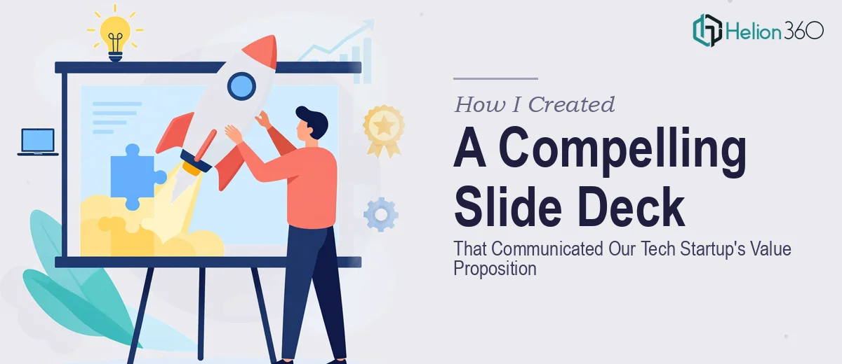
The Presentation Was More Than a Slide Deck — It Was the Pitch
We were three weeks out from a demo day presentation and I had a problem that wasn't just about slides. Our tech startup had a genuinely strong value proposition, but every attempt to communicate it visually landed flat. The decks we'd put together internally looked like internal documents — walls of text, inconsistent colors, no visual hierarchy. They explained the product, but they didn't sell it.
The stakes were real. This wasn't a casual walkthrough. The room would have investors, potential partners, and a handful of people who had already heard fifty pitches that week. We needed a startup pitch deck that could communicate our product's core value in the first thirty seconds of a slide — not thirty minutes of explanation.
I knew within about an hour of attempting a redesign myself that this was not something to figure out on the fly.
What I Found This Kind of Work Actually Requires
I started researching what a well-executed startup pitch deck actually involves, and the gap between "making slides" and "building a presentation that works" turned out to be significant.
The first thing I discovered is that the visual design is only one layer. Before a single layout gets touched, there's a structural problem to solve: what is the narrative arc of the deck? What does slide three say, and does it logically set up slide four? A pitch deck without a deliberate story arc loses the room fast, regardless of how polished the visuals are.
The second thing that stopped me was the rendering dimension. Our product had physical and digital components, and communicating them clearly required more than screenshots. Proper 2D and 3D visual representation of a product — the kind that actually reads well on a projected slide — requires knowledge of lighting, depth, composition, and how assets compress under different display conditions.
The third signal was consistency at scale. A twenty-slide deck with brand colors, typography, icons, and product visuals applied consistently across every slide is not something you achieve by eyeballing it. It requires a system — and building that system from scratch takes time most startup teams simply don't have.
What the Work That Produces a Great Startup Pitch Deck Actually Looks Like
The right approach starts with a full structural audit of the source content. This means mapping the logical flow of the deck — problem, solution, market, product, traction, ask — and identifying where the narrative breaks down or repeats itself. In a strong pitch deck, each slide carries exactly one idea, and the transition between slides creates forward momentum. This isn't copywriting; it's information architecture. Getting it right means reading the content critically, restructuring the sequence, and sometimes cutting slides that feel essential but actually interrupt the flow. This structural pass alone typically takes several hours of careful judgment from someone who has done it across many decks.
Visual mechanics are the next layer, and this is where technical skill becomes non-negotiable. A well-designed pitch deck uses a defined layout grid — typically a 12-column system — with a clear typographic hierarchy: a headline tier at roughly 36pt, a supporting text tier at 24pt, and detail or caption text at 16pt or below. Product visuals, whether 2D diagrams or 3D renders, need to be composed specifically for slide dimensions, accounting for how colors shift under projector light and how detail gets lost at scale. A render that looks sharp on a monitor can dissolve into grey mush on a conference room screen if the contrast ratios and asset resolution aren't handled correctly at the output stage.
Polish and consistency across the full deck is where most self-built presentations fall apart. The discipline required here is applying a palette of no more than four brand colors with strict rules about which tones appear in headers, backgrounds, and accents — and never deviating. Every icon set needs to come from a single source family. Every slide margin needs to match the master. Every product image needs to share a consistent light source and background treatment so the deck reads as a unified document, not a collection of separately built slides. Propagating these rules correctly through a slide master, so that changes cascade properly, requires familiarity with the tool's architecture that most people build over years, not days.
Why I Brought in Helion360 to Handle the Full Project
I didn't attempt this myself. Once I understood what the work actually required — the structural narrative work, the product visual treatment, the consistency systems — I recognized immediately that the smart move was to engage a team that does this work every day.
Helion360 handled the project end-to-end: the story structure review and slide architecture, the full visual design with brand-consistent layouts, and the product visual treatment across every slide. They turned the project around quickly — done in days, not weeks — which mattered enormously given our demo day presentation timeline.
What I valued was that I didn't have to manage pieces of the project across different people. The narrative, the design, and the visual production all came from one capable team with the tooling and expertise already built in. That's not something you replicate by spending a weekend with YouTube tutorials.
The Result and What I'd Tell Anyone Looking at the Same Situation
What came back was a deck that finally matched the quality of the product we'd built. The slides were clean, the story moved, and the product visuals communicated what a screenshot never could. In the room, we got through our pitch without a single moment of someone squinting at a slide trying to parse what they were looking at — which, if you've ever watched a cluttered deck kill a room's energy, you know is not a small thing.
The outcome went beyond aesthetics. The deck became the artifact we sent after every follow-up meeting. It worked as a leave-behind, a conversation starter, and a reference document — because it was built with that kind of rigor from the start.
If you're looking at a similar situation — a presentation that needs to carry real weight and you don't have weeks to build the expertise required — Helion360 is the team I'd engage. They delivered for me fast, handled the full execution depth the project needed, and the result spoke for itself.