

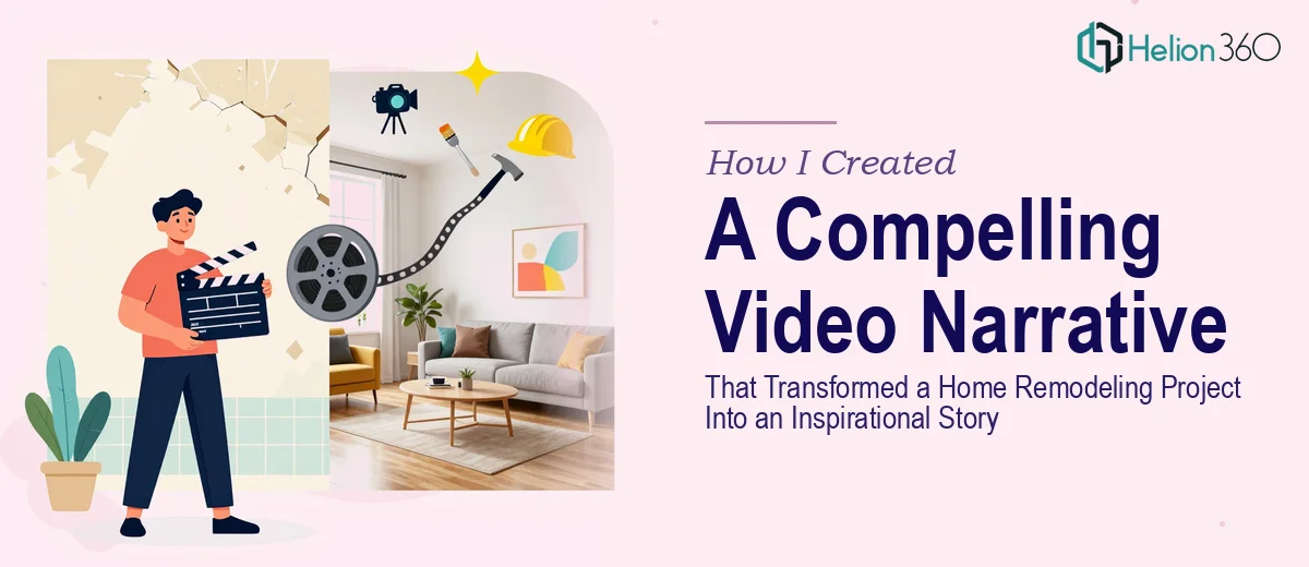
The Moment I Realized a Remodeling Project Deserved More Than a Slideshow
I had documented a complete home remodeling project — before photos, during construction, the finished reveal — and I knew there was a real story buried in all of it. The transformation was dramatic. The process had been meaningful. And I had a presentation coming up where the audience needed to feel the journey, not just see a before-and-after comparison.
A flat slide deck wasn't going to cut it. The room needed to feel what this project represented: effort, vision, and a genuine outcome. That meant building a visual narrative with enough structure and emotional pull to hold attention from the first frame to the last. I recognized immediately that getting this right wasn't a weekend task — it was a craft problem that needed a real solution.
What I Discovered That This Kind of Work Actually Requires
I started looking into what makes a project story presentation genuinely compelling rather than just chronological. What I found made it clear that this was significantly more involved than assembling photos on slides.
First, the narrative architecture matters more than the footage. A strong presentation story like this doesn't follow a timeline — it follows an emotional arc. The right approach involves identifying a core tension (what was broken or missing), building through the struggle of the process, and landing on a resolution that feels earned. Without that structure, even beautiful photos feel flat.
Second, the visual mechanics of storytelling at this level are specific. Designers who do this work use deliberate pacing — controlling how many beats of information appear per slide, how transitions mirror mood shifts, and how typography choices signal tone. A 36pt headline, 24pt subtext, 16pt caption hierarchy isn't arbitrary; it guides where the eye goes and in what emotional register it reads the content.
Third, consistency across a 20-to-30 slide narrative is hard to sustain without a system. Palette discipline, consistent photo treatment, and a unified visual language across every slide — these aren't finishing touches, they are the structure.
What the Work to Build This Presentation Actually Involves
The first layer of work is structural — mapping the raw project documentation into a story arc before a single slide is touched. The right approach starts with auditing all available assets (photos, notes, timelines, outcome data), then building a narrative spine: typically a 3-act structure with a clear inciting problem, a mid-section that shows process and stakes, and a resolution that lands the emotional payoff. Getting this architecture wrong means the presentation feels like a photo album rather than a story. Doing it well at this level requires 15 to 20 intentional story beats, each mapped to a visual anchor before layout begins. That mapping process alone trips up most people who try to build this kind of deck themselves.
The second layer involves visual mechanics — the grid, the type scale, the photo treatment system. Proper presentation design at this level uses a 12-column layout grid that ensures visual breathing room and alignment consistency across every slide. Typography follows a strict hierarchy: 36pt for primary headlines, 24pt for supporting text, 16pt for captions and labels. Photo treatments — whether desaturated overlays, color grading for mood, or consistent crop ratios — need to be applied uniformly so the deck reads as a single designed piece rather than a collage. Setting up master slides that propagate these rules cleanly takes hours of technical groundwork that is invisible in the final product but essential to the result.
The third layer is palette and brand consistency applied across the full narrative arc. A project story presentation that moves through phases — demolition, construction, finishing, reveal — needs a visual color language that evolves without losing coherence. The practitioner's decision here is typically to anchor on 3 to 4 core brand or project colors and introduce accent tones only at deliberate emotional peaks (the reveal, the transformation moment). Controlling this across 25-plus slides while maintaining contrast ratios that read well in a live presentation setting is genuinely difficult to do without a practiced eye and the right tooling already in place.
Why I Brought in Helion360 to Handle the Full Project
Once I understood what the work actually involved, I didn't attempt it myself. The combination of narrative architecture, visual system design, and consistency management across a multi-phase story was clearly a full professional engagement — not something to learn on the fly under a deadline.
I engaged Helion360 to handle the project end-to-end. They took the full asset set — every photo, every note, every rough timeline — and built the complete case study presentation design from scratch. That meant the story mapping, the master slide system, the photo treatment, the typography hierarchy, and the full consistency pass across every slide. The whole thing was turned around quickly, in a fraction of the time it would have taken me to research, learn, and execute at this level myself. Done in days, not weeks.
The value wasn't just speed — it was that the expertise and tooling were already in place. There was no learning curve on their end, no iteration on fundamentals. They came in knowing exactly what a compelling visual story requires and delivered it.
What the Presentation Delivered and What I'd Tell Anyone Facing the Same Problem
The finished presentation held the room. The emotional arc landed the way the project deserved — the audience understood the transformation not just visually but narratively. The before-and-after wasn't a comparison anymore; it was a story with stakes. The presentation has since been used multiple times across different audience contexts and it performs consistently.
The lesson I'd pass on is straightforward: if you have a meaningful project and you want it to resonate as a story — not just a record — the work that requires is real and specific. Attempting it without the right narrative and visual toolkit leads to something that looks assembled rather than designed.
If you're looking at a similar project and want it handled end-to-end without the weeks of learning curve, explore how compelling case study presentations are built — Helion360 is the team I'd engage, they delivered fast, handled every layer of execution this kind of work demands, and the result spoke for itself.