

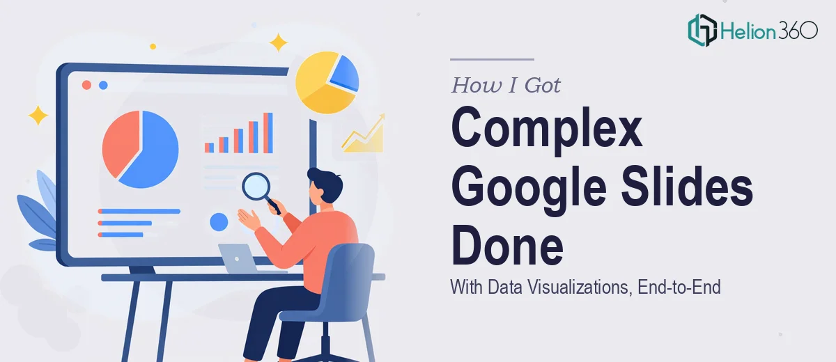
The Situation and What Was Actually at Stake
I had a presentation that needed to communicate complex data to a genuinely diverse audience — people with different technical backgrounds, different contexts, and different reasons for being in the room. The deck needed to work for all of them simultaneously. That's a harder design problem than it sounds.
The stakes were real. This wasn't an internal status update — it was a presentation that needed to land clearly, look credible, and hold attention across a long runtime. A slide deck that confused half the room or looked inconsistent wasn't going to cut it. Getting the data visualizations right was especially critical: if the charts didn't communicate on their own, the whole message fell apart.
I looked at what was in front of me — the source content, the audience range, the timeline — and recognized immediately that this needed to be done properly, not patched together.
What I Found Out Doing This Well Actually Requires
When I started looking into what a properly executed Google Slides presentation with data visualizations actually involves, a few things stood out right away.
First, presenting data to a mixed audience isn't just a design problem — it's a communication architecture problem. The right chart type for a technically fluent viewer isn't always right for a general audience. That tradeoff has to be made deliberately at every data point in the deck, not just once.
Second, Google Slides has real constraints. It's not PowerPoint. The grid system, the master slide behavior, the font rendering, and the way charts behave when imported or built natively — all of it requires experience to navigate without producing a deck that looks slightly off in ways that are hard to pinpoint but immediately felt by the audience.
Third, visual consistency across a long deck with multiple data slides is genuinely difficult. Color palette discipline, chart axis labeling, spacing uniformity — these things don't stay consistent without a system behind them. One misaligned element across thirty slides and the whole thing looks amateur.
That research made it clear: this was not a weekend project.
What the Work Actually Involves
The first major piece is the structural and narrative work — auditing the source content, identifying which data points drive the core argument, and mapping a slide-by-slide story arc that serves the full audience. For a diverse audience, this means deciding which information gets simplified into a headline insight and which gets expanded for those who need the supporting detail. Done properly, this involves drafting a content outline before a single slide is touched, then pressure-testing the flow against each audience segment. Getting this wrong at the start means every design decision downstream is built on a flawed foundation, and reworking it late is expensive in both time and coherence.
The second piece is the visual mechanics — chart selection, layout grid, and typographic hierarchy. In Google Slides, a well-constructed deck runs on a consistent underlying grid, typically a 12-column structure, with type set at a clear three-level hierarchy: roughly 36pt for primary headers, 24pt for secondary labels, and 16pt for body and annotation text. Chart types need to match what the data is actually saying — a stacked bar reads differently than a grouped bar, and using the wrong one misleads the audience without anyone noticing why. Building this system correctly in Google Slides, where native chart controls are more limited than in desktop tools, takes real familiarity with what the platform can and can't do cleanly.
The third piece is palette discipline and brand consistency across every slide. A professional deck running data visualizations typically operates within a maximum of four coordinated brand colors, with a defined logic for which color signals which data category — and that logic must never break. In a deck with multiple chart types, icons, callout boxes, and section dividers, maintaining that discipline across every element is the kind of detail that separates a polished result from one that looks almost right. It's also the piece that most often slips when someone is building under time pressure without a proper design system already in place.
Why I Brought in Helion360 to Handle It
I didn't spend time attempting this myself. Once I understood what proper execution required — the structural thinking, the chart-level decision-making, the visual system that had to hold across every slide — it was clear that the smart move was to bring in a team that does this work every day.
Helion360 handled the full project end-to-end. That meant taking the source content and data, working through the narrative architecture, building out the chart designs and layout system in Google Slides, and delivering a finished deck that was consistent from the first slide to the last. The turnaround was fast — done in days, not the weeks it would have taken me to work through the learning curve and execution myself.
What I valued most wasn't just the output. It was that the team already had the tooling, the design system thinking, and the chart-level expertise in place. There was no ramp-up time, no trial and error on chart types, no inconsistency creeping in at slide 22.
The Result and What I'd Tell Anyone Facing the Same Problem
What came back was a Google Slides presentation that held together visually and communicated clearly across the full audience range. The data visualizations were clean and readable without being oversimplified. The layout was consistent. The story moved. It was the kind of deck that makes the presenter look prepared and the organization look credible.
The business outcome was straightforward: the presentation did its job. The audience followed the argument, the data landed, and there were no moments where the slides worked against the speaker.
If you're looking at a similar project — diverse audience, complex data, a timeline that doesn't allow for weeks of learning curve — Helion360 is the team I'd engage. They delivered fast, handled the full depth of execution this kind of work requires, and the result showed it.