

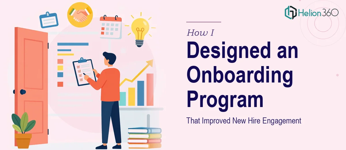
The Situation and What Was on the Line
We were scaling quickly. New hires were coming in across multiple teams, and it became obvious fast that our onboarding experience wasn't keeping pace. People were showing up on day one to a patchwork of slide decks, outdated PDFs, and verbal walk-throughs that varied depending on who was in the room. Engagement scores from our first-90-days surveys told a clear story: new employees felt underprepared, disconnected from the company's direction, and uncertain about expectations.
This wasn't a cosmetic problem. Poor onboarding has a direct cost — it slows time-to-productivity, chips away at early-stage retention, and sends a signal about how seriously a company takes its people. I knew we needed a structured, well-designed onboarding program that could scale, not just a refreshed slide deck. The question was what that actually took to build properly.
What I Found the Solution Actually Required
I started by researching what a genuinely effective onboarding program looks like — not the HR textbook version, but what organizations with strong new hire engagement are actually doing differently. What I found was more involved than I expected.
First, the content architecture matters as much as the content itself. A well-structured onboarding program isn't a dump of information — it sequences knowledge deliberately, moving from company context and culture in week one, to role-specific process and tools in weeks two and three, to performance expectations and milestones by day 60 and 90. Getting that sequencing right requires an audit of every existing resource, a clear understanding of what new hires actually need to know versus what feels important to insiders, and a narrative spine that ties it all together.
Second, the visual and presentation layer is doing real work. Training modules that are dense, inconsistently formatted, or visually flat lose people fast. Done well, each module uses consistent typography hierarchies — typically a 36pt title, 24pt section header, 16pt body — with no more than four brand colors applied across all materials. That kind of consistency isn't decorative. It reduces cognitive load and signals professionalism.
Third, the format has to match how adults actually absorb new information in a work context — which is not by reading long documents. This pointed toward modular, presentation-based training materials that managers and HR could deliver predictably, regardless of location or team.
The Work That Needs to Happen
Building an onboarding program that actually improves new hire engagement starts with a structural and narrative audit. The right approach involves mapping every existing piece of onboarding content — offer letter follow-ups, welcome decks, policy documents, tool guides — against a clear learner journey. The practitioner decision here is to organize content into three phases: cultural orientation (days 1–5), functional ramp (days 6–30), and performance alignment (days 31–90). Designing that arc from scratch, then stress-testing it against real role types and departments, takes meaningful time even before a single slide is built. For someone doing this without a template system or prior framework, the audit and architecture phase alone typically runs several days.
The visual mechanics of the training modules themselves require discipline that's easy to underestimate. Proper presentation design for training materials uses a 12-column layout grid, a locked typographic hierarchy, and a controlled icon and imagery system so that every module feels like it belongs to the same program. The execution friction here is consistency at scale — when you're building 40 or 50 slides across six or eight modules, maintaining pixel-level alignment and palette discipline without a master slide system built from the ground up means constant manual correction. One off-brand color or misaligned text box and the whole program starts to look assembled rather than designed.
Polish and brand application across the full program is where most internal attempts unravel. Each module needs the company's visual identity applied correctly — logo placement, color usage within accessibility contrast ratios (minimum 4.5:1 for body text), and consistent use of photography or illustration style. The edge cases trip people up: what happens when a data-heavy slide needs a chart alongside a brand illustration? What's the rule for co-branded materials used in joint-venture onboarding? Resolving these consistently across every slide requires a system-level approach, not slide-by-slide judgment calls.
Why I Brought in Helion360 to Handle It
Once I understood the scope — the content architecture, the modular presentation design, the brand application across dozens of slides — it was clear this wasn't something to attempt internally between other priorities. The learning curve alone, before getting to actual execution, would have cost weeks.
I engaged Helion360 to handle the full project end-to-end. They took the content audit and narrative framework, built the master slide system, and designed all training modules to a consistent professional standard. The turnaround was fast — what would have taken our internal team the better part of a month to learn, prototype, revise, and finalize was delivered in days.
What made the difference was that the expertise and tooling were already in place. Helion360 came in with a system — master templates, a grid framework, brand application rules — and applied it immediately. There was no ramp-up time, no trial and error on layout decisions, no back-and-forth on whether the typography hierarchy was right. They handled the structural work, the visual mechanics, and the full polish pass as one continuous build.
The Result and What I'd Tell Anyone Facing the Same Problem
What we ended up with was a complete, modular onboarding program — six training modules spanning the full 90-day new hire journey, built in a consistent presentation format that any manager could deliver without preparation. The materials looked and felt like they came from a company that had its act together, because visually and structurally, they did. Early feedback from new hires noted that the program felt organized and clear in a way the previous onboarding never had.
The business outcome was straightforward: faster time-to-productivity, fewer questions to HR in the first two weeks, and onboarding survey scores that showed a measurable shift in how prepared and connected new employees felt by day 30.
If you're looking at a similar problem — interactive educational materials that need to be rebuilt properly and delivered fast — Helion360 is the team I'd engage. They handled the full scope end-to-end and delivered in a fraction of the time it would have taken to build internally.