

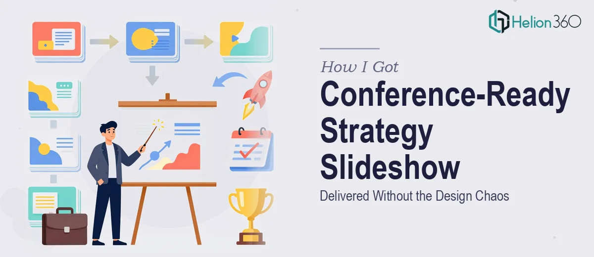
The Situation I Was Looking At
We had a conference coming up in under a month and needed a polished business strategy slideshow that could hold a room. This wasn't an internal update — it was a public-facing presentation covering a full year of strategic direction, performance context, and forward-looking priorities. The audience would include industry peers, partners, and senior stakeholders who would form opinions about our organization based on what they saw on that screen.
The stakes were clear. A cluttered deck with inconsistent visuals, hard-to-read charts, or misaligned messaging would undermine everything we were trying to communicate. I knew within about ten minutes of scoping the content that this needed to be handled properly — by people who do this work every day, not cobbled together in spare hours before the deadline.
What I Discovered This Actually Involves
Before engaging anyone, I spent time understanding what a well-executed conference presentation actually requires. What I found made it obvious this wasn't a quick formatting job.
First, the content itself needed structural work. A year of business strategy doesn't naturally organize itself into a coherent narrative — it needs a deliberate arc that moves an audience from context to insight to conclusion without losing them halfway through.
Second, the data visualization layer was genuinely complex. Charts needed to communicate the right thing at a glance, not just display numbers. The wrong chart type, or a poorly labeled axis, actively misleads an audience.
Third, design consistency across a multi-slide deck covering several distinct topic areas is harder than it looks. Typography, color usage, image treatment, and layout logic all have to hold together across every single slide — and one off-brand slide in the middle breaks the experience.
That combination of narrative strategy, data design, and visual polish is not something you knock out over a weekend.
What the Work Actually Requires
The right approach to a conference-quality business strategy slideshow starts with a content audit and narrative structure. Done well, this means mapping every source document — reports, data exports, exec briefs — against a clear story framework before a single slide is touched. A proper narrative arc for a business review typically moves through four to five logical phases: context setting, performance summary, strategic priorities, supporting evidence, and a clear forward look. Skipping this step and jumping straight into slide building is the most common mistake, and it shows — the result is a deck that feels like a document dump rather than a presentation.
Visual mechanics come next, and the specifics matter more than most people expect. A 12-column grid underlies every professional slide layout, ensuring that text blocks, charts, and images align to invisible but consistent anchor points across the whole deck. Typography hierarchy follows a strict rule — typically 36pt for headlines, 24pt for subheadings, and 16pt for body — and that hierarchy must be enforced through master slides so it propagates automatically rather than being manually adjusted 40 times. Charts need to be rebuilt from scratch in most cases, not copy-pasted from spreadsheets, because default chart styling almost never meets conference-quality visual standards. Getting this right in a large deck takes hours even for someone who knows exactly what they're doing.
Polish and brand consistency across the full deck is where a lot of otherwise decent work falls apart. A professional presentation operates within a maximum of four brand colors, applied according to a logic that assigns each color a specific role — primary background, accent, data highlight, neutral. When that logic isn't documented and enforced slide by slide, the deck drifts visually and starts to look assembled rather than designed. Image treatment — consistent framing, consistent filter application, consistent scale — adds another layer that requires systematic review of every visual asset in the deck before final output.
Why I Brought Helion360 in to Handle It
I recognized early that attempting this myself — or asking someone internally who wasn't a presentation specialist — would cost more in time and rework than it was worth. The conference deadline was fixed. The audience was not forgiving. And the scope covered narrative restructuring, data visualization, and full visual production across what would end up being a substantial deck.
Helion360 handled the business review presentation design end-to-end: content structure and story arc, chart design and data visualization, and complete visual production against our brand standards. The turnaround was fast — done in days, not weeks — and at no point did I need to chase down individual pieces or re-brief the same requirements twice. They came in with the tooling, the process, and the expertise already in place. That's the part that matters when you're working against a hard deadline with a high-stakes audience.
The Result and What I'd Say to Anyone in the Same Position
What came back was a complete, conference-ready business presentation — structured to move an audience through a year of strategy in a way that felt logical and purposeful, with charts that communicated clearly, and visual consistency that held up from the first slide to the last. The conference went well. The deck earned comments from attendees about how clear and professional it looked, which is exactly the kind of feedback that signals the design was doing its job invisibly.
If you're looking at a similar project — a conference presentation, a business review, anything where the content is complex and the audience is consequential — the lesson I took from this is simple: understand what the work actually requires, then engage people who do it at this level every day. If you're in that spot and need it handled end-to-end and turned around fast, Helion360 is the team I'd engage without hesitation.