

The Situation I Was Looking at and Why It Couldn't Wait
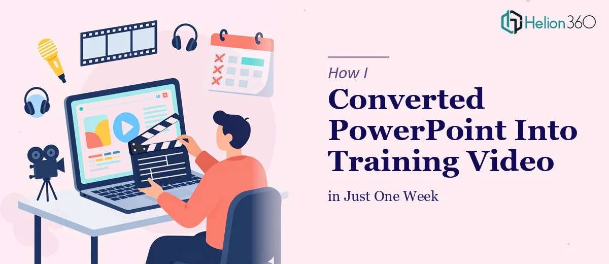
We had a solid PowerPoint deck — built over months, full of the right information about our tech product — and a hard deadline to get it in front of a new client cohort as a self-paced training module. The slides were dense, the visuals were inconsistent, and nothing about the format said "engaging learning experience." It said "internal document someone put together fast."
The stakes weren't small. This training material was the first real impression a new group of users would have of how we communicate, how polished our product is, and how seriously we take onboarding. A clunky slide deck repurposed as a video wasn't going to cut it. I knew immediately that getting this right — visually cohesive, professionally paced, brand-aligned — was not a casual weekend project.
What I Found Out When I Actually Researched What This Involves
I started digging into what a proper PowerPoint-to-training-video conversion actually requires, and the scope expanded quickly.
The first thing that became clear is that slides built for a live presenter don't translate directly to video. The information density is wrong, the visual hierarchy doesn't hold up without someone talking over it, and the pacing assumptions are completely different. Every slide essentially needs to be re-evaluated as a standalone visual unit.
The second signal was the infographic work. Turning bullet-heavy slides into clear, branded infographics requires decisions about layout grids, iconography, and data flow — not just "making things look nice." There are real rules governing how information moves through a visual, and breaking those rules produces something that looks busy rather than clear.
The third thing I noticed was the brand consistency problem. Our deck had three different font treatments, two slightly different shades of our primary blue, and no consistent slide master. Any serious conversion would require a full audit and rebuild of those fundamentals before a single frame of video could be composed.
The Work That Needs to Happen to Do This Right
The right approach starts with a structural audit of the existing deck. Every slide needs to be evaluated for information load — a well-designed training slide should carry one idea, supported by one visual, with a clear typographic hierarchy of roughly 36pt for titles, 24pt for supporting points, and no more than 16pt for any secondary annotation. Slides that violate this need to be split, simplified, or redesigned from the ground up. This phase alone — mapping what exists, deciding what stays, what merges, and what gets rebuilt — takes longer than most people expect, especially when the source material has accumulated over time without a clear visual system.
The infographic creation layer adds another dimension of complexity. Proper infographic design for a professional training context means working within a defined layout grid — typically a 12-column structure — so that visual elements align predictably across a series of slides. Icon families need to be consistent in stroke weight and visual style. Color usage must follow a strict palette: ideally no more than four brand colors applied with a defined role for each (primary, secondary, accent, neutral). The temptation when building infographics from scratch is to treat each one as its own creative exercise. The execution friction is that consistency across twelve or twenty infographics, all built to the same grid and palette rules, requires constant discipline and a reliable design system underneath it all.
Polish and brand consistency across the full deck is the third layer, and it's where projects tend to fall apart at the end. A proper slide master in PowerPoint or an equivalent system controls fonts, color themes, background treatments, and placeholder geometry so that every new slide inherits those decisions automatically. Setting up a master that propagates correctly — including custom layouts for title slides, section breaks, infographic frames, and data slides — is a multi-hour undertaking even for someone experienced with the tool. For someone learning as they go, it can easily consume a full day before a single piece of real content gets placed.
Why I Brought in Helion360 to Handle the Full Project
I looked at what the work actually required — structural content audit, infographic design system, slide master rebuild, brand alignment across every frame — and I made the call quickly. This wasn't something I was going to figure out over a few evenings. The expertise, the tooling, and the process needed to already be in place.
Helion360 handled the project end-to-end. That meant the content audit and narrative restructuring, the full infographic design suite built to our brand palette and grid, and the final slide master rebuild that made the whole deck consistent and video-ready. They turned it around fast — the kind of turnaround that would have taken me weeks of learning and iteration to approximate on my own. What I got back was a coherent, visually professional training deck that held up as a standalone video experience without a presenter in the room.
The thing that stood out was that there was no back-and-forth on fundamentals. The team understood brand application, layout discipline, and what training content needs to do visually. That fluency made the whole process move quickly.
The Result and What I'd Tell Anyone Facing the Same Problem
The finished training module looked like something our brand had always been capable of producing — clean, consistent, and designed for the audience rather than for internal use. The client cohort moved through the material without friction, and feedback on the onboarding experience was noticeably better than previous cycles.
The broader lesson for me was that presentation design at this level isn't a task you can casually absorb. The gap between a serviceable slide deck and a genuinely effective visual training experience is real, and the work required to close that gap is specific and time-consuming.
If you're looking at a similar project — a deck that needs to become something your audience will actually engage with — and you want it handled end-to-end without the weeks of learning curve, check out how I handled converting presentation slides into interactive e-learning modules with Helion360.