

The Problem With Having Data and No Clear Story
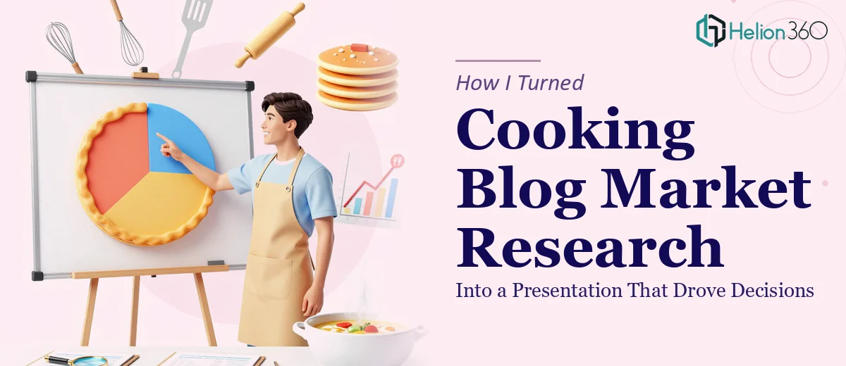
I run a cooking blog that had been growing steadily for a couple of years, but I kept making content decisions based on gut instinct. I knew I needed to do proper market research — trends in the culinary space, what competitors were doing, where audience preferences were shifting — but the real problem wasn't just gathering data. It was what to do with it once I had it.
I had a stakeholder meeting coming up where I needed to present findings to a small advisory group who could help shape the blog's next content and growth phase. Showing up with a spreadsheet wasn't going to cut it. The data needed to become a clear, visually compelling presentation that made the opportunity obvious at a glance.
I recognized quickly that this wasn't a job I could handle in a few evenings. Done right, it would require real research depth AND the ability to translate that into a presentation built for decision-making.
What I Found the Solution Actually Required
When I started mapping out what good market research for a content brand actually looks like, I realized the scope was much larger than I'd assumed.
Proper culinary market research means going beyond a quick Google scan. It involves analyzing social listening data to understand what food topics are gaining traction, reviewing industry reports on consumer behavior around home cooking and food media, auditing competitor blogs for content gaps and engagement patterns, and synthesizing survey data if primary research is part of the brief.
The second layer — turning all of that into a presentation — added another dimension of complexity. The findings had to be structured as a narrative, not just a data dump. Charts had to be chosen for the right reasons. Consumer preference trends don't communicate the same way as competitive positioning maps. And the whole thing needed to look credible enough to hold up in front of an informed audience.
That combination of research depth and presentation craft is not a one-person weekend job.
What the Work Actually Involves
The first major layer of this kind of project is structural — auditing the data sources and mapping a story arc before a single slide gets built. With cooking blog research, that means deciding which signals matter most: is the story about audience growth opportunities, content category gaps, monetization potential, or all three? A practitioner building this properly starts by grouping raw findings into themes, then sequencing those themes so each slide advances a single coherent argument. Getting that narrative architecture right before touching design typically takes several hours of focused work, and skipping it produces presentations that feel like a list of facts rather than a recommendation.
The second layer is visual mechanics — choosing and building charts that match the data type and the audience's reading level. A trend line showing search volume growth over 18 months communicates differently than a clustered bar chart comparing competitor content frequency across categories. The right approach applies a type hierarchy of roughly 36pt for headlines, 24pt for body callouts, and 16pt for supporting labels, while keeping each chart to a single insight. The friction here is real: most people default to whatever chart type is easiest to make, not the one that's clearest to read, and that decision compounds across 20-plus slides.
The third layer is polish and brand consistency across the full deck. A well-built market research presentation design holds a maximum of four brand colors, applies them according to a documented palette rule, and uses a layout grid that keeps every slide visually aligned even when the content varies widely. Maintaining that discipline from slide one through slide thirty-five is where most self-built decks fall apart — fonts drift, spacing gets inconsistent, and the overall effect undermines the credibility of the findings themselves. Fixing it retroactively is often slower than building it correctly from the start.
Why I Brought in Helion360 to Handle It
I looked at what the full project required — structured research, narrative architecture, chart design, visual consistency across dozens of slides — and it was immediately clear this wasn't something I should be attempting alongside my regular schedule.
Helion360 handled the project end-to-end. That meant taking the raw research brief, building out the market research findings across culinary trends, audience behavior, and competitive landscape, and then translating all of it into a polished presentation designed for the advisory meeting. They handled the story arc, the chart selection, the slide layout, and the brand application from start to finish.
What stood out was the speed. The work was turned around in a fraction of the time it would have taken me to learn and execute it myself. A team that does this kind of work every day has the frameworks, the tooling, and the judgment already in place — there's no learning curve eating into the timeline. The full project was done in days, not weeks.
What the Presentation Delivered — and What I'd Tell Anyone in My Spot
The final presentation gave the advisory group exactly what they needed: a clear picture of where the culinary content space is heading, where the blog's competitors are strong and where they're leaving gaps, and a prioritized view of content opportunities worth pursuing. The meeting produced concrete decisions about editorial direction — which is exactly what good market research, properly visualized, is supposed to do.
For anyone looking at a similar situation — data in hand, a real audience to present to, and no realistic path to executing the research and the design well on your own timeline — Helion360 is the team I'd engage. They delivered fast, handled every layer of the work, and produced something that held up in the room.