

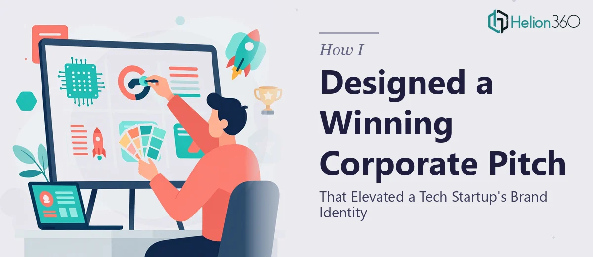
The Brief Sounded Simple Enough
When the task landed on my desk, it seemed manageable at first. The startup had been operating for a few years, had a decent track record, and now needed a corporate profile presentation that would do justice to everything they had built. The goal was straightforward: create something that clearly communicated their mission, capabilities, and values — something that would hold up in front of potential clients and partners.
I had the raw material. There were brand guidelines, a rough content outline, a few case study summaries, and a folder of logos and images. On paper, it looked like enough to get started.
Where It Got Complicated
The problem was not a shortage of information — it was too much of it, pulling in too many directions. The brand guidelines were partially developed. The case studies were written in different tones. The imagery was inconsistent. And the content itself had not been structured for a presentation format — it read more like a website copy dump than a narrative someone could follow slide by slide.
I started laying out slides manually, trying to pull together a coherent story. I worked through the company overview, the services section, the team page, and the achievements block. Each section looked decent in isolation, but when I stepped back and looked at the full deck, it felt fragmented. The visual language was not consistent. The typography choices were not reinforcing the brand. And the flow did not build the way a strong corporate profile presentation needs to — with each slide earning the next.
I also realized that designing a presentation like this is not just about making things look polished. It is about understanding how a company wants to be perceived, and then translating that into layout decisions, color hierarchy, type choices, and visual pacing. That requires a level of design judgment that goes beyond knowing the tools.
Bringing in the Right Support
After hitting that wall, I came across Helion360. I explained the situation — what the startup needed, what I had already built, and where the deck was falling short. Their team asked the right questions upfront: Who is the audience? What action should this presentation drive? What does the brand want to feel like?
Those questions alone helped clarify the direction. From there, they took over the design work completely.
What the Team Delivered
Helion360 rebuilt the deck with a clear structure that moved from the company story and mission through to capabilities, key achievements, and a closing section that reinforced the brand's unique positioning. The visual design was tight — consistent color application, purposeful use of white space, and a typographic system that felt professional without being generic.
The case study slides were particularly well handled. Instead of presenting them as blocks of text, the team turned them into visual narratives with outcome callouts and supporting layout structures that made the information scannable and memorable. The testimonial section was given its own visual treatment that gave it weight without feeling like an afterthought.
Brand alignment was thorough throughout. Every slide felt like it belonged to the same family — something the original draft was missing entirely.
What I Took Away From the Experience
Building a corporate profile presentation that genuinely represents a company's identity is a more layered task than it appears. It requires someone who understands both design craft and communication strategy — how to structure content, how to pace a visual story, and how to make brand guidelines actually come to life in a slide environment.
The finished deck was used in client meetings and partnership conversations almost immediately. The feedback from the startup's team was that it finally felt like something they were proud to share.
If you are working on a corporate profile presentation and finding that the pieces are not coming together the way you need them to, Helion360 is worth reaching out to — they handle exactly this kind of work, and the results speak for themselves.