

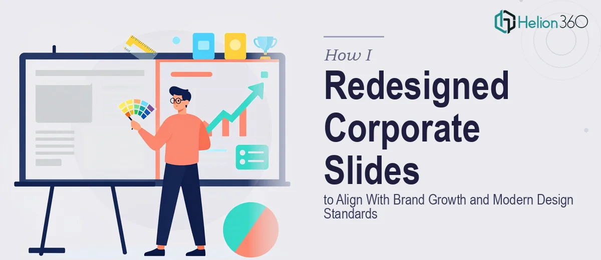
The Situation — A New Product Line, Slides That No Longer Fit
We had just launched a new product line. It was a meaningful moment for the company — new positioning, a more sophisticated brand direction, and a level of ambition in the market that our existing materials simply didn't reflect anymore. The slides we'd been using were functional, but they were built for a different chapter. They didn't carry the weight of where we were headed.
The stakes were real. These weren't internal decks — they were front-facing presentations used in sales conversations, partner meetings, and executive briefings. Walking into those rooms with slides that looked dated or inconsistently branded was a credibility problem waiting to happen. I knew immediately this wasn't a quick cleanup job. A proper corporate presentation redesign — one that would hold up across every use case and truly align with our brand — needed to be done right.
What I Found the Solution Actually Required
When I looked closely at what a credible redesign would involve, the scope became clear quickly. This wasn't about swapping out colors or dropping in a new logo. A presentation redesign that's genuinely aligned with brand guidelines means rebuilding the visual system from the master slide level down — grid structure, type hierarchy, color application rules, icon treatment, and imagery standards all have to work as a coherent whole.
Three things stood out as signals of real complexity. First, brand consistency at scale: when a deck has 30, 40, or 60 slides, every layout variation has to express the same visual language — not just roughly, but precisely. Second, the content was already written, which meant the design had to serve existing text and data without restructuring the narrative — a different challenge than building from scratch. Third, the new product line introduced visual assets that needed to be integrated without looking bolted on. Getting all of that right, cohesively, across a full deck was not a weekend project.
What the Redesign Work Actually Involves
The foundation of a strong corporate presentation redesign is the master slide system. Done well, this means establishing a 12-column layout grid that governs every content zone — title placement, body text margins, image boundaries, and data regions — so that no slide looks improvised. Typography rules are set at three levels: a headline at 36pt, a subhead at 24pt, and body copy at 16pt, with line spacing and paragraph spacing locked to maintain visual rhythm. Getting this right in PowerPoint requires working inside Slide Master view, building multiple layout masters for section openers, content slides, and data slides, and ensuring every master propagates changes correctly across the full deck. For someone new to this layer of the tool, it easily consumes a full day before a single visible slide is touched.
Visual mechanics — how charts, icons, and imagery are treated — is where brand sophistication either shows or falls apart. The right approach limits the deck to four brand colors with defined usage rules: a primary, a secondary, an accent used sparingly, and a neutral for backgrounds and text. Charts need to be rebuilt to match that palette, not just recolored — axis labels, gridlines, and data labels all require manual formatting to stay consistent. Icons must come from a single family with uniform stroke weight and sizing. Images need consistent treatment — same corner radius, same overlay rule, same cropping ratio across every slide. Each of these decisions is straightforward in isolation; applying them consistently across 40-plus slides under a deadline is where execution friction compounds quickly.
Polish and brand consistency across the full deck is the final layer, and it's often underestimated. Every slide needs to be audited against the brand guidelines: does the logo appear at the correct size and in the correct position? Are the slide numbers styled consistently? Do the section dividers use the right color weight? Does the footer content match the approved format? This kind of detail work requires going slide by slide, cross-referencing the brand guide, and making corrections that seem minor but collectively define whether the deck reads as professionally produced or assembled. On a 50-slide deck, this audit alone can take four to six hours.
Why I Brought in Helion360 to Handle It
Once I understood the actual scope — master slide architecture, brand-accurate visual mechanics, and a full-deck consistency audit — it was obvious that attempting this myself wasn't realistic. I didn't have the tooling depth, and I certainly didn't have the time to climb the learning curve while managing a product launch.
I engaged Helion360 to handle the full project end-to-end. They rebuilt the master slide system from the ground up, applied the brand guidelines across every layout, and redesigned the data and content slides to reflect both the new product line and the elevated brand direction. The deck was turned around quickly — done in days, not weeks — and handled in a fraction of the time it would have taken me to research, learn, and execute at this level. That's the value of a team that does this work every day with the process and tooling already in place.
The Result and What I'd Tell Anyone Facing the Same Decision
What came back was a fully rebuilt corporate deck — visually consistent, brand-accurate, and ready for the room. Every slide reflected the same design system. The new product line was integrated cleanly. The overall feel matched the sophistication our brand had grown into. Walking into meetings with those slides felt different — the presentation carried the weight it was supposed to.
If you're looking at a similar situation — existing content that works, a brand that's evolved, and a deck that needs to catch up — the move is not to spend your own nights and weekends learning master slide architecture. Engage the team that does this every day. If you want it handled end-to-end and delivered fast, Helion360 is exactly who I'd go to.