

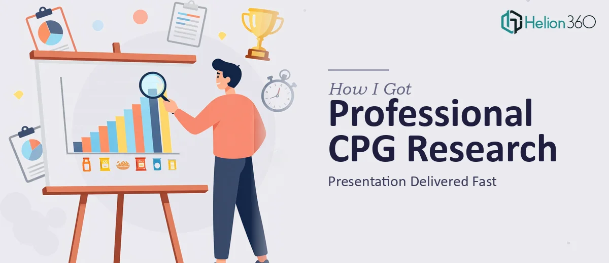
The Problem I Was Staring At
I was sitting on a mountain of CPG category data — competitive pricing, packaging trends, regional distribution patterns, consumer preference signals — and a leadership meeting on the calendar that wasn't moving. The ask was clear: take all of this research and turn it into something the room could actually act on. Not a data dump. A market research presentation that told a coherent story about where the category stood, where the gaps were, and what the opportunities looked like.
The stakes were real. This wasn't an internal status update. The output would inform product roadmap decisions and go-to-market priorities. Getting it wrong — or just getting it out the door looking sloppy — would undercut the credibility of the research itself. I recognized quickly that doing this well was not a task I could shortcut or squeeze into spare hours between everything else on my plate.
What I Found the Work Actually Required
The more I looked at what a proper CPG category research presentation involves, the more I understood the scope. This wasn't just formatting slides. The research itself spans pricing strategy analysis, product feature benchmarking, packaging innovation mapping, distribution channel comparisons, and marketing tactic breakdowns — often segmented by region and sub-category. Each of those threads needs to be synthesized, not just reported.
Three things signaled real complexity almost immediately. First, the data lived across multiple sources — retail audit data, syndicated reports, competitive monitoring — and reconciling it into a single coherent narrative requires judgment calls, not just copy-paste. Second, the audience for this kind of presentation expects a clear point of view, not a neutral summary. The slides need to argue something. Third, visualizing category dynamics — price ladders, share waterfalls, competitive positioning maps — requires charting competence that goes well beyond inserting a default bar chart. I knew this was not a weekend project.
What Doing This Well Actually Involves
The first layer of work is structural — auditing all the research inputs and mapping a narrative arc before a single slide gets built. For a CPG category research presentation, that means deciding which competitive signals matter most, how to sequence the market context before the opportunity framing, and what the single takeaway is per section. A well-structured deck of this kind typically runs 20 to 35 slides across defined chapters: category overview, competitive landscape, consumer dynamics, pricing architecture, and strategic implications. Getting that structure wrong upstream means every slide downstream tells the wrong story. Reorganizing later costs double the time.
The second layer is visual mechanics — translating competitive and market data into charts that actually communicate. Price ladder visualizations, share-of-shelf comparisons, and regional heat maps each require the right chart type, a clean data hierarchy, and a consistent visual grammar across the deck. Proper execution means working within a 12-column layout grid, holding to a type scale of roughly 32pt for headlines and 16pt for body, and using no more than four brand-anchored colors to encode meaning. The friction here is significant: even someone who knows the data well will spend hours wrestling with alignment, legend placement, and making sure a 15-row comparison table doesn't collapse into an unreadable wall on a widescreen slide.
The third layer is consistency and polish across the full document — applying brand standards uniformly, ensuring every data label, source citation, and axis title follows the same formatting rules from slide one to the last page. In a research presentation, inconsistency doesn't just look unprofessional — it raises questions about the rigor of the underlying analysis. Auditing a 30-slide deck for visual consistency, fixing master slide inheritance issues, and making sure every chart reads clearly at both presentation size and printed format is painstaking work that regularly catches people off guard when they think they're almost done.
Why I Brought in Helion360 to Handle It
I looked at the scope clearly and made the call. Attempting to build this out myself — while managing everything else in motion — wasn't realistic. The time to learn the visual mechanics properly, reconcile the data sources, build the narrative architecture, and then audit the full deck for consistency would have eaten weeks I didn't have.
Helion360 handled the full project end-to-end. That meant taking the raw research inputs and structured source material, building the narrative arc, executing all the data visualization — price architecture charts, competitive positioning maps, regional breakdowns — and delivering a polished, brand-consistent deck ready for the room. They turned it around quickly. What would have taken me weeks of stumbling through unfamiliar territory was done in days. The team does this kind of work continuously, with the process and tooling already in place to move fast without sacrificing the depth the work requires.
The Outcome and What I'd Tell Anyone in My Spot
What came back was a presentation that matched the quality of the research behind it. The narrative was clear, the data visualizations were sharp and legible, and the competitive analysis read as argued and deliberate — not like a data inventory. The leadership team could follow the logic from category context through to strategic implication without needing a guided tour through the slides. That's what a research presentation is supposed to do, and it only happens when the structure and the visuals are doing real work together.
Anyone who's looked at a CPG category research project and thought they'd build the presentation themselves on top of everything else should take a hard look at what the work actually involves before committing to that path.
If you're in that same position — solid research in hand, a high-stakes audience ahead, and not enough runway to execute the presentation properly — Helion360 is the team I'd engage. They handled the full end-to-end execution fast, and the depth of the output reflected exactly what this kind of work demands.