

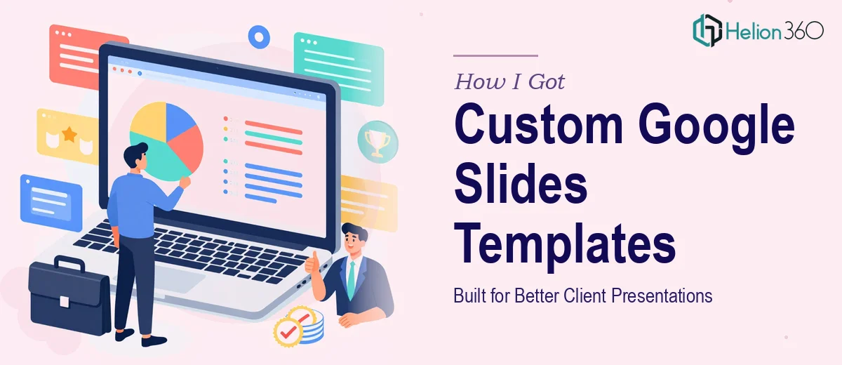
The Problem With Our Presentations Was Costing Us Credibility
We were a growing tech startup with a strong product and a real story to tell. But every time our team sent out a client deck, a webinar follow-up, or an internal report, it looked like it was built in a rush — because it was. Inconsistent fonts, mismatched colors, slides that didn't feel like they came from the same company. The problem wasn't the content. The problem was that we had no proper Google Slides template system in place.
This mattered more than it sounds. We were presenting to digital marketing clients who judged design instinctively. If our own slides looked cobbled together, why would they trust us to help them look sharp? I knew we needed a complete custom Google Slides theme — one that carried our brand identity across every layout, every slide type, every use case. And I knew immediately that doing this properly wasn't a casual afternoon project.
What I Found a Proper Google Slides Theme Actually Requires
Once I started looking into what a well-built Google Slides template actually involves, a few things became clear fast. This wasn't just about swapping in brand colors and calling it done.
A proper custom theme starts with master slide architecture. Every layout variant — title slide, section divider, two-column content, data slide, full-bleed image — needs to be built and governed by the master so that edits propagate correctly. Get that structure wrong and you're manually fixing every slide every time someone updates the deck.
Beyond structure, there's the brand application layer. Typography hierarchies need to be locked in — typically a 36pt headline, 24pt subhead, 16pt body minimum — and the palette has to be constrained to no more than four primary brand colors with defined accent use rules. Then there's the icon library, the placeholder logic, the image mask styles. Each of these is a deliberate design decision, not a default.
The third signal that this was real work: Google Slides has its own constraints compared to PowerPoint, and building around them — especially for teams who'll reuse the template across dozens of future decks — requires someone who knows exactly where those limits are.
What the Build Process Actually Involves
The foundation of a custom Google Slides template is the master slide and layout system. Proper execution means defining a base master — background, logo placement, footer zone, safe margin rules — and then building every child layout off that master so changes cascade automatically. A 12-column invisible grid typically governs content placement to ensure alignment is consistent across layout types, not eyeballed slide by slide. Setting this up correctly, so that it actually holds when non-designers use the template, requires both structural discipline and a deep familiarity with how Google Slides inheritance works. For someone new to this, the master-layout relationship alone takes significant time to get right.
The visual mechanics layer is where brand identity gets translated into actual design rules. This means defining a typographic hierarchy — most brand systems use three levels: display, heading, and body, each with a fixed size, weight, and color assignment — and pairing it with a constrained color system of no more than four primary and two accent values. Icon styles, image treatment rules (whether images bleed to edge or sit inset with rounded corners), and chart color sequences all need to be decided and built as reusable elements. The friction here is consistency enforcement: a template that looks polished in the hands of the original designer often falls apart the moment another team member opens it and makes edits.
Polish and cross-slide consistency is where most DIY template attempts quietly fail. Every layout variant needs to be stress-tested — what does a two-column slide look like with a short headline versus a long one? Does the data slide hold up with a six-row table versus a two-row one? Placeholder sizing, text overflow behavior, and logo safe zones all need to be reviewed across the full deck. This QA pass alone, done properly across 15 to 20 layout variants, is several hours of focused work that requires both a designer's eye and systematic checking discipline.
Why I Brought in Helion360 to Handle the Full Project
Looking at what the build actually required, I made the call quickly: this needed a team that does this work every day, with the tooling and process already in place.
Helion360 handled the project end-to-end. That meant the full master slide architecture, all layout variants built to our brand spec, a locked-down palette and typography system, and a packaged template ready for the entire team to use without breaking on first touch. They turned it around quickly — done in days, not the weeks it would have taken me to work through the learning curve alone.
What I valued most was that I didn't have to manage the process in pieces. The structural decisions, the brand application, the consistency pass — all of it was handled in a fraction of the time it would have taken to figure out and execute internally.
What We Got and What I'd Tell Anyone Facing the Same Problem
What came back was a complete Google Slides template system: a master with 18 layout variants, a locked brand palette, a defined type hierarchy, and a set of reusable elements our whole team could use without needing design experience. Every deck we've sent since has looked consistent, professional, and clearly on-brand. Client feedback shifted noticeably — presentations started getting commented on as a strength, not an afterthought.
The business outcome was straightforward: we stopped losing credibility on the visual layer and started showing up the way our product deserved. The template also meant our team spent less time on per-deck formatting and more time on content.
If you're looking at the same situation — brand that deserves better presentation, no template infrastructure in place, and not enough time to build it right — Helion360 is the team I'd engage. They delivered fast, handled the full execution depth this work requires, and the result held up in real use from day one.