

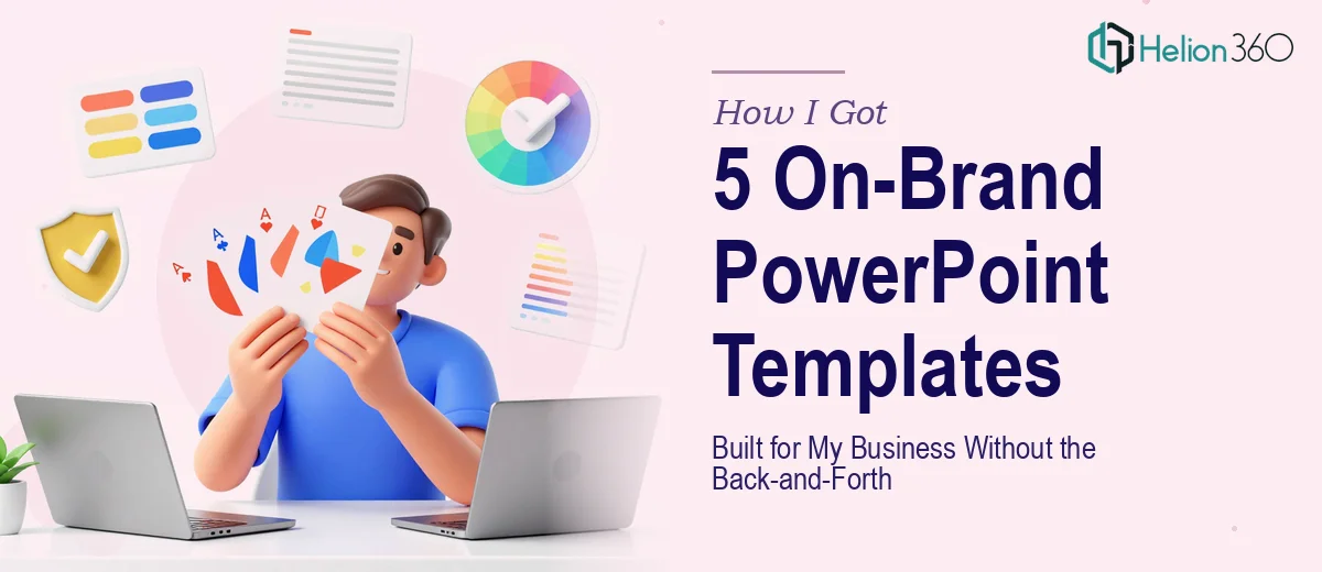
The Situation and Why Getting It Right Mattered
I run a growing business and we were putting together five distinct presentation types — a sales pitch, a client meeting deck, an internal update format, a product overview, and a quarterly report layout. Every one of them was going out to a different audience, but they all had to feel like they came from the same company.
The problem wasn't a lack of content. The problem was that every time someone on the team opened a blank PowerPoint file, the output looked completely different. Different fonts, different colors pulled from memory, inconsistent spacing. The decks technically communicated what we needed, but they didn't look like a professional organization.
With client meetings and sales conversations on the calendar, I needed this solved cleanly and quickly. Not patched — properly built. That meant custom PowerPoint templates that any team member could drop content into and have the output look polished without any additional design work on their end.
What I Found the Work Actually Required
I started by looking into what a properly built template system actually involves, and it became clear fast that this wasn't just a matter of changing some colors and saving a file.
The first thing that stood out was the master slide architecture. PowerPoint's Slide Master system controls how every layout inherits styling — fonts, placeholders, color fills, line weights. If that layer isn't set up correctly from the start, every layout beneath it will have inconsistencies that are tedious to trace and fix later.
The second thing was brand discipline. A real brand-aligned template doesn't just use the right hex values — it applies them with rules. Which color goes on which element, what the accent hierarchy is, how much white space each layout preserves. Without those decisions made at the master level, the template drifts the moment someone starts editing.
The third signal was the layout variety itself. Five templates for five different use cases means five distinct content structures — title slides, data slides, agenda layouts, full-bleed visual slides, text-heavy report pages. Each one has its own grid logic. Getting five of them to feel unified while serving genuinely different functions is a design problem, not just a formatting task.
What Doing This Well Actually Involves
The structural work starts with auditing the use case for each template and mapping the content hierarchy before a single layout is touched. A sales pitch needs a strong opening slide, a problem-solution flow, and a clear closing call-to-action — each requiring a different placeholder arrangement. An internal update deck needs density-friendly layouts that can carry data tables and status summaries. The practitioner's job here is to define the narrative skeleton of each deck type and match it to a set of slide layouts that make the right content easy to place. Skipping this step and jumping straight to visual design is the most common reason templates end up generic and unusable in practice.
The visual mechanics layer is where the 12-column grid, type scale, and color application rules get locked in at the master slide level. A proper type hierarchy uses three defined sizes — typically 36pt for titles, 24pt for section headers, and 16pt for body — and those values propagate from the master so no individual slide can accidentally override them. The brand palette gets assigned by role: a primary fill color, one accent, one neutral background, and a text color. That's a maximum of four active colors across the system. Setting this up so it survives real-world editing — where team members resize text boxes, paste in external content, and add unformatted charts — requires careful master configuration that takes real time to get right.
Polish and consistency across five templates is where most DIY efforts fall apart. Each template has to pass a visual consistency check against the others — same logo placement zone, same margin padding (typically 0.5 inches on all sides), same footer treatment, same icon style. Any deviation that seems minor in isolation becomes obvious when decks are presented back-to-back. The execution friction here is cumulative: a detail missed in one template has to be caught, corrected, and verified against the others, which means the QA pass alone on a five-template set takes several hours for someone who knows what to look for.
Why I Brought in Helion360 to Handle It
I looked at what this work actually required and made the call quickly. I didn't have the time to learn the Slide Master system properly, work through five layout architectures, and then run a full consistency audit across the set. And doing it halfway would have cost me more in rework than doing it right from the start.
Helion360 handled the full project end-to-end — from the initial brand brief through master slide configuration, all five template layouts, and the final delivery in editable PowerPoint files. They turned it around in days, not the weeks it would have taken me to navigate the learning curve and execution myself. The brief I gave them covered color schemes, font preferences, and the intended use case for each template. From there, they handled every decision — grid structure, layout variants, placeholder logic, and the consistency pass across all five files.
The value was in the speed and the depth. This is work they do continuously, with the tooling and process already in place.
What Was Delivered and What I'd Tell Anyone in the Same Spot
What came back were five fully editable, brand-aligned PowerPoint templates — each built on a properly configured master slide, each with layouts designed for its specific use case, and all five consistent enough to present as a cohesive system. The team started using them immediately. No reformatting, no color corrections, no hunting for the right font. The files just worked.
The business outcome was straightforward: presentations going out now look like they came from the same professional organization, and the team doesn't spend time on formatting decisions that should have been locked in months ago.
If you're looking at the same kind of project — multiple templates, brand alignment, and a short runway — Helion360 is the team to engage. They delivered themes and templates design services fast and with exactly the execution depth this kind of work requires. Learn more about how brand-consistent PowerPoint templates actually get built, and discover what professional PowerPoint and Word templates aligned with strict branding really involves.