

The Research Was Strong. The Presentation Was Not.
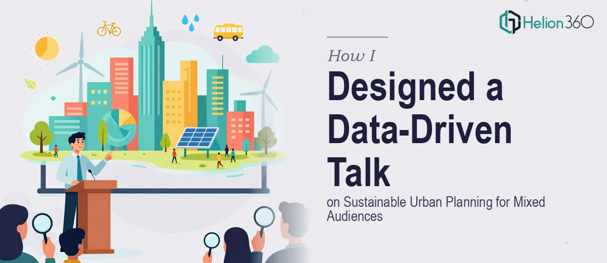
Our team had spent months building a solid body of research on sustainable urban planning — specifically, innovative approaches to climate change mitigation at the city level. The data was rigorous, the findings were meaningful, and the panel discussion we were presenting at was a real opportunity to share the work with a wider audience.
The problem? When I sat down to turn all of it into a presentation, I quickly realized how difficult it is to design something that speaks clearly to both engineers and policy advocates sitting in the same room. Technical accuracy and audience accessibility rarely overlap on their own — someone has to deliberately bridge that gap.
Where the Process Broke Down
I started by drafting slides directly from the paper. That was my first mistake. Academic writing and slide design follow completely different rules. The sentences were too long, the charts were too dense, and the structure felt more like a literature review than a compelling conference talk.
I tried simplifying the language, but then the technical reviewers on our team felt the precision was being lost. I tried adding more visual elements, but without a clear design framework, the slides looked inconsistent and cluttered. The data visualization pieces — charts on urban heat island reduction, modal shift statistics, emissions per capita over time — needed to work visually without losing their analytical integrity.
After two rounds of internal revision that still did not land where we needed them to, I knew this required a different kind of expertise.
Bringing in a Presentation Design Team
A colleague mentioned Helion360 after they had used them for a similar research-to-presentation project. I reached out, explained the context — a conference panel on climate change mitigation strategies, a mixed audience of urban planners, sustainability researchers, and local government officials, and a paper with a significant amount of quantitative data that needed to be communicated cleanly.
Their team asked the right questions upfront. What was the core argument we wanted the audience to walk away with? Which data points were load-bearing versus supporting? Where in the talk did we want to shift the emotional register from analytical to forward-looking?
Those questions alone helped me see that the presentation had a structure problem, not just a design problem.
What the Final Presentation Looked Like
Helion360 restructured the content before touching a single slide visually. They proposed a narrative arc that opened with a grounded, relatable urban scenario before introducing the research framework — which immediately made the technical content feel relevant to non-specialists without dumbing it down for the experts in the room.
The data visualization work was particularly strong. Dense tables from the paper were converted into clear comparative charts. A multi-variable emissions model that had been nearly impossible to explain verbally became a staged visual that revealed itself step by step during the talk. Each visual was designed to carry one clear point, not multiple.
Language across the slides was calibrated so that technical terms were used precisely where needed and plain language carried the narrative everywhere else. It was a balance I had not been able to strike on my own.
What I Took Away From This
Presenting research at a conference is not the same as writing it. The skills are genuinely different. Knowing your subject deeply does not automatically translate into knowing how to stage it for a live audience with varying levels of domain knowledge.
The presentation performed well during the panel. The questions from the audience were substantive, which told me the material had landed. One attendee specifically mentioned that the data was easier to follow than most research talks they had seen at similar events — which is exactly what we were aiming for.
If you are preparing a conference paper presentation and finding that the gap between your research and a polished deck is wider than expected, Helion360 is worth reaching out to — they handled the structural and visual complexity that I could not resolve alone, and the outcome spoke for itself.