

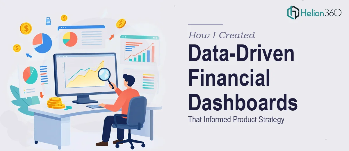
When the Spreadsheets Stopped Making Sense
I was a few weeks into a business analysis project for a small but fast-growing technology company in San Francisco. The ask seemed straightforward at first: pull together sales performance data, segment the customer base, track market trends, and then package all of it into PowerPoint decks that the leadership team could actually use.
I am reasonably comfortable with Excel. I can build pivot tables, write formulas, and create basic charts. But when I sat down with the raw data, I realized the scope was much bigger than a few tidy spreadsheets. The company had data coming from multiple sources — CRM exports, marketing reports, and manual sales logs — and none of it was in a format that could feed cleanly into a financial analysis dashboard. On top of that, the PowerPoint presentations needed to tell a coherent story to upper management, not just display numbers.
That combination — deep Excel modeling plus presentation-quality data visualization — pushed past what I could comfortably deliver on my own within the timeline.
The Gap Between Raw Data and a Useful Dashboard
The core challenge was not just cleaning data. It was deciding what story the data needed to tell, and then building Excel dashboards that surfaced those insights automatically. Customer segmentation alone required cross-referencing three different data tables. Sales performance tracking needed dynamic charts that updated as new data came in. And the market trend analysis had to be structured in a way that translated directly into slides for stakeholder presentations.
I spent two days trying to architect the Excel model myself. I had a working version, but it was fragile — too many manual steps, inconsistent formatting, and charts that did not hold up visually when dropped into PowerPoint. The slides looked like data dumps rather than a polished financial analysis presentation.
I knew I needed someone who had done this kind of work before, not just someone who knew Excel.
Bringing in the Right Support
After hitting that wall, I reached out to Helion360. I explained the full scope: structured Excel dashboards for sales performance, customer segmentation, and market trends, plus a companion PowerPoint deck that would summarize findings for the executive team. They asked the right questions upfront — about the data sources, the audience for the presentation, the level of interactivity needed in the dashboards, and the visual style expected.
Within a short time, their team took over the build. They restructured the Excel model so the dashboards were dynamic and easy to maintain. The financial analysis framework they used made it simple to update inputs and have the charts and summaries refresh automatically. Each section of the workbook was clearly organized — sales performance on one sheet, customer segmentation on another, market trend data on a third — all feeding into a summary dashboard view.
From Excel to a Stakeholder-Ready PowerPoint
The PowerPoint deck that came out of this process was a significant step up from what I had attempted. Helion360 translated the dashboard outputs into clean, well-designed slides that communicated the key findings without overwhelming the audience. Charts were simplified. Data labels were purposeful. The visual storytelling followed a logical arc — here is where we are, here is what the data shows about our customers and market, and here is what it means for product and marketing decisions.
The slides did not just summarize the Excel data. They shaped it into a narrative that leadership could engage with and act on.
What This Project Taught Me
The biggest lesson was that financial analysis dashboards and executive presentations are two different disciplines, and doing both well at the same time is genuinely hard. Building a robust Excel model requires analytical rigor. Building a compelling presentation requires a different kind of thinking — one focused on what the audience needs to understand and decide.
When those two things need to work together, and the timeline is tight, trying to handle it all solo often means doing both things at a mediocre level rather than doing either one well.
If you are facing a similar situation — raw data that needs to become a structured dashboard and a polished presentation — Helion360 is worth reaching out to. They handled the technical and visual sides of this project together, and the final output was exactly what the stakeholders needed.