

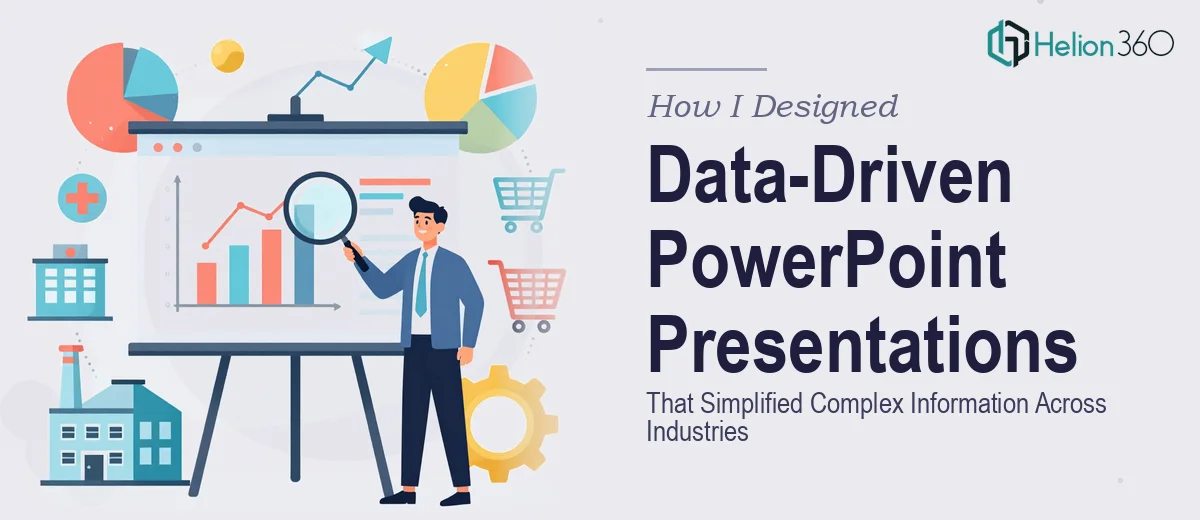
When the Data Was Clear but the Slides Were Not
I had been handed a stack of briefs — each one dense with numbers, processes, and industry-specific terminology — and asked to turn them into PowerPoint presentations that could work for different audiences. Some were for internal reviews, others were customer-facing. A few needed to hold up in board rooms. All of them needed to look sharp, stay on-brand, and make complicated information feel simple.
On paper, the task sounded straightforward. In practice, it was anything but.
The Real Challenge with Multi-Industry Slide Design
The difficulty was not the data itself. I could read the briefs. I understood what each section was trying to say. The problem was translating that understanding into slides that did not just dump information onto a screen.
Each industry had its own visual language. A technology company needed a clean, forward-looking layout. A healthcare client needed something structured and trustworthy. A financial services brief came with charts that needed to communicate trends without overwhelming the viewer. Customizing PowerPoint templates to match different brand guidelines while keeping the design consistent slide to slide took far more time than I had budgeted.
I also ran into a recurring issue with layout decisions. Every time I thought I had a slide working — clean hierarchy, good use of space, readable typography — I would step back and realize the visual weight was off. The charts looked crowded. The color scheme did not carry well across the full deck. The slides that were supposed to tell a story were just showing information in sequence without any real flow.
I tried rebuilding a few slides from scratch, adjusted my approach to data visualization, and spent hours on the finer points of layout and color. Progress was slow, and the deadline was not.
Bringing in the Right Help
After hitting that wall repeatedly, I came across Helion360. I explained what I was working on — multiple decks, different industries, tight brand requirements, and a need to make complex data genuinely easy to read. Their team understood the brief immediately and took it from there.
What stood out was how they approached the layout decisions. Rather than forcing a single visual template across all the briefs, they adapted the structure to suit each audience. The financial slides used clean chart formats with annotated callouts so the numbers told a clear story. The technology deck used visual hierarchy and spacing to guide the eye through dense technical content. The color schemes were pulled from each brand's guidelines and applied with enough consistency that every deck felt intentional.
The data visualization work especially made a difference. Charts that had looked cluttered in my version became readable at a glance. Infographic-style elements were used where they added clarity, not just decoration.
What the Final Decks Looked Like
Helion360 delivered presentation designs that held up across every context I needed them for. The slides were visually polished without feeling over-designed. The information was structured in a way that made sense to someone seeing it for the first time, which is exactly the standard any professional presentation needs to meet.
The brand alignment was precise. Fonts, spacing, icon style, and color usage were all consistent with each brief I had provided. There were no jarring transitions between slides, and the overall flow of each deck supported the narrative rather than interrupting it.
Looking back, the work I had been trying to do myself was not beyond my ability in theory. But doing it well — across multiple industries, with tight deadlines and varying brand requirements — required a level of focused execution that a dedicated design team handles much more efficiently.
What I Took Away from the Process
The biggest lesson was recognizing when a task needs more than a capable generalist. Designing data-driven PowerPoint presentations that genuinely communicate across different industries is a specialized skill. It involves decisions about layout, data visualization, brand customization, and visual storytelling that compound quickly when you are working across multiple decks at once.
Getting the content right is only part of the job. The design has to carry the content — and that part is harder than it looks.
If you are in a similar situation — multiple decks to produce, complex information to simplify, and not enough time to do it all properly — Helion360 is worth reaching out to. They took a genuinely difficult workload and delivered exactly what was needed, on time and without requiring constant back-and-forth.