

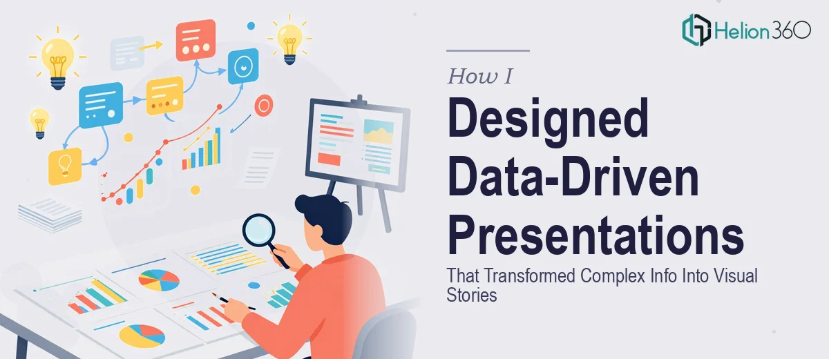
When the Slides Start Looking Like Spreadsheets
I had been handed a task that sounded straightforward at first — build a series of presentations for our company's upcoming annual conference. Each deck was tailored to a different department: marketing, product, and operations. The content covered market trends analysis, KPI summaries, and product launch overviews. On paper, it was organized. In practice, it was a mountain of raw data, competing priorities, and very little visual direction.
I opened PowerPoint and started building. The first deck came together reasonably well — clean layout, a few charts, decent flow. But by the third presentation, I realized I was losing the plot. The slides were becoming walls of numbers. Every chart looked like a screenshot from Excel. The narrative I was supposed to create had quietly disappeared under layers of tables and bullet-heavy slides.
This was not a problem of effort. I had the content. The issue was translating dense, multi-layered data into something an audience would actually absorb in a conference room.
The Gap Between Data and Story
Data-driven presentations are deceptively hard to get right. Anyone can paste a graph onto a slide. What is genuinely difficult is deciding which numbers matter, how to sequence them, and how to design around them so the audience feels informed rather than overwhelmed.
I spent a couple of days reworking layouts, trying different chart types, experimenting with color-coded sections for each department. Some of it worked. A lot of it did not. The decks were inconsistent in style, and the visual storytelling felt choppy — each slide existed in isolation rather than as part of a flowing narrative.
With the conference deadline approaching, I knew I needed outside help from someone who genuinely understood presentation design at this level.
Bringing in a Team That Understood Both Design and Data
After some research, I came across Helion360. I reached out, explained the scope — multiple conference presentations, department-specific content, heavy on data visualization, tight on time — and their team took it from there.
What happened next was not just a visual polish job. The Helion360 team worked through the actual structure of each deck. They identified which data points deserved visual prominence and which ones could be supporting context. They rebuilt the charts with cleaner, more intentional designs — not just prettier, but more readable under conference room lighting conditions. Each presentation was given a consistent visual language while still feeling distinct to its department.
The market trends deck got a flow that moved from context to insight to implication. The product launch slides were built around a story arc, not just a feature list. The KPI summary for operations was transformed into a visual dashboard spread across several slides — something the team could actually walk an executive audience through without losing anyone.
What the Final Decks Actually Looked Like
The difference between what I had built and what came back was significant — not because my starting point was bad, but because professional presentation design at this level involves decisions that go beyond software skills. It is about understanding how an audience processes information in a live setting, and designing every slide with that in mind.
The color palette was consistent across all three decks. Typography was legible from a distance. Data was visualized in ways that made trends immediately obvious. Transitions were subtle and purposeful. Nothing felt decorative for its own sake.
Most importantly, each presentation now had a clear visual narrative — a beginning, a middle, and a conclusion that left the audience with something actionable.
What This Experience Taught Me
Complex, multi-presentation projects for live events are a different challenge than building a single internal deck. The moment you are dealing with multiple data sources, multiple departments, and a live audience, the design requirements scale up significantly. Getting that right under deadline pressure is where having a skilled team makes a real difference.
If you are in a similar position — staring at a pile of data that needs to become a series of compelling conference presentations — Helion360 is worth reaching out to. They handled the full scope of what I could not manage alone and delivered exactly what the project needed.