

The Task Seemed Straightforward at First
As a practicing dentist with several years of teaching experience, I was asked to develop a series of dental health PowerPoint presentations covering topics like oral hygiene basics, gum disease prevention, pediatric dental care, and more advanced clinical topics such as periodontitis staging and restorative protocols.
The audience was mixed — some slides were meant for patient education in waiting rooms and community workshops, while others were intended for dental interns and medical professionals attending continuing education sessions. That dual-audience requirement is what made this project far more demanding than I initially expected.
I figured my clinical knowledge would carry the weight. But clinical accuracy is only one piece of the puzzle.
Where the Complexity Crept In
I started drafting slides on my own. The content was solid — I knew what information needed to go in, how to sequence it, and what clinical evidence to reference. But when I looked at the actual slides, something was off.
The patient-facing slides were too dense. I was writing at the level I'd present to a peer, not to someone sitting anxiously in a dental chair. Simplifying the language without dumbing down the message is a specific skill, and I kept overcorrecting in both directions.
The professional slides had the opposite problem. They were text-heavy with almost no visual hierarchy. There were no diagrams to support clinical concepts, no structured flow that could hold an audience's attention across a 45-minute session.
I also had no consistent visual theme across the decks. Each topic looked like a separate project. For a series meant to reflect a coherent educational program, that was a problem.
I spent two weeks reworking slides and still wasn't satisfied. The content was there. The presentation wasn't.
Bringing in the Right Support
After hitting that wall, I came across Helion360. I explained the challenge — dual audiences, multiple topics, need for both clinical precision and visual accessibility. Their team understood the brief immediately and asked the right questions: What tone should each deck carry? What visual style would work for a healthcare setting? How much text per slide was acceptable for each audience type?
Those questions told me they'd done this kind of work before.
I handed over my raw content outlines and a few rough slide drafts. From there, Helion360 took over the structural and visual design work entirely.
What the Final Presentations Looked Like
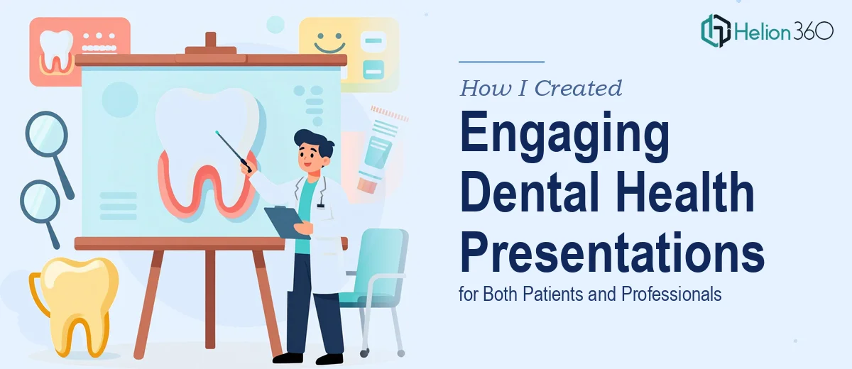
The patient-facing decks came back clean and approachable. Key messages were broken into short statements. Visuals like tooth anatomy diagrams, before-and-after comparisons, and simple infographics replaced walls of text. The color palette was calm and clinical — nothing jarring, nothing that felt like a generic template.
The professional decks were structured differently. They carried more depth, used proper clinical terminology, and included chart-based comparisons for treatment protocols. Visual hierarchy was clear — main points were prominent, supporting detail was present but not competing for attention.
Across all decks, there was a consistent design language. Same font system, same slide grid, same icon style. The series finally felt like a series.
What I Took Away From This
Building educational content for healthcare requires two competencies working together: subject matter depth and communication design. Having one without the other produces slides that either mislead or bore the audience.
I had the clinical side covered. What Helion360 brought was the design and structure expertise that transformed functional content into training presentations that actually hold attention and drive comprehension — for a patient trying to understand why flossing matters, and for a clinician reviewing treatment classifications.
If you're a healthcare professional dealing with the same gap — good content that isn't landing visually — the answer isn't to become a designer. It's to work with people who understand how to present complex information clearly.
Let Helion360 Handle the Slides While You Focus on the Content
If you're sitting on strong material that isn't translating well into slides, Helion360 is worth reaching out to. Their team steps in at exactly the point where content expertise ends and design execution begins — and they do it without requiring you to explain design theory or micromanage layouts. You bring the knowledge. They build the presentation around it.