

The Brief Looked Simple — Until It Wasn't
I was putting together materials for an internal marketing campaign review, and the ask seemed straightforward: two PowerPoint slides, infographic style, covering customer acquisition data and product launch metrics. Clean, visual, ready to present.
I had all the numbers. Total leads generated over the past year, conversion rates, ROI figures, social media engagement from recent launches, website traffic spikes — all of it was sitting in spreadsheets. The data part was done. What I underestimated was how much work goes into turning raw numbers into something that actually communicates clearly on a slide.
What I Tried First
I opened PowerPoint and started building. I pulled in bar charts, typed in the big numbers, dropped some icons from a free library. About two hours in, I had something that technically showed the data — but it looked like every other forgettable internal report slide. No visual hierarchy. No clear story. Just numbers in boxes.
The customer acquisition slide especially struggled. I needed it to show total leads, conversion rates, and ROI in a way that felt connected, not like three separate tables stacked together. And the product launch slide needed to capture social media engagement, website traffic, and customer sentiment in a format that was actually engaging to look at — not just informative.
I tried a few different layouts. I watched some tutorials. The designs kept coming out either too cluttered or too sparse. Neither version felt polished enough to be part of our larger marketing materials.
Handing It Off to People Who Do This Daily
After hitting a wall, I came across Helion360. I explained what I needed — two infographic-style PowerPoint slides, consistent with our brand colors and fonts, optimized for presentation use. I shared the raw data, a rough idea of the visual direction, and some notes on what each slide needed to communicate.
Their team asked a few focused questions about the brand identity guidelines and the audience for the presentation. That told me they were thinking about context, not just aesthetics.
What the Slides Looked Like When They Came Back
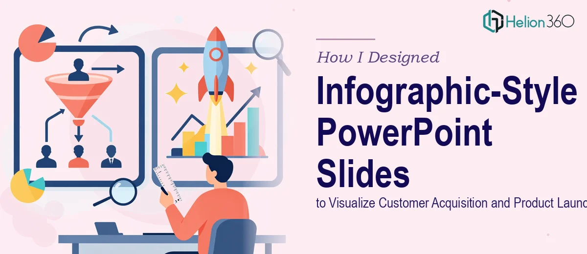
The first slide — focused on customer acquisition metrics — came back with a clean, modern layout that grouped the key numbers logically. Total leads, conversion rate, and ROI each had their own visual anchor: large, bold numerals with supporting micro-copy that gave each figure context. A simple progress-style graphic connected the lead-to-conversion flow without overcomplicating it. The whole thing read in about five seconds, which is exactly what a presentation slide needs to do.
The second slide handled the product launch data differently, which was the right call. Social media engagement, website traffic, and customer feedback each had distinct visual treatments — a small donut chart for engagement share, a trend line for traffic, and an icon-based feedback summary. It broke up the content visually without making the slide feel busy. Icons were consistent in weight and style, and everything aligned to a clear grid.
Both slides matched our brand palette and used our typography. They were delivered as editable PowerPoint files, so I could adjust numbers if anything changed before the presentation.
What I Took Away from This
The data visualization part of presentation design is genuinely its own skill. Knowing what numbers to show is different from knowing how to show them. Infographic-style PowerPoint slides in particular require a sense of layout, visual weight, and information hierarchy that takes real practice to develop.
For two slides going into a live marketing review, the stakes were higher than I initially gave them credit for. A poorly designed slide doesn't just look bad — it buries the point you're trying to make. The Helion360 team understood that, and the result reflected it.
If you're working on marketing presentation design and find yourself spending more time fixing layouts than thinking about your message, that's usually the signal to get the right support in place.
Need Slides That Actually Communicate?
If you're working on infographic-style PowerPoint slides and the design isn't coming together the way the data deserves, Helion360's team can step in and handle the heavy lifting — from layout and data visualization to brand-consistent, presentation-ready output.