

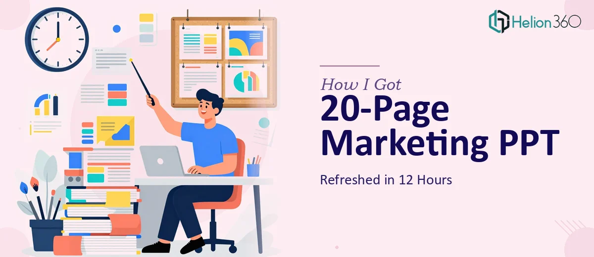
The Clock Was Already Running
It was early morning when I opened the calendar reminder. The marketing presentation was due at 6 PM — same day. Twenty slides, built over a year of incremental edits, now looking like a patchwork of mismatched fonts, outdated stock photos, and walls of text nobody wanted to read.
The content itself was solid. Strategy, messaging, and data were all in good shape. But the design? It hadn't been touched in over a year. The layout felt cluttered, the flow was hard to follow, and there was nothing interactive about it. For a virtual presentation to a sharp audience, that wasn't going to cut it.
I had exactly 12 hours to turn it around.
What I Tried to Handle Myself
My first instinct was to fix it myself. I spent about 90 minutes trying to clean up the slide master, swapping out a few images, and adjusting some font sizes. The problem wasn't skill — it was scope. A proper PowerPoint redesign across 20 slides, with updated visuals, interactive clickable navigation, mobile-responsive layout, and polished copy, is a serious undertaking. Doing all of that well in under 10 hours while also managing everything else on my plate wasn't realistic.
The slides needed more than a cleanup. They needed a complete visual overhaul — consistent layout grid, a modern aesthetic, clear hierarchy, and functional interactive elements. That's a full design job, not a quick edit.
Where Helion360 Came In
After hitting that wall, I reached out to Helion360. I explained the situation clearly: 20-page marketing PPT, tight 12-hour deadline, no content changes needed — just a full visual and structural refresh.
Their team responded quickly. I shared the file and a brief on what we needed: revamped layout and flow, updated imagery with a cleaner modern look, clickable interactive slides for virtual delivery, tightened copy without losing the original meaning, and mobile-friendly formatting.
From that point, I stepped back and let them work.
What the Refresh Actually Involved
A presentation redesign at this level isn't just swapping colors and fonts. Here's what a proper PPT refresh like this actually covers:
Layout and flow — Every slide was restructured so information landed in the right order. The eye had somewhere to go on each page. Sections were grouped logically so the narrative built naturally.
Modern visual aesthetic — Old stock images were replaced with cleaner, more relevant visuals. Icons were standardized. The color palette was made consistent across all 20 slides.
Interactive elements — Clickable navigation was added so the presenter could jump between sections without scrolling through slides linearly. This is especially useful for live Q&A during virtual sessions.
Copy refinement — Verbose bullet points were trimmed. Key messages were made sharper. Nothing was removed — just tightened so it was easier to absorb at a glance.
Mobile responsiveness — With virtual presentations, people often view shared screens on smaller devices. The layout was adjusted so text and visuals held up across different screen sizes.
The Result Before 6 PM
The refreshed deck came back with time to spare. I reviewed it, left a few minor notes, and those were addressed quickly. By the time the presentation went live, it looked like something the team had been building for weeks — not something turned around in half a day.
The feedback afterward was noticeably better than previous versions of the same deck. People actually engaged with the content instead of tuning out. A few colleagues asked who redesigned it.
What I Took Away From This
There's a real difference between knowing what a presentation needs and having the bandwidth to execute it — especially under deadline pressure. Trying to do both at once is usually where quality slips.
For a tight turnaround on something as visible as a marketing presentation, handing the design work to people who do this every day is just the smarter move. The content knowledge stays with you. The execution goes to people who can actually deliver it fast and cleanly.
If you're in a similar situation — a deck that needs a serious refresh on a short timeline — Helion360 is worth reaching out to. They handle the complexity so you can stay focused on the substance.
Need a fast, professional presentation refresh? Helion360 steps in when the work gets too detailed or time-sensitive to handle alone.
Related reading: full PowerPoint presentation redesign | PPTs and workbooks launch-ready