

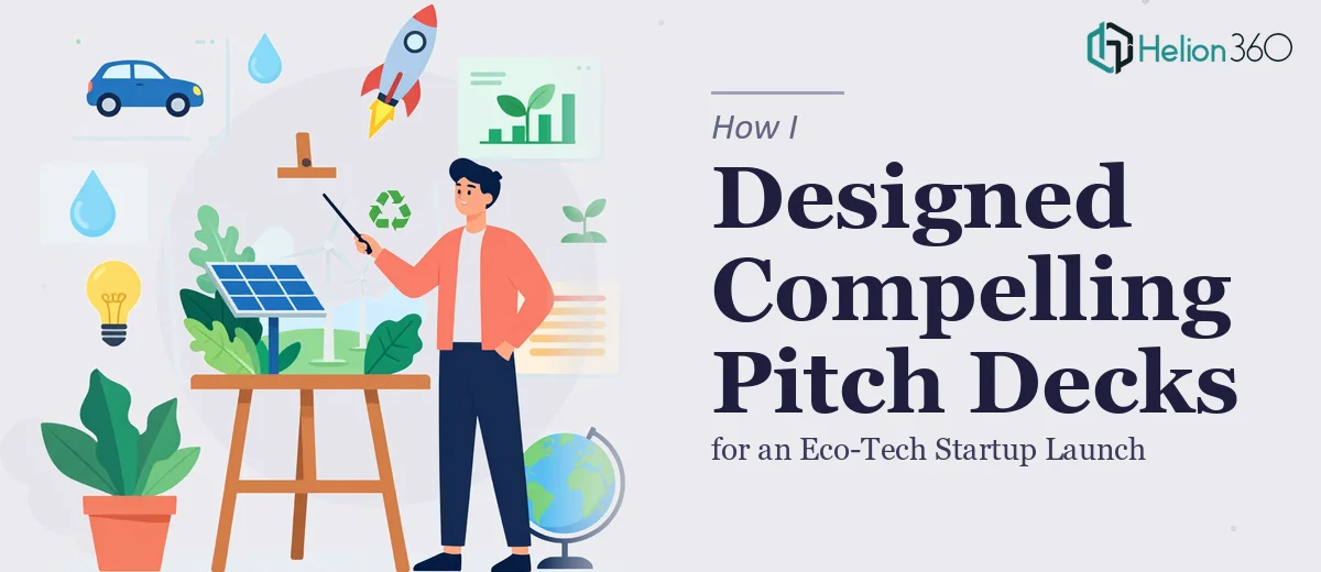
The Problem: A Product Launch With a Lot Riding on Visuals
When our eco-friendly tech startup was getting ready to launch its first product, we quickly realized that the quality of our presentations would directly affect how seriously people took us. We needed a compelling investor pitch deck, a product launch presentation, and a few internal decks to align the team around the roadmap. That is three distinct formats, three different audiences, and one very tight timeline.
I decided to take the first crack at it myself. I had used PowerPoint before, knew our product story better than anyone, and figured I could put something solid together. I started with the investor pitch deck since that was the highest-stakes deliverable.
Where It Got Complicated
The content came naturally. I knew the problem we were solving, the market opportunity, and the competitive landscape. What I could not figure out was how to make the slides look like they belonged to a serious startup and not a class project.
The eco-tech angle added another layer of complexity. We wanted the visual identity to reflect sustainability without leaning into tired green-and-leaf clichés. Every time I tried to design around that, something felt off — either too corporate or too activist, never quite right for a product launch targeting both investors and early adopters.
Beyond aesthetics, I was also struggling with information hierarchy. A startup pitch deck needs to tell a story in a specific sequence. Problem, solution, traction, team, ask. Getting that flow to feel natural on a slide rather than mechanical took more design thinking than I had anticipated. I spent two full evenings reworking the same five slides and still was not happy with the result.
Bringing In Specialized Help
After hitting that wall, I came across Helion360. I explained the full scope — the investor pitch deck, the product launch presentation, and the internal team deck — along with our brand direction, the eco-tech context, and the timeline. Their team asked the right questions upfront: tone, audience, key messages, and the visual style we were aiming for. That conversation alone gave me confidence they understood what we actually needed.
They took the raw content I had drafted, along with our loose brand references, and started building from there.
What the Final Decks Looked Like
The investor pitch deck came back structured around a clean visual narrative. The opening slide established the environmental problem with a single striking data point. The slides that followed moved through our solution, product demo visuals, and market sizing in a way that felt natural rather than formulaic. The color palette stayed minimal — deep slate, soft cream, and a single accent color that referenced sustainability without overselling it.
The product launch presentation was built for a different context entirely. It was more energetic, with stronger visual storytelling and clearer calls to action. Where the pitch deck prioritized credibility, the launch deck prioritized excitement and clarity around what the product actually did.
The internal team deck was the leanest of the three — focused on alignment rather than persuasion. It used consistent branding from the other two decks so everything felt like it came from the same company.
What I Took Away From This
The biggest lesson was that pitch deck design for a startup is not just a design task — it is a communication strategy that happens to live inside slides. Getting the visual hierarchy right, maintaining brand consistency across multiple decks, and tailoring tone for different audiences all at once is genuinely complex work.
I also learned that trying to do it all yourself when you are simultaneously managing a product launch is a recipe for mediocre output on both fronts. The decks I could have delivered would have been functional but forgettable. What we actually needed — and what we got — were presentations that held attention and communicated professionalism from the first slide.
The launch went well. Investor meetings moved forward, and the internal team felt genuinely aligned heading into the first product rollout.
If you are at the same stage I was — clear on your story but stuck on how to make it land visually — Helion360 is worth reaching out to. They handled the complexity I could not, and delivered decks that actually did their job.