

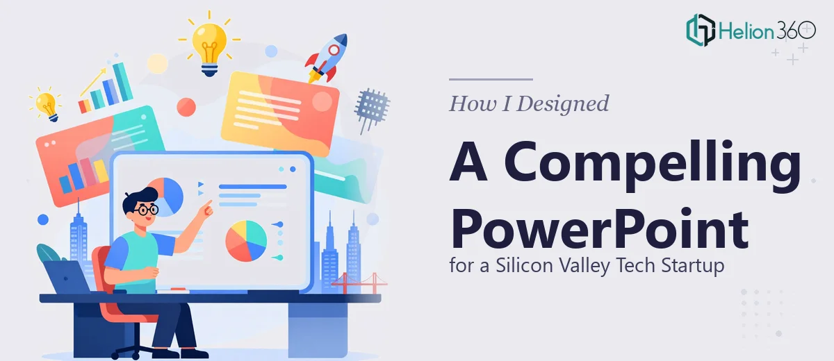
The Brief Was Simple. The Execution Was Anything But.
When the project landed on my desk, the ask seemed straightforward: build a PowerPoint presentation for a growing tech startup based in Silicon Valley. They needed something that would work across three audiences — investors, potential partners, and internal team members.
I've put together presentations before. Slide decks for internal reviews, product walkthroughs, status reports. But this felt different from the moment I read the brief. The startup had a genuinely strong concept, real market traction, and high-stakes meetings lined up. A generic startup pitch deck wasn't going to cut it.
Where the Complexity Started
The first challenge was the content itself. The team had a pile of raw material — market data, product screenshots, traction metrics, a founding story, and competitive analysis notes scattered across multiple documents. Turning that into a coherent narrative was the real work, and it sat at the intersection of storytelling, data visualization, and presentation design.
I started sketching out a slide flow. Problem slide, solution, product demo, market size, traction, team, ask. The standard investor pitch deck structure. But when I tried to make the data visually engaging, I kept running into the same wall: the charts looked flat, the layout felt cluttered, and the branding wasn't consistent across slides.
I also realized the presentation needed to serve multiple contexts — an investor deck, a partner overview, and an internal company slide set — each with a different level of detail and tone. That's three distinct decks, not one.
Reaching a Turning Point
After a few rounds of iteration that didn't produce the quality the brief demanded, I decided to bring in additional support. That's when I came across Helion360. I explained the scope of the project — the three audience types, the raw content that needed structuring, the branding inconsistencies, and the tight timeline.
Their team asked the right questions upfront. What's the primary goal of the investor-facing deck? What tone does the founding team want to project? Are there brand guidelines to follow, or do we need to build from scratch? That level of clarity before touching a single slide told me they understood what professional presentation design actually involves.
What the Design Process Looked Like
Helion360 took the raw inputs and started with content architecture — organizing the narrative before touching the visual layer. The investor deck opened with a crisp problem statement backed by a single, well-sourced data point. The product slides used clean screen mockups rather than dense text. The traction slide used a visual timeline that made growth easy to read at a glance.
For the partner-facing version, the tone shifted. Less emphasis on funding trajectory, more on integration value and use-case fit. For the internal deck, the formatting was simplified — same visual language, but structured for team updates rather than external pitching.
The visual design itself was consistent throughout: a modern tech aesthetic with a defined color system, clean sans-serif typography, and restrained use of animation — just enough to guide attention, not distract from the content.
Data visualization was handled with real care. Revenue projections, market sizing charts, and feature comparison tables were all redesigned to be readable in under five seconds — which is roughly how long a slide has to make its point in a live presentation.
The Result
The final deliverable was a three-deck package: a 14-slide investor pitch deck, a 10-slide partner overview, and an 8-slide internal presentation. All three shared a unified visual identity but were tailored for their respective audiences.
The startup used the investor deck in a series of pitch meetings shortly after delivery. The feedback from their team was that the presentation held the room's attention and made the business case without requiring constant verbal explanation — which is exactly what a well-designed PowerPoint should do.
What I took away from this experience is that startup presentation design is rarely just a design problem. It's a content problem, a strategy problem, and a communication problem — all at once. Having Helion360's team handle the complexity meant the final output was genuinely presentation-ready, not just visually polished.
Need a Presentation That Actually Works for Your Audience?
If you're working on a startup pitch deck or a multi-audience presentation and the complexity is getting ahead of you, Helion360 is worth reaching out to. Their team handles the full scope — from content structuring and data visualization to slide design and brand consistency — so you're not just getting a prettier version of what you already had.