

The Situation We Were In and Why It Couldn't Wait
We were at a critical point with our digital marketing startup. A presentation was coming up — the kind where the room would be full of people who had seen hundreds of decks and could spot a weak one in three slides. The goal was straightforward on paper: show our growth, position ourselves clearly against the competition, and make our vision feel inevitable. But what that actually required under the hood was anything but straightforward.
The competitive landscape in digital marketing tools and software services is dense. There are well-funded incumbents, fast-moving challengers, and a dozen niche players who all look similar from the outside. Any presentation that didn't account for that landscape in real, specific terms was going to fall flat. The stakes were real — this wasn't an internal update, it was a positioning moment. I recognized quickly that this needed to be done right, not just done.
What I Found the Solution Actually Required
When I started mapping out what a genuinely strong startup presentation deck would require, I realized the scope was much larger than I'd initially framed it.
The first thing that became clear was that the competitor research layer wasn't optional decoration — it was foundational. Building out a credible competitive positioning section means systematically documenting how each key competitor presents its product, what pricing structures they expose publicly, what their customer-facing messaging emphasizes, and where visible gaps exist. That's not a two-hour Google session. It's structured, category-by-category analysis across multiple sources, captured in a way that can actually be turned into slides.
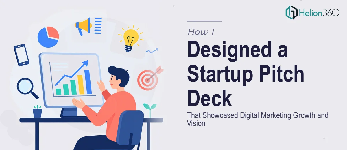
The second signal of real complexity was the visual storytelling requirement. A growth and vision narrative for a startup isn't just bullet points about the market. It needs a visual architecture that carries the story — the right chart types for growth data, a competitive landscape layout that reads immediately, and a framework that makes the startup's positioning feel clear rather than claimed. That requires design judgment, not just slide-building. I knew I wasn't going to produce that combination of research depth and visual quality myself, not in the time available.
What the Work That Needs to Happen Actually Looks Like
The starting point for a project like this is the structural and narrative work — auditing what you actually know versus what needs to be researched, then mapping a story arc that earns its conclusion. For a digital marketing startup, a well-structured deck typically runs 15 to 20 slides, with a clear problem-solution-traction-vision flow. The competitor research section alone requires at minimum four to six distinct competitor profiles, each covering product positioning, pricing exposure, marketing angles, and differentiated features. Skipping or thinning out this section is what causes presentations to feel thin on credibility. Getting it right means spending real hours in systematic research before a single slide gets built.
The visual mechanics layer is where the execution friction escalates sharply. A presentation that communicates growth and competitive positioning needs a 12-column layout grid applied consistently across master slides, a typographic hierarchy running at roughly 36pt for headlines, 24pt for subheads, and 16pt for body, and a data visualization approach matched to the actual story each chart needs to tell — line charts for growth trends, bubble charts or matrix layouts for competitive positioning, not whatever default PowerPoint suggests. Anyone who hasn't built these systems repeatedly will spend more time troubleshooting master slide inheritance and chart formatting than on the actual content. The technical side alone is a steep learning curve under time pressure.
Polish and brand consistency across a 15-to-20-slide deck is the layer that most people underestimate until they're deep into it. Maintaining a palette of no more than four brand colors, ensuring icon sets are from a single family, and applying consistent margin and padding rules across every layout variant — these are the details that separate a deck that looks professional from one that looks assembled. A single off-brand color or an inconsistent header treatment on slide 14 erodes the confidence the deck is supposed to build. Getting this right requires a disciplined review pass that most non-designers skip because they don't know what they're looking for.
Why I Brought in Helion360 to Handle It
I didn't spend time attempting this myself. The combination of structured competitor research, story architecture, and visual execution depth made it obvious that this was a full-project engagement, not something to figure out on the fly.
Helion360 handled the full scope end-to-end — the systematic competitor research and screenshot documentation across digital marketing tools and services, the narrative structure and slide architecture for the startup's growth and vision story, and the complete visual design built to a professional standard from the first slide to the last. The turnaround was fast. What would have taken me weeks of learning, iterating, and second-guessing was delivered in days, at a level of execution I couldn't have matched regardless of the time I put in.
The value wasn't just the output — it was knowing that a team with the tooling and expertise already in place was running the project, not someone building the process from scratch while the clock ran down.
What Was Delivered and What I'd Tell Anyone in the Same Spot
The result was a complete, professional presentation deck — competitor research documented and visualized clearly, growth narrative structured to land, and visual design consistent from cover to close. It performed exactly as intended in the room. The competitive positioning section, in particular, gave the presentation a credibility that self-assembled decks rarely carry.
The most important thing I'd share with anyone facing a similar project is this: the complexity isn't in the idea, it's in the execution depth. A startup presentation deck that actually works in a high-stakes room requires research rigor, narrative structure, and visual discipline working together — and pulling all three off well, fast, is not a solo project.
If you're looking at this same combination of competitor research, startup positioning, and professional presentation design and want it handled end-to-end without the weeks of learning curve, Helion360 is the team to engage — they delivered fast and brought the execution depth this kind of work genuinely requires.