

The Problem With Raw Sustainability Data
When you are running a startup focused on environmental solutions, the last thing you want is for your data to sit in a spreadsheet that nobody can interpret at a glance. That was exactly where I found myself a few months ago. We had been collecting metrics across multiple projects — project completion rates, funding received, resource utilization — but the raw numbers were telling no story on their own.
Stakeholders were asking for progress updates, and I was sharing tables. Not ideal.
I knew we needed dynamic Excel charts that could update automatically as new data came in. No one on the team had time to manually refresh graphs before every meeting. The goal was simple: build something reliable enough that we could trust it during a live stakeholder presentation.
What I Tried on My Own
I started by building a few basic bar charts and line graphs directly in Excel. They looked reasonable at first, but the moment I started adding conditional formatting, dynamic named ranges, and drop-down-driven chart filters, things got messy fast.
I tried linking the charts to a live data table using structured references. When the data range expanded with new rows, the charts sometimes failed to pick up the new entries correctly. I also attempted to use color-coded thresholds to flag underperforming metrics — the kind of visual cue that would help stakeholders immediately spot problem areas — but getting that logic to work cleanly across multiple chart types was taking far more time than I had.
After two evenings of debugging formula errors and misaligned chart axes, I had to be honest with myself. The problem was not that I could not use Excel. It was that building a clean, production-ready data visualization system with this level of detail requires a very specific skill set and a lot of focused time.
Bringing in Outside Help
I came across Helion360 while searching for Excel data visualization specialists. I reached out, explained the situation — sustainability startup, multiple metrics, stakeholder-facing charts, automatic updates required — and their team got to work.
What helped was that I did not have to translate my needs into technical language. I described what I needed the charts to do, and they figured out the structure behind it. They asked the right clarifying questions: How often does the data update? Who will be maintaining the file? Do you need filter controls for different project views?
Those questions alone told me they had done this before.
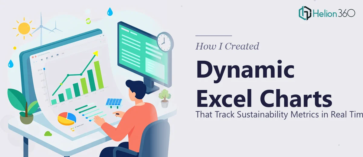
What the Final Excel Charts Looked Like
Helion360 delivered a well-structured Excel workbook built around a clean data input sheet that fed into a dynamic dashboard. The charts — covering project completion rates, funding progress, and resource utilization — all updated automatically as new rows were added to the source table.
They used color-coded thresholds so that metrics falling below target would appear in a muted red, while those on track showed in green. Annotations were added to flag milestone dates. The whole thing was intuitive enough that someone who had never touched the file could open it and immediately understand what they were looking at.
The chart for resource utilization was particularly well done. It used a stacked bar format that made it easy to see not just how much had been used, but how it was distributed across different project categories — something I had struggled to represent clearly on my own.
What I Learned From This Process
The biggest takeaway was that dynamic Excel chart design is its own discipline. It is not just about knowing how to insert a chart — it is about understanding how data flows through a workbook, how named ranges and structured tables interact with chart series, and how to design something that is maintainable long after the original builder is gone.
For a sustainability-focused startup where the data story changes every few weeks, having charts that adapt automatically is not a luxury. It is a basic operational need.
Our stakeholder presentations have been noticeably smoother since. The charts do the explaining before I even start talking, which is exactly what good data visualization is supposed to do.
If you are in a similar position — data collected, story unclear, and not enough time to build the right Excel chart structure from scratch — Helion360 is worth a conversation. They handled the complexity that was slowing us down and delivered something we actually use every week.