

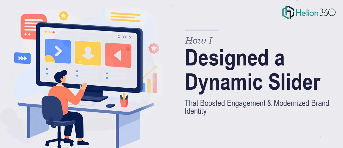
The Homepage Was Quietly Hurting Us
I noticed it during a routine site review. The homepage slider — the very first thing a visitor sees — was static, visually flat, and doing nothing to communicate what we actually stood for as a brand. It looked like it was built three years ago and never touched since, because it was.
The stakes were real. The homepage is the front door of any digital presence. A stagnant banner image sends the wrong signal immediately: that we're not current, not dynamic, and maybe not worth the visitor's time. With a brand refresh in progress and an audience we were actively trying to grow, the gap between where our homepage was and where it needed to be was impossible to ignore.
I knew this wasn't a quick swap of an image file. A proper homepage slider redesign — one that actually performs — is a compound problem involving motion design, visual storytelling, brand application, and technical integration. It needed to be done right.
What I Found a Real Slider Redesign Actually Requires
When I looked into what a high-performing homepage slider actually takes to build properly, the scope expanded quickly. The surface problem — a stale banner — turned out to be a symptom of several deeper issues that all needed addressing at once.
First, the visual hierarchy was broken. The existing slider had no clear focal point, no typographic system guiding the eye, and no deliberate contrast between the background imagery and the text sitting on top of it. Fixing this isn't just a design preference — it requires a structured approach to layout, legibility, and image treatment.
Second, animation and motion design are their own discipline. An effective homepage slider doesn't just fade between images. It uses timed entrance animations, parallax layering, and transition logic that reinforces the brand's energy without overwhelming or distracting the visitor. Getting that balance right requires both design judgment and technical fluency.
Third, brand consistency across the entire homepage — not just the slider — had to be addressed. Updating the hero section while leaving the rest of the page visually disconnected would make things worse, not better. The redesign had to propagate coherently across the full page.
What the Work Actually Involves
The right approach to a homepage slider redesign starts with the narrative and structural layer. Before any visual work begins, the content inside each slide needs to be mapped: what message each frame carries, what action it drives, and how the sequence tells a cohesive brand story. Effective sliders typically run three to five frames maximum — more than that and engagement drops sharply. Each frame needs a headline, a supporting visual, and a clear call-to-action positioned within a consistent layout grid. Getting this architecture wrong makes every subsequent design decision harder to resolve, and it's the step most people skip entirely when they go straight to visual production.
With the structure mapped, the visual mechanics come next. A 12-column grid provides the underlying structure that keeps elements aligned across every slide and across every screen size. Typography needs a defined scale — headline type typically sits at 52–64pt, subheads at 28–32pt, and body or CTA copy at 16–18pt — and those rules need to hold across all frames without exception. Banner imagery requires intentional treatment: color grading, overlay gradients, and masking so that text remains legible at all viewport sizes. The friction here is that these decisions interact. A choice made on the headline scale affects how the image crop works, which affects how the overlay needs to behave on mobile. Each variable pulls on the others, and inconsistency compounds fast.
The motion and animation layer is where the most time disappears for anyone attempting this without a dedicated workflow. Entrance timing for text elements — typically staggered at 200–400ms intervals — needs to feel natural and not mechanical. Image transitions, whether crossfade, slide, or parallax-based, each carry a different emotional tone and need to match the brand's register. On top of that, all animation behavior needs to be validated across browsers and device types, because what renders smoothly in one environment can stutter or break in another. This phase alone can consume multiple revision cycles even for experienced practitioners.
Why I Brought in Helion360 to Handle It
I recognized quickly that this project had too many moving parts to hand off to chance or to attempt piecemeal. The combination of structural planning, motion design, brand application, and cross-device technical validation isn't a one-afternoon task — it's a full-scope project that requires a team with the workflow already in place.
Helion360 handled the full project end-to-end and delivered fast. The scope included the full homepage slider redesign with animated banner assets, a visual hierarchy system applied consistently across the homepage, and brand integration that carried through from the hero section down through the supporting page elements. What would have taken me weeks of research, trial and error, and revision cycles was turned around in a fraction of that time. They came in with the tooling, the design judgment, and the motion design fluency already built in — no ramp-up required.
The Result and What I'd Tell Anyone Facing the Same Problem
What came back was a homepage that finally matched the brand we were building. The slider had real visual energy — timed animations, sharp typographic hierarchy, and imagery that was properly treated and on-brand across every frame. The full homepage cohesion meant the slider didn't feel like a patch over an old page; it felt like the page had been rethought from the top.
More importantly, the site now makes the right first impression. Visitors land and immediately get a clear sense of who we are and what we offer. The visual language is consistent, the motion feels purposeful rather than decorative, and the whole thing holds up on mobile just as well as on desktop.
If you're looking at a homepage that's stopped representing your brand well and you want it handled end-to-end without the weeks of learning curve, Helion360 is the team I'd engage — they delivered for me fast and brought exactly the kind of execution depth this work requires.