

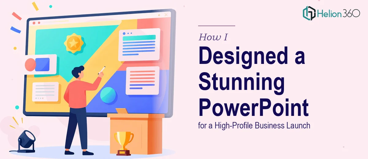
The Brief Was Clear. The Execution Was Anything But Simple.
When I was handed the task of building a PowerPoint presentation for a major business launch event, I thought I had a reasonable handle on things. I knew the content, I understood the brand, and I had used PowerPoint enough times to feel confident. The brief called for at least ten slides, dynamic visuals, integrated charts and graphs, and a design that felt polished enough for a high-profile audience. Tight deadline included.
I started on slide one and immediately realized the gap between "knowing PowerPoint" and "designing a professional business presentation" is wider than most people admit.
Where I Got Stuck
The content side was fine. I had the key messages, market data, product highlights, and the business story mapped out. But turning that into something visually compelling was a different challenge entirely.
My initial slides looked functional at best. The charts were there, but they didn't feel integrated — they looked like they were pasted in from a spreadsheet. The color palette was inconsistent. Slide transitions felt random. And the overall flow from one idea to the next had no visual rhythm.
For a regular internal meeting, this might have been acceptable. But for a business launch event with a room full of investors, partners, and media — it wasn't going to cut it. A weak presentation design at this level doesn't just underperform. It actively works against the credibility of everything being said.
I had about three days left on the deadline.
Bringing in the Right Support
After hitting a wall trying to fix the design on my own, I came across Helion360. I explained the situation — the event context, the slide count, the data that needed to be visualized, the brand assets I had, and the deadline. Their team understood the scope immediately and took it from there.
What they asked for was practical: the raw content, brand colors, any existing slides, and a clear sense of the audience. No lengthy onboarding. No back-and-forth for days. They got to work.
What the Finished Presentation Looked Like
When the first draft came back, the difference was immediate and significant.
The opening slide had a clean, bold visual identity — strong typography, a striking hero image, and a layout that communicated authority without being cluttered. Each subsequent slide had a clear purpose. Data slides used custom-styled charts that matched the brand palette, making the numbers readable and visually compelling at the same time.
The flow between slides was intentional. There were logical section breaks, subtle transitions that didn't distract, and consistent spacing that made every slide feel like it belonged to the same story. The charts and graphs showing market data, growth projections, and product positioning were all formatted to reinforce the narrative rather than interrupt it.
By the time we hit slide ten, the presentation felt complete — not just in slide count, but in structure and visual momentum.
What Made the Difference
Looking back, a few things stand out about what Helion360 delivered that I couldn't have pulled off under that time constraint.
Consistent visual language across all slides was the foundation. Every element — fonts, colors, icon styles, spacing — was aligned. This is the kind of detail that's easy to overlook when you're working fast but impossible to miss when it's done right.
Data visualization that serves the story was the other major shift. Charts weren't just dropped in — they were designed to highlight the specific insight that mattered on that slide. A revenue growth chart was formatted to emphasize the inflection point. A competitive comparison was structured to make the positioning clear at a glance.
Smooth content flow meant the audience wasn't doing mental work to follow the presentation. Each slide transitioned into the next in a way that felt natural.
The Event and What I Took Away
The presentation landed well. The audience was engaged, the Q&A that followed was substantive, and several attendees commented on how clearly the information was presented. That's not a small thing — clarity in a launch presentation shapes the first impression of everything that comes after.
The real lesson for me wasn't about PowerPoint features or design theory. It was about recognizing when a project's visual demands exceed what you can reasonably deliver under pressure — and getting the right support before the deadline makes that decision for you.
Need a Presentation That Has to Perform?
If you're working on a high-stakes business launch, investor meeting, or any event where the presentation needs to do real work — Helion360 is worth reaching out to. They step in when the design complexity or timeline gets beyond what's manageable alone, and they deliver work that holds up in the room.