

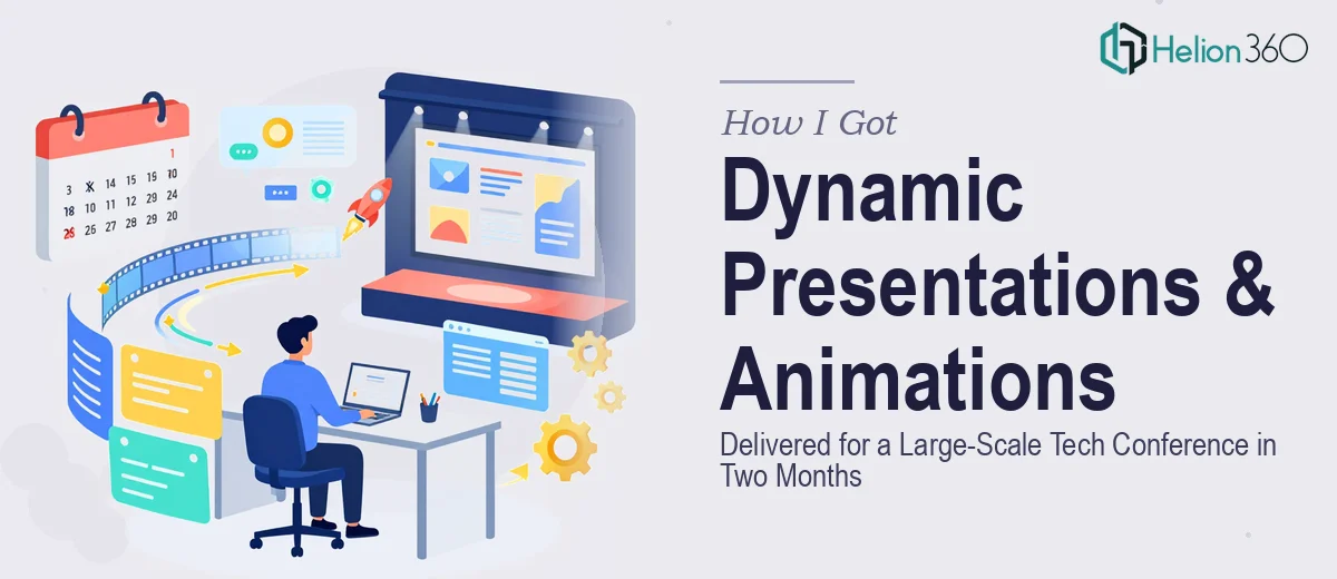
The Pressure of a Two-Month Conference Deadline
Two months sounds like a reasonable runway until you map out everything a large-scale tech conference actually needs visually. We had keynote decks, speaker introduction slides, animated lower thirds, session transition screens, exhibitor spotlight visuals, and promotional materials — all needing to feel like a single coherent visual world rather than a patchwork of last-minute design decisions.
The stakes were real. Hundreds of attendees, a lineup of credible speakers, and exhibitors who had paid to be part of something that looked polished and professional. A conference's visual identity is often the first thing an audience registers before a single word is spoken. If the slides look inconsistent or the animations feel cheap, the whole event loses authority before it starts. I knew immediately this wasn't something to improvise. It needed to be done right, from the ground up.
What I Found Conference Presentation Design Actually Requires
Once I started looking seriously at what this scope of work involved, the complexity became obvious fast. Conference-scale presentation design isn't just making slides look nice — it's building a system. Every keynote, panel, and breakout session needs to draw from the same visual framework: a consistent master template, a defined animation language, and a brand palette that holds up across dozens of individual deliverables.
The animation side alone signaled real depth. Motion design for presentations operates on specific timing conventions — entrance animations at 300–500ms feel natural, anything slower reads as sluggish on a large screen. Easing curves matter. The difference between a linear fade and an ease-out on a content reveal is immediately perceptible to an audience, even if they can't articulate why. Beyond timing, animated elements need to be built so they can be adapted quickly when a speaker updates their content the night before the event — which they always do. That kind of forward-thinking build structure takes experience to get right the first time.
What the Work Actually Involves at This Scale
The foundation of a conference presentation system is structural. The right approach starts with a master slide architecture — a set of 8–12 master layouts covering titles, content, speaker bios, section transitions, and full-bleed visual moments. These masters need to carry the full brand system: a type hierarchy locked to something like 48pt/32pt/20pt across display, subhead, and body, a four-color palette capped at one primary, one accent, one neutral, and one background tone. Getting this architecture right before a single speaker deck is built is what makes consistency achievable across 20 or 30 individual files. Without it, every file drifts and every revision becomes a manual fix.
The animation layer is its own discipline. Doing this well requires building a motion system, not just applying effects slide by slide. That means defining a set of animation presets — consistent entrance, exit, and emphasis behaviors — that any slide in any deck can draw from. On a large screen in a dark room, poorly timed animations are immediately noticeable: a 700ms fade-in on a bullet point that should have appeared in 350ms stalls the speaker's rhythm. The execution friction here is significant. Building reusable animation states in PowerPoint or Keynote, testing them at actual display resolution, and making sure they survive last-minute content edits without breaking takes skill and patience that only comes from doing this kind of work repeatedly.
Polish and brand consistency across a multi-deck project is where most in-house attempts fall apart. With a conference of this size, the deliverable set includes not just session decks but title cards, holding screens, speaker introduction sequences, and exhibitor slides — all of which need to look like they were built by one hand. That means enforcing padding rules (consistent 40–60px safe zones on all four sides), icon style uniformity, and photo treatment standards — whether images are full-bleed, masked in a shape, or overlaid with a brand-tinted gradient. Auditing every file against these standards before the event is a multi-hour process, and the edge cases that slip through are the ones that show up on a 15-foot screen.
Why I Brought in Helion360 to Handle It
Once I understood the scope clearly, attempting to manage this internally wasn't a real option. The combination of structural template work, motion design, and multi-deck consistency enforcement across a tight timeline needed a team that already had the process and tooling in place — not one learning it on the job.
I engaged Helion360 to handle the full project end-to-end. They built the master template system from scratch, developed the animation presets and applied them consistently across every deck format, and handled the full round of consistency audits before final delivery. What would have taken weeks of internal iteration was turned around quickly — done in days, not weeks, and at a level of execution depth that internal resources simply couldn't have matched given the timeline. The team worked closely with our marketing leads to make sure every visual decision reflected the event's positioning, and they were structured enough to absorb last-minute speaker content changes without derailing the overall timeline.
The Result and What I'd Tell Anyone Looking at a Similar Project
What came back was a complete visual system — a master template, a full animation library, and every session deck built to the same standard. On the day of the conference, the visual experience held up from the first keynote to the closing panel. Speakers commented that their slides felt elevated. Exhibitors asked who handled the design. The overall production quality set the tone for how the content was received, and that's exactly what good conference presentation design is supposed to do.
The two-month window that initially felt tight became workable precisely because the right team was on it from day one. If you're looking at a conference, summit, or large-scale event that needs this kind of visual system built fast and built properly, Helion360 is the team I'd engage — they handled the full execution depth this project required and delivered it on a timeline that made the difference.