

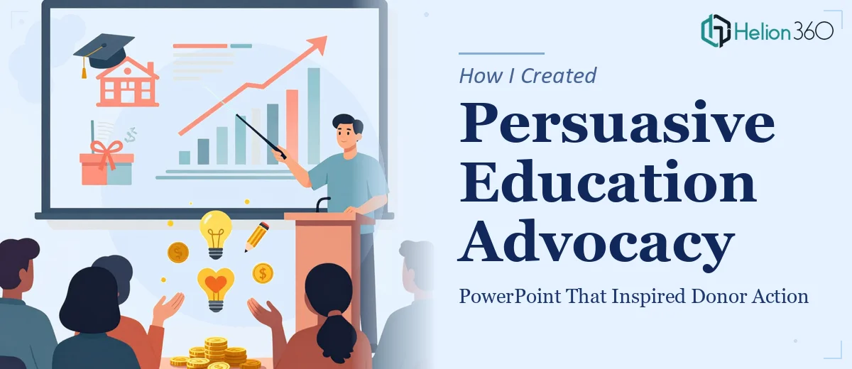
When the Mission Is Clear but the Slide Deck Is Not
We had a cause worth fighting for. Our nonprofit initiative, focused on expanding education access for children from low-income backgrounds, had a name — "Empowering Tomorrow" — and a message we genuinely believed in. What we did not have was a presentation that could carry that message to donors and stakeholders without losing them halfway through.
I volunteered to put together the PowerPoint. I figured I could handle it. I had the content, I had the data, and I understood the emotional core of what we were trying to say. What I underestimated was how much craft goes into building a persuasive education advocacy presentation that works — not just one that exists.
What I Tried Before Hitting a Wall
I started with a standard PowerPoint template. I dropped in our mission statement, a few statistics about education inequality, and some stock images I found online. It looked serviceable. But when I ran through it myself, something felt flat. The slides were informative, but they were not moving anyone toward action.
The problem was not the data — we had compelling numbers. The problem was that I was presenting facts without a narrative arc. A donor does not just need to understand the issue; they need to feel it and then see a clear path to being part of the solution. Building that kind of visual storytelling into a slide deck is a different skill set than I had at the time.
I also struggled with layout decisions. I kept overcrowding slides, unsure of how to balance text with imagery. Every time I pulled back the text, the slide felt incomplete. Every time I added more, it looked like a report rather than a call to action.
Bringing in the Right Support
After a few rounds of revisions that still were not landing, I reached out to Helion360. I explained the context — a nonprofit appeal presentation, emotionally driven, designed to move donors to act — and their team understood immediately what kind of work this required.
They took the content I had drafted and restructured it into a clear narrative flow. The presentation opened with the human story — a child, a community, a gap — before introducing the data that backed it up. The statistics did not lead; they supported. That shift alone changed how the whole deck felt.
The visual design followed the same logic. Clean layouts, purposeful imagery, and a color palette that felt warm and trustworthy without being overly emotional. Each slide had a single, focused point, and the transitions between sections felt intentional rather than mechanical.
What the Final Presentation Looked Like
The finished deck opened with a short narrative framing the problem in human terms, then moved into the scope of the issue using well-placed data visualizations. From there, it presented our program model and what donor support would specifically enable — not in vague terms, but with clear, visual breakdowns of impact.
Helion360 also helped structure the closing section as a genuine call to action rather than a passive summary. The final slides were designed to leave the audience with a specific next step in mind, which is exactly what a fundraising presentation needs to do.
When we presented the deck to our first group of stakeholders, the response was different. People were asking questions about how to get involved, not just nodding politely. That shift was directly connected to how the story was structured and how the visuals supported it.
What I Took Away From This
Building a persuasive advocacy PowerPoint is not about having more content — it is about having content in the right order, supported by visuals that reinforce the message rather than compete with it. Emotional resonance and logical structure have to work together, and that balance is harder to achieve than it looks when you are too close to the material.
The experience also reminded me that a presentation is not a document. It is a performance tool. Every slide should earn its place by moving the audience one step closer to action.
If you are working on a similar appeal — whether for education, community development, or any cause-driven initiative — and the deck is not quite landing the way you need it to, Helion360 is worth a conversation. They brought structure, design, and narrative clarity to a project that genuinely needed all three.