

When a Complex Topic Needs to Reach a Non-Expert Audience
I was working on a research project involving some fairly dense technical subject matter — the kind of content that makes perfect sense to the people who live inside it every day, but lands as complete noise for everyone else. The ask was to create an educational presentation that would bring a broader team up to speed: not a conference paper, not a whitepaper, but a clear, structured, visually engaging walkthrough that people could follow without a specialist background.
The stakes were real. Alignment across the team depended on people actually understanding what we were building and why. A slide deck that confused rather than clarified would set us back. I knew this needed to be done properly — not just a few slides thrown together with some bullet points and a stock photo.
What I Found Out This Kind of Presentation Actually Takes
When I started looking seriously at what a well-executed educational presentation requires, three things became clear quickly.
First, translating technical content for a general audience is its own discipline. It is not simply removing jargon — it requires restructuring the logic of how information is sequenced so that each concept builds on the last. That is a narrative architecture problem, not a formatting problem.
Second, Canva as a design environment has real capability, but using it well at a professional level — with consistent master layouts, a locked brand palette, and typography that communicates hierarchy — requires knowing the tool deeply. Most people who open Canva produce something that looks like a Canva template, not a polished professional asset.
Third, the visual translation of complex ideas — turning process flows, system relationships, and layered concepts into diagrams and infographics that are accurate and readable — is genuinely skilled work. I could see within an hour of attempting it that this was not going to be a weekend effort.
What the Work Actually Involves
The foundation of any strong educational presentation is a structural audit of the source material. The right approach starts with mapping what the audience needs to understand by the end, then reverse-engineering the narrative arc from that outcome. In a technical subject area, this typically means identifying three to five core concepts that form a logical chain, trimming everything that does not serve those concepts, and writing bridging language that connects each section. Doing this well on dense technical material takes real editorial judgment — knowing what to cut is harder than knowing what to keep, and getting the sequence wrong means the audience loses the thread early and never recovers.
Once the structure is sound, the visual mechanics have to support the narrative rather than fight it. A well-built educational presentation in Canva uses a consistent layout grid — typically a 12-column base — with a typography hierarchy running at roughly 36pt for titles, 24pt for section headers, and 16pt for body text. Colour use stays disciplined: no more than four brand-aligned values, applied consistently to signal meaning (action, data, callout) rather than decoration. The execution friction here is real. Propagating a clean grid and palette system across 20 or more slides inside Canva, where master slide control is more limited than in PowerPoint, takes hours even for someone who knows the platform well. For someone learning as they go, it takes much longer and the result rarely holds together visually.
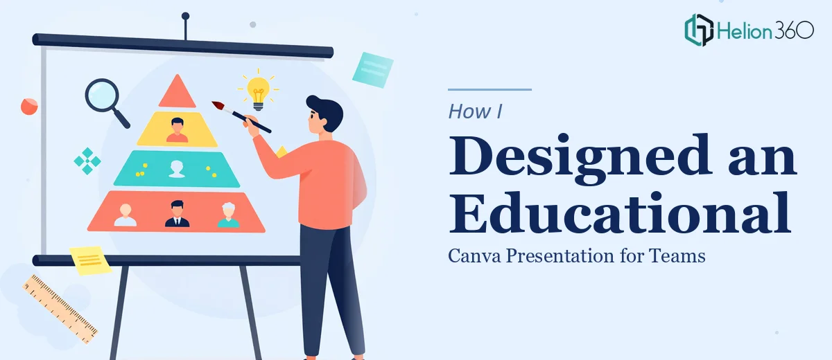
The third layer is the infographic and diagram work — and this is where most DIY attempts fall apart. Translating a technical concept like a system architecture, a process loop, or a detection pipeline into a clean visual diagram requires both domain comprehension and graphic design execution. The diagram has to be accurate enough that subject-matter experts do not wince at it, and simple enough that a non-expert can follow it in under thirty seconds. Getting that balance right means multiple iterations, careful labelling decisions, and a layout that guides the eye in the right sequence. The time and skill investment for this layer alone makes it clear that this is specialist work.
Why I Brought in Helion360 to Handle It
I recognised early that attempting this myself was not a realistic use of my time. The structural, visual, and diagrammatic layers each demanded a level of craft that I did not have sitting idle on my schedule — and the deadline was tight.
Helion360 handled the full project end-to-end. That meant taking the raw technical material, developing the narrative structure from scratch, building the visual system in Canva with a consistent grid and locked palette, and producing the infographics and diagrams that made the technical concepts readable for a non-specialist audience. The entire thing was turned around in days — handled in a fraction of the time it would have taken me to learn and execute it myself.
What made the difference was that this is what their team does all day. The tooling, the design judgment, and the ability to process dense technical content into clear visual communication were already in place. There was no ramp-up, no trial and error on my dime.
The Outcome and What I'd Tell Anyone in My Spot
The final presentation was clean, consistent, and genuinely useful. The team walked away understanding the subject matter well enough to contribute meaningfully to discussions they had previously been sitting out. The diagrams did the heavy lifting — concepts that had required ten-minute verbal explanations could now be absorbed in a single well-designed slide.
The structural work meant the deck could also be reused as an onboarding resource, which extended its value well beyond the original purpose. That was a direct result of building it properly from the start rather than patching something together under pressure.
If you are looking at a similar brief — complex technical content that needs to reach a broader, non-specialist audience, with real stakes attached to whether people actually understand it — consider the Company Training Modules that Helion360 offers. They delivered fast, handled every layer of the work, and the result was something I would not have been able to produce on my own timeline.