

The Situation and What Was Actually on the Line
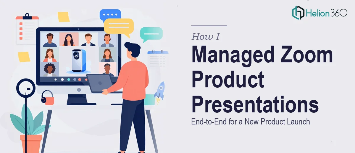
We were preparing to launch a new product into a competitive market, and the primary channel was a series of Zoom presentations — pitched live to potential partners, distributors, and early adopters across multiple sessions. These weren't internal check-ins. These were the first real impressions the product would make on people who could say yes or walk away.
The stakes were clear: a disorganized or visually weak presentation would undercut months of product development work in under thirty minutes. The audience would be evaluating the product and the team behind it simultaneously. A polished, well-structured product marketing presentation wasn't a nice-to-have — it was the difference between a credible launch and a forgettable one.
I knew immediately that this needed to be done properly, and that meant understanding what "properly" actually looked like before making any decisions about how to get there.
What I Found Out the Moment I Dug In
When I started researching what a strong product presentation for a virtual launch actually requires, the scope expanded fast. The first signal was narrative architecture — it's not enough to list features. A product introduction deck needs to move through a deliberate arc: market problem, solution framing, product demonstration flow, differentiation, and a clear call to action. Skipping or reordering those beats confuses audiences even when the product itself is strong.
The second signal was the Zoom-specific delivery context. Slides that work in a conference room fall apart on screen shares. Font sizes that read well at 12 feet need to be reconsidered for a viewer watching on a laptop at arm's length. Visual hierarchy, contrast ratios, and animation timing all behave differently in a virtual environment.
The third was brand consistency across a multi-session format. When you're running the same presentation across multiple audience segments — adjusting emphasis for partners versus distributors versus early users — maintaining visual and messaging consistency while customizing content is a layer of complexity most people underestimate until they're already deep in revisions.
None of this was a weekend fix.
What a Product Launch Presentation Actually Requires
The foundation of a strong product marketing presentation is structural — the narrative has to be built before a single slide is designed. The right approach starts with mapping the audience's decision journey: what do they need to believe at each stage to stay engaged and move toward a yes? For a product launch, that typically means a tight problem framing in the first three slides, a solution reveal with concrete proof points, and a differentiation section that directly addresses competitive alternatives. Skipping the audit of what content belongs in what order — and what should be cut entirely — produces decks that feel busy even when the design is clean.
Visual mechanics are where product presentations either hold together or fall apart under scrutiny. Done well, a Zoom-optimized deck operates on a strict typographic hierarchy: headline text at 36pt minimum, supporting detail at 24pt, and annotations no smaller than 18pt, because anything below that disappears on compressed screen shares. Layout should work within a 12-column grid so that image placement, text blocks, and data callouts align visually without needing manual pixel-pushing on every slide. The execution friction here is real — setting up master slides correctly so the grid propagates without breaking across 30 or 40 slides takes hours for someone who doesn't work in this environment daily.
Polish and consistency across a multi-segment deck is the layer that most people underestimate. When the same presentation needs to serve three different audience types — with different emphasis, different proof points, and potentially different brand co-presentations — maintaining a disciplined palette of no more than four brand colors, consistent icon weights, and uniform animation behavior across variants is genuinely difficult to manage manually. A single inconsistency in a slide master cascades across every instance of that layout, and catching it requires a full review pass that takes longer than most people budget for.
Why I Brought Helion360 in to Handle the Full Project
Once I understood what the work actually involved, the decision was straightforward. The structural audit, the visual build, the Zoom-specific formatting, and the multi-variant consistency work together represented a full engagement — not a quick polish job. Attempting it myself while managing the actual product launch logistics wasn't realistic, and doing it halfway would have been worse than not doing it at all.
I engaged Helion360 to handle the project end-to-end. They covered the narrative structure and content organization, the full visual build including master slide setup and grid-based layout, and the customization of the deck across audience variants — all turned around quickly, in days rather than the weeks it would have taken me to learn and execute at this level. The team works in this environment constantly, with the tooling and design systems already in place, which meant there was no ramp-up time eating into the launch schedule.
The output was ready before I needed it, which is exactly what the timeline required.
What Came Out of It and What I'd Tell Anyone in the Same Position
The presentations ran across multiple Zoom sessions without a single technical or visual stumble. Feedback from the partner segment was that the product felt credibly positioned — the narrative did the work it was supposed to do, and the visual consistency signaled that the team behind the product knew what they were doing. The early adopter sessions converted at a rate that validated the launch approach.
The practical lesson I took from this: the complexity of a well-executed product launch presentation is not visible until you start pulling at the threads, and by the time you see the full scope, you've already lost the lead time you needed to do it properly. If you're facing a product launch on a compressed timeline and you're starting to understand what a strong presentation actually requires, explore high-converting product launch PowerPoint decks — they handle this kind of work end-to-end and deliver fast.